| Image |
Comment |
| 08/22/2003 12:44:43 AM |
Mademoiselleby RiderGalComment: This is hard for me, because though I have never really been a big fan of portrait shots, I can recognize good points in almost all aspects of photography, and this is rather impressive. So, even with my bias, lol, you still get an 8. good job. |
 Photographer found comment helpful. Photographer found comment helpful. |
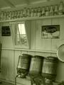
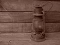
| 08/22/2003 12:17:43 AM |
Grandma's Vasesby Faye PekasComment: I'm usually hesitant about pictures that only convey the challenge once the title has been read. Excellent composition, but it seems slightly blurry, and I don't know about the choice of subjects... |
| Photographer found comment helpful. |
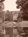
| 08/22/2003 12:01:10 AM |
Batavia 1887by pitsamanComment: Hmmmm... a valiant effort, so you will score a 7 with me. However, there are a few things I'd reccomend. First, I'm sorry that the sign was on the front of that fence for your picture, because the colors make it rather distracting. Secondly, I think that a larger depth of field (bringing the flowers in focus) would be very helpful. Finally, clouds would add so much depth to this that I think it would raise your score significantly. |
| Photographer found comment helpful. |
| 08/21/2003 11:56:24 PM |
Milkin' Barnby muckpondComment: Very very good shot. I can't think of anything I would change in it. However, I feel like something's missing from it, but since I can't place it, I'll give you the benefit of the doubt and award my first 10. Congrats. |
| Photographer found comment helpful. |
| 08/21/2003 11:50:52 PM |
Ghosts of Eshtonby LindaLeeComment: Good composition, but the picture is missing something because of being shot straight on. It looks like a postcard of a house that's supposed to look rundown. Alter your angle and I think it would look great. |
| Photographer found comment helpful. |
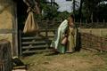
| 08/21/2003 11:43:42 PM |
Gate-keepingby e301Comment: Wow, I've been disappointed with other submissions so far, so thank you for putting forth a strong effort. The only suggestion I can make is to spread out the distance between the girls and the sack on the roof, so that the girls could be placed a little further to the right side of the shot. Excellent photo, good luck. |
| Photographer found comment helpful. |
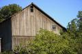
| 08/21/2003 11:30:07 PM |
The Old Barnby kyrielleComment: Hmmmm, to me, the barn itself isn't really a strong enough subject on its own. With something in the foreground other than trees, I think this would have been an effective picture |
| Photographer found comment helpful. |
| 08/21/2003 11:26:45 PM |
Windmillby SonifoComment: Windmill? At any rate, good subject matter for the past, but I think it would have been a vast improvement to shoot this picture at an angle and to have the lines of the porch fade off into some sense of distance. Basically, it feels rather flat. |
| Photographer found comment helpful. |
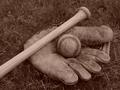
| 08/21/2003 11:25:00 PM |
Yesterday's Gameby jimmythefishComment: Subject is too dead on for my tastes. Baseball stands out to me, and I think it would look better if the baseball fit the rule of thirds |
| Photographer found comment helpful. |
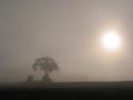
| 08/21/2003 11:23:01 PM |
Misty Days Gone Byby JackoComment: Fog effect is great, making for an outstanding picture. For my tastes, though, I don't feel as though this truly represents the past. |
| Photographer found comment helpful. |
Home -
Challenges -
Community -
League -
Photos -
Cameras -
Lenses -
Learn -
Prints! -
Help -
Terms of Use -
Privacy -
Top ^
DPChallenge, and website content and design, Copyright © 2001-2024 Challenging Technologies, LLC.
All digital photo copyrights belong to the photographers and may not be used without permission.
Current Server Time: 04/24/2024 03:18:49 PM EDT.