|
|
| Image |
Comment |
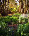
| 05/08/2007 08:54:37 PM | Eternal Peaceby dippydazComment: Greetings from the Critique Club!
I'll start by saying that for what it is, I like this image. This has a painterly feel to it, sort of Claude Monet meets Salvador Dali. It's quite an enjoyable piece of artwork; one you should be proud of.
With that said, I do feel compelled to say that this falls somewhat outside what I would expect to see in even an Expert Editing challenge. The Expert Editing rules do remind participants to "[p]lease remember ...that this is a photography contest. You are encouraged to keep your entries photographic in nature, and voters are encouraged to rate entries accordingly."
Though this is, in my opinion, an excellent piece of artwork, I find it difficult to classify this as "photographic in nature." Though I did not vote in this challenge, I must confess that if I had, I almost certainly would have deducted a few points as suggested by the above guideline.
Of course, none of this takes away from the quality of the artwork itself, and to be fair, I do feel I owe you a critique on that artwork.
The light in this photograph seems to draw the viewer's eye down from top center, toward the bridge, and around it clockwise. There, the flow is abruptly interrupted by the ghost horse. By having the horse overlap the bridge, it prevents the eye from following this natural flow created by the light. Instead, I might have placed the horse a little lower in the frame, so its head was clear of the bridge. This would require some careful editing as it would result in its legs being partially obscured by the tall grasses in the foreground. It may have also required some careful cloning of the ground cover so as to give the horse something on which to graze.
Overall, though, this is indeed a beautiful image. Nice work.
~Terry |  Photographer found comment helpful. Photographer found comment helpful. |
| 05/08/2007 07:56:47 PM | I Contemplate My Crimeby _eugComment: Greetings from the Critique Club!
ESP is certainly a great place for photography, and I regret that I have yet to go there. I've parked in its shadow countless times to have dinner at London Café 2 blocks away, but have yet to actually visit. I need to remedy that.
I like this image quite a lot. You composition, though unconventional, works quite well in this case, as a tighter crop at the top would lose the beam of light. Centering the head as you did was, indeed, the way to go in this case.
Though I recognize you probably did not have a way to accomplish this at the time, I would have preferred to see more light on the face, so as to make that the focus of this photograph. As it is, the light draws primary attention to the top of the prisoner's hat (try looking at this from across the room and you'll see what I mean). This is partially compensated for by the dimmer light on the shirt, which forces the eye to circle around from the hat, down and to the right toward the shirt, and then to be pulled back across the face by the brighter light on the hat. If you have an opportunity to re-shoot this at a later date, you might try bringing a pen light or other small, focused light with you. A 5-second exposure should allow you plenty of opportunity to use a painting with light technique to bring better light the face. Another option, which may be more practical, is to simply dodge the face in post-processing.
Your exposure, focus and other technicals are flawless here, and the photograph is well-composed and creative to boot. Congratulations on a very good photograph.
~Terry | | Photographer found comment helpful. |
| 05/08/2007 12:18:26 AM | He Reignsby timfythetooComment: Greetings from the Critique Club!
What a striking image! When I clicked the critique button and this appeared on my screen, my first thought was "wow... definitely a top 10." Then I scrolled down and saw I was right.
I really like the way this image fades to black around the perimiter. The relatively shallow DoF, with focus on the face, help keep the viewer focused on the image as well. These combined with the lion's intense stare make this photo absolutely captivating. I'm actually not bothered by the fact that the focus is on the nose and whiskers rather than the eyes, but I wonder if I'd feel there were something "extra" there if the focus were on the eyes as well.
Congratulations on an excellent image, and a well-deserved top 10 finish in a very competitive field.
~Terry | | Photographer found comment helpful. |
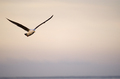
| 05/05/2007 05:18:37 PM | Morning Flightby louiejf1Comment: Greetings from the Critique Club!
I love the composition here, with just a hint of horizon at the bottom. I did notice, however, that the horizon is not quite level. A slight clockwise rotation would fix this. You've hit the rule of thirds nearly perfectly here as well.
The fact that you have captured this photograph with the brightest part of the sky behind the bird helps draw the viewer's eye in and keep it there. The naturally muted colors work well here and add to the peacefulness of the composition.
~Terry | | Photographer found comment helpful. |
| 05/05/2007 04:54:39 PM | Colors of Loveby sz1_Comment: Greetings from the Critique Club!
No question about it, this photograph certainly meets the challenge, in that this is a textbook example of the rule of thirds.
That said, the best photographs in any challenge are usually ones that stand on their own. That is, they are great photographs even without knowing what the challenge topic was, or even that they were part of a challenge at all. What this photograph lacks is an interesting subject to hold the viewer's attention.
The blue seems a bit flat and a saturation or curves adjustment in the blue or cyan channels might have added some punch to this.
~Terry | | Photographer found comment helpful. |
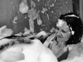
| 05/05/2007 02:52:07 PM | BUBBLE FIGHT!by ingridblueComment: Greetings from the Critique Club!
What a fun photograph! I love your subject's expression. The back wall kind of detracts from the photograph a bit, especially the black line near the corner, and I wonder if a tighter crop might have improved this photograph a bit. In particular, you might try a square crop, cropping just above your model's head and about halfway across the frame right to left.
Your post-processing seems a bit "muddy" to me. I would have preferred to see a curves adjustment to allow for more contrast in the mid-range, and perhaps to lighten your subject's face just a touch. In any case, this is a fun and enjoyable photograph that brought a smile to my face.
~Terry | | Photographer found comment helpful. |
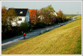
| 05/05/2007 10:31:51 AM | The road to freedomby onarComment: Greetings from the Critique Club!
This is an excellent photograph. In viewing it I can almost feel the rider's solitude. You've hit the rule of thirds perfectly here with your rider and with the horizon. It does appear, however, that your horizon is somewhat tilted (the rooftops seem to confirm this), something easily corrected with a slight counterclockwise rotation.
The strong diagonal of the road does so much here, separating the houses on one side from the empty green field on the other, and pulling the eye through the photograph. I also like that you captured the cyclist in light on the shadowy road, this and his red shirt makes it possible for him to stand out as your subject.
Congratulations on an excellent photograph, and a well-deserved 6+ score!
~Terry | | Photographer found comment helpful. |
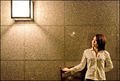
| 05/05/2007 10:18:45 AM | Why me?by heavyjComment: Greetings from the Critique Club!
I quite like this photograph. The balance created by having the light in one corner, and your wife in the opposite corner, is very pleasing to the eye, and creates a natural, circular flow through the photograph.
On its own merits, just viewing the photograph as a photograph and ignoring the constraints of the challenge, this is an excellent composition and a photograph you should be proud of. When viewed in the context of the Rule of Thirds challenge, however, I personally believe it falls short of meeting the challenge. Your wife's eyes are roughly centered top to bottom in the frame, and fall well to the right of the rightmost thirds line. Likewise, the light at the top left corner falls somewhat above and to the left of that intersection.
Overall, the composition says more to me about negative space than it does about the rule of thirds. I suspect that the most or all of your 6 votes of 3 or lower were people who felt this entry did not meet the challenge criteria. I recognize, however, that if this photograph were recomposed in a way that met the rule of thirds, it probably would not be as aesthetically pleasing, so perhaps it may have been best to save this concept for a different challenge, where it could realize its full potential. Still, that does not take away the fact that this is an excellent photograph, and the fact that you achieved a score of 5.7-plus, despite arguably not meeting the challenge, speaks volumes about the high quality of this photograph.
~Terry | | Photographer found comment helpful. |
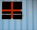
| 05/04/2007 08:59:31 PM | Southern Az Ranchby bigtreearrowheadComment: Greetings from the Critique Club!
There are quite a lot of things going on in this photograph, and unfortunately, they all seem to compete with each other for the attention of the viewer.
Fences can be tricky in photographs. Just as they are barriers in real life, they also tend to serve as barriers in photographs as well, restricting the viewer's eye as it travels through the photograph. I find that my eye wants to stay above or below the fence, and not cross it. It's almost as if there were two separate photographs here.
I do like the color of the mountain and sky, though perhaps a polarizer might have cut the haze and deepened the blues a bit. The "UO" stands out very well and I quite like it in this photograph.
~Terry | | Photographer found comment helpful. |
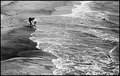
| 05/04/2007 08:34:09 PM | First Stepsby alexjackComment: Greetings from the Critique Club!
This is a brilliant photograph, I love the toning and exposure on it. Black and white was absolutely the right choice here.
You timed this photograph brilliantly. The waves, the line between sand and water, the pose of the mother and child, and the complete absence of sky all come together to make a near perfect photograph.
If this were not a Basic Editing challenge, I would suggest cloning away the dry sand in the top right corner as well as just below that on the left. Since they are lighter than the rest of the background, they do tend to disrupt the flow and pull the eye away from the center of the image.
Congratulations on a brilliant photograph, and a very well deserved top twenty finish.
~Terry | | Photographer found comment helpful. |
Home -
Challenges -
Community -
League -
Photos -
Cameras -
Lenses -
Learn -
Prints! -
Help -
Terms of Use -
Privacy -
Top ^
DPChallenge, and website content and design, Copyright © 2001-2024 Challenging Technologies, LLC.
All digital photo copyrights belong to the photographers and may not be used without permission.
Current Server Time: 04/19/2024 03:45:40 AM EDT.
|