| Image |
Comment |
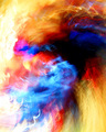
| 02/07/2006 02:28:58 PM |
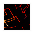
Where the green grass growsby M.O.C.Comment: Abstract - yes, cause I can't tell what this is. The image feels a bit unbalanced to me (too much black on the left), but I do like the colors. |
 Photographer found comment helpful. Photographer found comment helpful. |
| 02/07/2006 08:36:21 AM |
3by arsenalComment: Hm. I have to confess this one doesn't really qualify as an abstract for me, not just because the objects (or shadows + persons in this case) are recognizable, but because they are also not at an unusual angle or anyththing that would make me go, wow, I never looked at it this way, or take a minute to figure out what I'm looking for. Obviously, interpretations of an abstract are very personal. This is just mine. I'll have to come back to you on whether I like this as an image. It works better than I would expect, being that nothing is really in focus. |
| Photographer found comment helpful. |
| 02/07/2006 08:33:29 AM |
ifby jmritzComment: Wow, there's a lot going on here, even w/out the image being repeated on the left. I find its inclusion very intriguing, but it also draws my eye away from some of the other elements more in the middle of the image. Nice entry though. |
| Photographer found comment helpful. |
| 02/07/2006 08:32:08 AM |
Saturdayby taterbugComment: I am not typically a fan of those "shake the camera" kind of shots, but I have to give it to you ... it really works here. Almost like a painting. Very nice. |
| Photographer found comment helpful. |
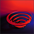
| 02/07/2006 08:30:34 AM |
spin by arngrimurComment: I really like this one. The red reflection on the coil works well with the background shifting to red, too. |
| Photographer found comment helpful. |
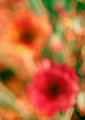
| 02/06/2006 01:29:40 PM |
pastel.jpgby mcmurmaComment: To me, it's not really an abstract, because I can tell what it is. Having said that, I like it. Colors are nice and there's lots for the eye to explore. How would I have rated it? Probably a 5. |
| Photographer found comment helpful. |
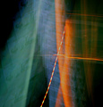
| 02/06/2006 01:24:41 PM |
Last Train to Albervilleby ArtanComment: Now there's a proper title for an abstract :) Like the simplicity and the framing works well, too. There's a reflection on the red on the left turn ing it orange. Would've liked it better if that wasn't there. |
| Photographer found comment helpful. |
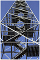
| 02/06/2006 01:23:29 PM |
Destination Unknownby SDWComment: Not really an abstract in my book to be honest. Having said that, interesting stuff going on, I like the blue background contrasting the b&w structure. Would've cropped just a tad more at the bottom, there's something poking into the image at the left (fence?). Nice symmetry. |
| Photographer found comment helpful. |
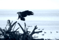
| 02/06/2006 01:00:58 PM |
Returning from the huntby jbsmithanaComment: I didn't vote on this challenge, but I probably would've given you a 4. The things I don't like much are the blue cast, the blown out white sky, and there's not enough detail in the bird's wing. I know you meant for the blue cast to be there, but it just doesn't work for me. Sorry. |
| Photographer found comment helpful. |
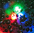
| 02/06/2006 12:57:15 PM |
Red Green and Blueby tazzaComment: Not sure if you coudl've avoided them, but the three bright lights in the middle are distracting from the rest of the image for me. Interesting idea though. |
| Photographer found comment helpful. |
Home -
Challenges -
Community -
League -
Photos -
Cameras -
Lenses -
Learn -
Prints! -
Help -
Terms of Use -
Privacy -
Top ^
DPChallenge, and website content and design, Copyright © 2001-2024 Challenging Technologies, LLC.
All digital photo copyrights belong to the photographers and may not be used without permission.
Current Server Time: 04/19/2024 08:40:05 PM EDT.