| Image |
Comment |
| 02/24/2006 10:42:08 AM |
lost in thought...by IreneMComment: Beautiful composition, detail, tonality. Wonderful unobtrusive, yet not totally plain background. Title fits, too. I think my only thing is that the focus is just a little bit off on the eyes, which are usually so important for a portrait. I wonder if advanced editing outside of the challenge could help you apply some additional focus to the eyes and change this from a good to a great photo. I would also crop just a bit more off the top. Small stuff though, I like this shot! |
 Photographer found comment helpful. Photographer found comment helpful. |
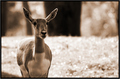
| 02/24/2006 10:35:56 AM |
Oh Dear (Deer?)!by NobodyComment: Nice! The deer is really nicely isolated against the background. I especially like how his/her one ear with the signs of fight is set off so well against the black area in the background. Nice tonal range, too. The color is a little too reddish on my monitor for my liking, something more sepia-like would've looked even better I think. |
| Photographer found comment helpful. |
| 02/24/2006 10:32:47 AM |
PEACOCKby harleyComment: To be honest, the peacock is hard to see, the eye is very much drawn to the left, bright side of the image. One of the few drawbacks of sunny days I guess, the high contrast light. |
| 02/24/2006 10:28:46 AM |
Black & Greenby HafiComment: Hm. Always love cat-eye shots. Doesn't look like a real duotone to me (but I could very well be wrong), more like anaturally two-colored image. Anyway, really nice composition, wish the eye on the left was a bit sharper, and you had cropped it properly on the left (white border). That one's easy to fix :) |
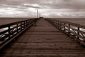
| 02/24/2006 10:27:00 AM |
Cayucos Pierby rachelellenComment: I like how the pier is centered in the middle of the image, really works here. Looks like I can walk to the end and reach the horizon :) Storm clouds also work well for this kind of image, a blue sky would not have been half as interesting for a sepia-ish tone. Overall, the image is just a bit dark on my monitor. Good work though. |
| Photographer found comment helpful. |
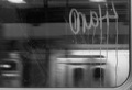
| 02/24/2006 10:24:54 AM |
Subway Viewby Andres ArangoComment: Love it. Reminds me of one PAD participant over at PBase (SteveH) who posts lots of wonderful shots of the London Underground. I like that you can just about see the frame of the window on the right and the bottom, the train moving in the background, the smears on the window and of course the graffiti. Lights at the top also help pull the whole shot together. Great choice for bw. Not sure how this will go down on DPC, but I really like it. Good luck :) |
| Photographer found comment helpful. |
| 02/24/2006 10:22:54 AM |
Sarajevo-old townby mulabegComment: I like the smoke in the right part of the photo and the sun hitting that one roof on the left. Interesting city scene, that works well in b&w. Sepia would be interesting to see, too, to give it more of an old feel, what with the older bldgs in the foreground. |
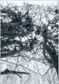
| 02/24/2006 10:20:25 AM |
I am protectedby greslizzzComment: Did you give this a hint of blue for that cold feeling? Or is it just the leftover snow on some of the branches that leaves the impression? Good angle, nice toning. Image is a bit too busy, I think some more straight trees (if you can find them) would probably work better for me. Not sure about the white border, it is too close to the sky at the top. A really thin gray or black line (one pixel each side) and then the white would've set the image off better IMO. |
| Photographer found comment helpful. |
| 02/24/2006 10:12:11 AM |
hold meby adoneComment: Hm. Nice bw tones, so meets the challenge. I am distracted by the grown out nailpolish, and the lighting is a bit harsh. Nice composition. |
| Photographer found comment helpful. |
| 02/24/2006 10:10:04 AM |
No Emotionby Buttox07Comment: Interesting crop. I would probably have cropped the top a little tighter. Some reflections on the skin, but otherwise really nice. Works well as a duotone. |
Home -
Challenges -
Community -
League -
Photos -
Cameras -
Lenses -
Learn -
Prints! -
Help -
Terms of Use -
Privacy -
Top ^
DPChallenge, and website content and design, Copyright © 2001-2024 Challenging Technologies, LLC.
All digital photo copyrights belong to the photographers and may not be used without permission.
Current Server Time: 04/18/2024 10:01:44 PM EDT.