|
|
| Image |
Comment |
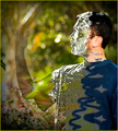
| 07/11/2007 07:42:34 PM | The Unseen Forest Dwellerby PeterPicComment: Greetings from the Critique Club
Definitely on the digital art side of the line, but that seems to have been appreciated in this challenge, and this piece seems to have been well appreciated. The idea fits the challenge very well, and it's fairly well executed. Perhaps a bit sloppy in places, but it doesn't really detract from the effect. The model is well posed, and his sense of wonderment clearly shows through his "mask". And I love the colors and the way they are used here.
My main complaint about this image is that the "forest dweller" seems very flat, almost like a cardboard cutout. This is partially from the lighting; there are no shadows to give him a three dimensional form. And partially from the processing, which posterized a lot of the details and eliminated the continuous tones. Perhaps that is what was intended, but to me the lack of realism kills the message. |  Photographer found comment helpful. Photographer found comment helpful. |
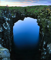
| 07/06/2007 10:08:27 PM | Seaside Archby orvaratliComment: Greetings from the Critique Club
Here's a creative take on the challenge: make "Waldo" a ghost! Seriously, the scenery is so breathtaking that I hardly notice the person; he's "hidden in plain sight".
What I really like about this photo is the illusion that the underside of the arch is the shore of a lake. The rocks are just the right shape and the sky below it just the right brightness that it looks like a reflection. And there is some artifacts or noise around the edges; just enough to make it look like ripples in the water. That's the clear focal point of the photo due to its brightness, contrast, and placement a third from the top. The eye is drawn there immediately when viewing the photo. It then moves down (away from the person!), and discovers the true nature of the scene. It works very well, and your high score is well deserved.
I hesitate to point out a technical issue because it's only really apparent when you look for it: the same artifacts or noise that works so well on the underside of the arch also appear above the arch, and give it an unwanted fuzzy appearance. I can't say where they came from, but similar artifacts appear in some of your other photos so you may want to track down their source so you can avoid them in future photos. Again, they are barely noticable so not a big deal; just something you may want to investigate. | | Photographer found comment helpful. |
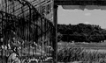
| 07/06/2007 02:43:53 PM | Hydroponic Waldoby posthumousComment: Greetings from the Critique Club
An unusual composition. The photo is split into two seemingly unrelated halves. The right side is lighter and the view more expansive, so it tends to attract the eye more strongly even though it's a bit blurry. The left side has two strong diagonal lines that lead the eye back to the right side, and the person is positioned near the edge. All these combined together are very effective in hiding the person, which was the main idea of the challenge here. In that respect, wonderful job!
But as a photograph, this really doesn't work for me. The two halves are just too different, with nothing to unify them. Once I've "found waldo", the photo just doesn't hold my interest. Which is too bad, because the textures on the left side are great. If they continue to the left a bit, I think turning the camera a bit left so that the post and woman are on thirds would make a more compelling photo (although not hiding the person nearly so well).
You're an experienced photographer, so I assume you made a conscious choice here to take the less conventional approach. A lot of people like it; there are a lot of positive comments here. Kudos on a successful photo! | | Photographer found comment helpful. |
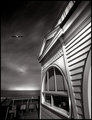
| 07/04/2007 11:30:55 PM | Storm Flight by hotpastaComment: Greetings from the Critique Club
Great job here; a well deserved ribbon. Sounds like you had a stroke of good luck to get the bird flying by and the boy looking at just the right time, but you've certainly made the most of it here. The subject works great in black and white; color would have probably been distracting and certainly not have allowed the superb tonal control exhibited here.
The wide angle distortion gives an other-worldly, almost surreal feel, which is nicely complemented by your treatment of the sky. Yet the bird and kid ground the photo firmly in reality. The result is surprisingly effective.
I keep thinking it needs a bit more space on the left for better balance and because the bird seems a bit crowded. But then again, the crowding and slight imbalance probably contribute to the effectiveness of this photo! So it's certainly fine as is.
This is an outstanding photo. Thank you for submitting it! | | Photographer found comment helpful. |
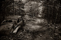
| 07/04/2007 02:18:03 PM | The Road not Takenby xianartComment: Greetings from the Critique Club
I love the feel here. The dark woods is interesting in itself, but the old car and subtle sepia convey the viewer back in time and make one wonder what might have been. Very well done.
There is a nice tension here. The obvious focal point is the end of the path; lots of lines (especially the path) lead to it and it's brightness catches the eye. The car is off to the side, and it's lines lead to the end of the path as well; so it clearly isn't the focal point. But it attracts attention because it is so different from the rest of the scene, and because of the kid in the window. But as soon as you look at it, it immediately leads your gaze back to the path. Great composition.
There's a bright area to the left of the focal point, not as bright as the end of the path itself, but still bright enough to cause some minor distraction. I think a little judicious burning to tone it down a bit would improve the photo. But that's minor; this really is a very good photo. I like it very much. | | Photographer found comment helpful. |
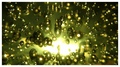
| 07/04/2007 12:10:37 AM | Big Bang... Beginning of the universe :)by FocusPointComment: Greetings from the Critique Club
A very effective photo. And a nice demonstration of how breaking photography "rules" can contribute to a photo's appeal. The large burned out spot would be too distracting in most photos, but here it becomes the focal point that ties everything together. And nothing here is in really sharp focus, another common photo killer. But the spherical forms are apparent and the lack of focus suggests chaos rather than carelessness.
But other rules are followed and lend stability and order that hold the viewer's interest. The bright spot has a great rule-of-thirds placement. The tones are nicely balanced, with the predominantly dark tones offsetting the few very bright ones. And the implied diagonal lines emanating from the center make this really dynamic.
I have two complaints about the photo. First, I wish it was more squareish. The 2:1 ratio seems a bit flat; I think a 4:3 would work better. Second, I really don't like the white border. It just doesn't work with the dark edges of the photo. And it puts a boundary on the "universe". I think it would work better with no border at all. Even if you printed this photo to hang it on a wall, I think it would work best flush-mounted on a board rather than framed! | | Photographer found comment helpful. |
| 07/03/2007 10:49:33 PM | Heads or Tails?by WallitComment: Greetings from the Critique Club
The negative space works well here. The photo certainly meets the challenge. And nice job hiding the thread; not an easy task with basic editing. Composition is nice and simple, though I think it would work better if the coin was higher; it kind of crowds the hand as is.
The low key approach doesn't really work for me here. Dark low key lighting is useful for conveying dramatic, gloomy, or romantic moods, but it just doesn't fit the subject here.
Finally, the subject here just isn't terribly exciting. While it's certainly possible to make a compelling photo of flipping a coin using the right lighting, position, etc., the mundane subject makes achieving this a bit harder. | | Photographer found comment helpful. |
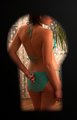
| 06/30/2007 01:14:46 PM | Peeping Tomby smykComment: Greetings from the Critique Club
Nice idea here, and well executed. Nice model (someone a peeping tom would be interested in!), and the lighting on her works well, giving nice skin tones and showing off her beautiful form. Good exposure and focus. The composition works well; the keyhole shape is great, and I like her head being partially obscured.
I wish more attention had been given to the background. I realize a real peeping tom doesn't care, but it's mildly distracting here. First, the part of the curtain right in front of the model is overexposed, which tends to pull the eye away from the subject. Second, the plant detracts from the photo both with it's shape and it's color. This very good photo would have been even better if the plant had been removed and the one part of the curtain been shaded from the light.
One more problem: the photo seems oversharpened. There are halos around the lines where dark meets light, and they seem unnatural.
But overall a good photo that deservedly did very well in the challenge. | | Photographer found comment helpful. |
| 06/30/2007 12:34:35 PM | Placid by lovethelightComment: Greetings from the Critique Club
Great shot! Well deserving of a ribbon. I love the way the shape of the hills is reflected in the water, then echoed once again in your arms. It makes a nice rhythm that combines with the warm colors of the sunset to create a photo with a nice peaceful feeling.
The cloudy sky is anything but placid! And bright cool colors normally attract attention away from dark warm ones. But for some reason that doesn't happen here; I don't find my gaze distracted by the sky. Interesting. I speculate that two factors combine to make this work: First, the clouds take almost exactly half of the photo, splitting the photo in two. This should normally be avoided, but breaking that "rule" of composition is very effective here. The bottom half is the more interesting, so the eye just ignores the top half. Second, your outfit is bright and cool, in constrast to the rest of the bottom half of the photo. This pulls attention right to you, which is where it should be.
I downloaded the photo and tried a couple of alternative crops just to see what would happen. First, I cropped enough off the top to put you on a "thirds" intersection. That doesn't work well at all; the clouds that remain at the top then grab attention and really ruins the balance. Then I tried cropping off all of the clouds and part of the bottom to balance it out and, again, put you on a thirds intersection. That gives it a horizontal format and makes for a very pleasant and placid image. Too placid! Almost boring.
So I really appreciate the composition you chose here. The bright, dynamic sky provides an exciting contrast to the tranquility of the bottom half, enhancing the overall feeling. The photo gives a message of placid in the face of chaos. Very nice! And though I appreciated this message at first glance (as did most voters), it took some analysis to understand just why this works so well.
Great work technically. The sky is slightly overexposed, but it isn't serious and I don't know if it could even have been avoided. Perfect focus and a good job of postprocessing. The trouble you had getting your camera to the right height really paid off. Wonderful pose. And you got the sun just right. Again, a wonderful photo! | | Photographer found comment helpful. |
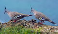
| 06/15/2007 06:43:09 PM | Pigeon Pairby owenComment: Greetings from the Critique Club
Great subjects here, really handsome birds. And a nice setting. I especially like the colors; even though the pigeons are mostly gray, there is enough color to make them really interesting.
The composition isn't bad, but there really needs to be a little more space to the left. There is a nice flow from the right side across the one bird's back and down it's beak to the other bird, and up it's back. But then it goes off the edge of the photo. Some space to the left of the bird would show that there is nothing interesting there, and make the flow stop at the left bird's eye, making that the focal point of the photo.
Another problem with the photo is that the subjects are not in sharp focus. Perhaps the focus was on the grass, which you nicely blurred to keep it from stealing attention. Ideally, the focus would be on the bird's eye. The photo also appears to be slightly oversharpened; there are halos at many of the edges. | | Photographer found comment helpful. |
Home -
Challenges -
Community -
League -
Photos -
Cameras -
Lenses -
Learn -
Prints! -
Help -
Terms of Use -
Privacy -
Top ^
DPChallenge, and website content and design, Copyright © 2001-2024 Challenging Technologies, LLC.
All digital photo copyrights belong to the photographers and may not be used without permission.
Current Server Time: 04/25/2024 05:37:57 AM EDT.
|