| Image |
Comment |
| 02/06/2014 11:29:37 PM |
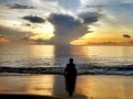
Serenityby kettleComment by pandabob: It may be the wine I've had tonight but it looks like your picture is crooked - leaning down to the right. I think the overall composition might also be improved by moving the horizon up or down and making the person or the storm the main focus. The two elements works well against each other but they're too "even" to me as it stands. If that makes any sense at all. |
| 02/06/2014 02:18:27 PM |
|
| 02/01/2014 01:00:27 PM |
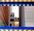
Heading Towards Methodistby kettleComment by njsabs: Wish that bottom line was level with the edge of the frame. Gives it a lop-sided look. I like the bold colors and the overall appeal....just a bit of straightening needed. |
 Photographer found comment helpful. Photographer found comment helpful. |
| 01/17/2014 05:49:31 PM |
|
| 10/01/2013 01:31:56 PM |
|
| 02/01/2013 03:50:18 PM |
Fallby kettleComment by bmartuch: This is a really nice shot Julie. I love the colors and the composition. |
| 11/21/2012 02:02:49 PM |
|
| 11/21/2012 01:19:15 PM |
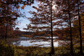
Autumnby kettleComment by giantmike: A serene setting, and does have some contrast due to the sun in the scene. I don't think the contrast overall is very high. |
| 09/08/2012 05:14:21 PM |
|
| 09/08/2012 02:06:58 PM |
Three Fansby kettleComment by bobnospum: Wow -- this ended up much lower than I would have thought (I gave it a 7). I found the repetition of the fans/wood and the extreme crop to make a very interesting and powerful image. |
Home -
Challenges -
Community -
League -
Photos -
Cameras -
Lenses -
Learn -
Prints! -
Help -
Terms of Use -
Privacy -
Top ^
DPChallenge, and website content and design, Copyright © 2001-2024 Challenging Technologies, LLC.
All digital photo copyrights belong to the photographers and may not be used without permission.
Current Server Time: 04/19/2024 05:50:46 PM EDT.