DPChallenge: A Digital Photography Contest You are not logged in. (log in or register
 
Browse Settings
Currently viewing:
Site CouncilGeneralE

Show comments:

Per page:

Order:

Comments:


Comments Received by GeneralE
Pages:   ... [1199] [1200] [1201] [1202] [1203] [1204] [1205] ... [1282]
Showing 12011 - 12020 of ~12814
Image Comment
He Went Thataway!
02/10/2003 03:35:11 PM
Are We "There" Yet?
02/09/2003 09:38:49 PM
Are We "There" Yet?
by GeneralE

Comment by GolferDDS:
A cute dog and a cute child in one picture. You get extra credit!
Cereal Killers (Cannibal Corn)
02/09/2003 02:10:24 PM
Cereal Killers (Cannibal Corn)
by GeneralE

Comment by Azrifel:
Made me laugh, good lighting. With the corn in the front a smaller aperture wouldn't hurt though. The pattern of the glass fits the pattern of the corn. Nice.
Photographer found comment helpful.
Cereal Killers (Cannibal Corn)
02/08/2003 09:23:16 AM
Cereal Killers (Cannibal Corn)
by GeneralE

Comment by lisae:
This photo seems a little pale and washed out on my monitor (which is calibrated for graphics work). Some more contrast would be good. The composition is OK. I'm not sure that your shallow DOF, blurring the foreground kernels, is really necessary for this photo.
Photographer found comment helpful.
Cereal Killers (Cannibal Corn)
02/07/2003 09:49:57 PM
Cereal Killers (Cannibal Corn)
by GeneralE

Comment by Anachronite:
a wider shot to make the corn shells more obvious. I had to look for a sec to see where the after was
Photographer found comment helpful.
Are We "There" Yet?
02/07/2003 07:40:46 PM
Are We "There" Yet?
by GeneralE

Comment by jgillard:
Too bad about the distracting couch in the background! jgillard6
Photographer found comment helpful.
Square Shim
02/07/2003 08:43:24 AM
Square Shim
by GeneralE

Comment by jmsetzler:
Greetings from the Critique Club :)

Hi General...

I highly agree with one of the comments you received this week about making this a black and white. The patterns that are available in this image coupled with some directional lighting from one side would create some great shadow effects that would work well as contrasts in black and white or duotone.

The overall image is slightly dark for my taste. The darkness is absorbing too much of the detail of the texture in this image. The texture seems to be the dominant factor in this image and I believe that highlighting that in your exposure would be very pleasing :)

The centered composition works well here. I don't believe that any other particular composition would be as strong as this one...

Keep up the good work :)

John Setzler
Photographer found comment helpful.
Are We "There" Yet?
02/06/2003 11:50:55 PM
Are We "There" Yet?
by GeneralE

Comment by PTLParsons:
Not sure I understand what you title has to do with the photo. But you met the challenge with out the title. Beautiful, well done photo. Good focus, color, composition, lighting, etc. Some will have a problem with the chair arm, but it is of no consequence in the photo. Doesn't add to or take away from. The kid and the dog hold your eyes fine. Nice one. Congratulations.
Photographer found comment helpful.
Heaven's Gate?
02/06/2003 12:43:57 AM
Heaven's Gate?
by GeneralE

Comment by DougPaz:
Greetings from the Critique Club };-)

Initial thoughts
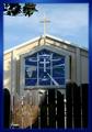
Beautiful color, meets the challenge, Fence is a distraction

Composition/ Content
Like most of your commenters, I would have liked to have seen this either without the fence or the fence in a different light. Actually, I like the idea of having the locked gate in front of the church. I think it is a perspective on our world today that needs to be shown. It just seems like a distraction with the light hitting it the way it is.

Background
The sky is nice and adds to the blue colors in this shot.

Camera Work - Technical
Focus seems good and contrast is excellent for the difference in light and shadow you have here. I don't agree that the stained glass window should have been shown being hit with sunlight. I think it would have washed the color out too much.

Digital Processing - Technical
I like the border a lot. I think the colors and gradient really adds to the colors in the photo.

Fits The Challenge
It almost fits the challenge too well. I think the window would have been enough. Hanging over the fence to take the Church window may have worked better here.

My Opinion On The Photo
I originally scored this shot a six. I think that it meets the challenge and I really like the colors. Good job, and keep up the good work.


I would be happy to talk further about this shot if you would like to contact me.
DougPaz
Cereal Killers (Cannibal Corn)
02/05/2003 09:50:16 PM
Cereal Killers (Cannibal Corn)
by GeneralE

Comment by magnetic9999:
need to adjust white balance for more realistic colors... :)
Photographer found comment helpful.
Pages:   ... [1199] [1200] [1201] [1202] [1203] [1204] [1205] ... [1282]
Showing 12011 - 12020 of ~12814


Home - Challenges - Community - League - Photos - Cameras - Lenses - Learn - Prints! - Help - Terms of Use - Privacy - Top ^
DPChallenge, and website content and design, Copyright © 2001-2024 Challenging Technologies, LLC.
All digital photo copyrights belong to the photographers and may not be used without permission.
Current Server Time: 04/16/2024 03:15:25 AM EDT.