| Image |
Comment |
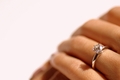
| 02/05/2006 06:34:13 PM |
Would you?by beggsComment: Since she's already wearing the ring I think that a caption such as "She Said Yes" or "I Do" would have been more appropriate. This is a nice, stock-like image; it looks almost like a jewelry advertisement. |
 Photographer found comment helpful. Photographer found comment helpful. |
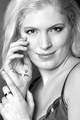
| 02/05/2006 06:31:19 PM |
I love you !by AnastasiaComment: The catchlight really helps to draw attention to your model's eyes. Her smile almost looks coy, but feels a little too posed to have full impact. The text on her hand clearly conveys the message, but I wonder whether her using her finger to beckon the viewer with a "come hither" gesture would have conveyed the same thought more effectively. I find the gleam on her ring a bit distracting; if this were an advanced editing challenge a little judicious burning might have been in order. I have mixed feelings about the B&W. I think that it draws attention to her lovely skin tone, but it also highlights the color difference between her eyebrows and her hair, which I think upsets the otherwise balanced presentation. The close crop helps to accentuate the intimate feel of the image. |
| Photographer found comment helpful. |
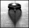
| 02/05/2006 06:23:44 PM |
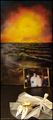
Enter Romeoby aerogurlComment: I would have never expected to see the word "fishified" in this challenge. The text and title are well chosen, but the execution of this shot is not as strong as the shots that it tries to mimic. A more well-defined shadow (and if possible, less blown-out text in the background) would make this a sure ribbon winner.
Even as currently shot, you probably could have adjusted curves to bring back a lot of the over-exposed areas and to increase the contrast in the shadows. Graphicfunk did a nice write-up on adjusting curves in this thread. |
| Photographer found comment helpful. |
| 02/05/2006 06:23:04 PM |
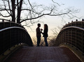
Lynne and Johnby e301Comment: Nice contrast throughout this image. If the names in the foreground were less noticeable I'd have disliked the way that the image is framed. I'd prefer to see a little more backlight to help separate the man from the background. This is one of my top picks for the ribbon. |
| Photographer found comment helpful. |
| 02/05/2006 06:20:14 PM |
Since 2002by greslizzzComment: The obviously painted background makes the shot feel a little fake. I would have prefer to see the white balance set to leave the lace more of a true white. |
| Photographer found comment helpful. |
| 02/05/2006 06:18:08 PM |
Open Your Eyes Honeyby GiorgioComment: Something about the pointy toes on those shoes reminds me of the wicked witch of the East(?)'s shoes; I'd be better able to focus on the intended meaning of your photo if not for this odd association.
The rose petals and the position of the feet are nicely done, but the lighting could stand some improvement. The fold in the background makes it clear that this is a white bed sheet, and the white is overexposed around the rose petals. Playing with the curves would probably have allowed you to make the entire background white without blowing out the detail around the petals. I take it that the sheet forms a rounded corner as it transitions from vertical to horizontal; this does a nice job of hiding the seam and creates a more studio-like feel. The image seems to have been slightly oversharpened; if the background weren't such a bright white I doubt that the effect would be noticeable. The white background also makes your model's skin tone look a little uneven; in front of a more organic looking background this probably wouldn't be noticeable. I think that a little bit more breathing room behind the raised heel would make this image look a little more balanced. |
| Photographer found comment helpful. |
| 02/05/2006 06:05:18 PM |
|
| Photographer found comment helpful. |
| 02/05/2006 05:59:11 PM |
Three Times A Dayby GolferDDSComment: The lighting seems a little flat; a light from behind would help to separate your subjects from the background. I can't help but wonder whether the different styles of brushes used is an intended part of the metaphor, or just an artifact of the oral hygiene habits of the members of your house. |
| Photographer found comment helpful. |
| 02/05/2006 05:55:35 PM |
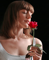
English Roseby AlexSaberiComment: The lighting is well done. I think I would have preferred to see the model's eyes at least partially open. |
| Photographer found comment helpful. |
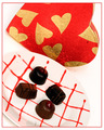
| 02/05/2006 05:50:59 PM |
Sweets For My Sweetby idnicComment: The plate and background are a little over-exposed, and the chocolates are rather under-exposed. More diffused lighting (or even using a long exposure and painting this with light) would have helped to balance the light distribution. |
| Photographer found comment helpful. |
Home -
Challenges -
Community -
League -
Photos -
Cameras -
Lenses -
Learn -
Prints! -
Help -
Terms of Use -
Privacy -
Top ^
DPChallenge, and website content and design, Copyright © 2001-2024 Challenging Technologies, LLC.
All digital photo copyrights belong to the photographers and may not be used without permission.
Current Server Time: 04/16/2024 11:18:28 AM EDT.