|
|
| Image |
Comment |
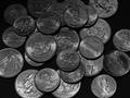
| 08/18/2002 11:37:00 AM | Pocket Changeby bunniesComment by HBunch: At first glance, I got a few different ideas. First, I thought. Woohoo, coins. Then as I sat here looking at it, I saw they are all 2002, so that is definately depicting newness. Then I thought, why is it in black and white? I realized that it could have been to further convey the newness look due to the fact that the black and white hides small scratches and slight discoloration. However, I would also like to see this done in color. If the b&w was to hide some discoloration of the coins, here is a trick. If you wash money in ketchup (sounds really sick, but it works) the acid in the ketchup kind of acts as a heavy duty cleaner and really puts a shine in the money. Just put a dab on and rub it between your fingers until nice and shiny. There was nothing more cool to me when I was young as putting really shiny coins in my piggy bank, so that's how I know about that. Anyway, great photo and good luck with the challenge. |
| 08/16/2002 11:35:00 PM | |
| 08/15/2002 01:07:00 PM | |
| 08/14/2002 09:21:00 PM | Pocket Changeby bunniesComment by psychephylax: Ok, I was originally going to rate this low for not being able to establish a clear connection but after someone pointed out the dates on the coins to me the score has jumped. Certainly meets the challenge, and I like the lighting on the coins. One suggestion I would make is to make a few of the coins more obvious that they are of new vintage. |
| 08/14/2002 07:10:00 PM | Pocket Changeby bunniesComment by Swashbuckler: New coins, thanks for not pointing out the obvious. I would bet you were trying to avoid flaring on the coins, but in my opinion, you netted a bit of a dark image. Focus is really nice, most all the way back, but coins start disappearing towards the back for the darkness. Could this be on purpose? yes, but I don't know either way, so I wrote it up. I like the fact that you show both sides of these coins, it looks "scattered", but seems purposeful, nice. All my jokes for you got backspaced as non-functional, lucky you. 7 Swash |
| 08/14/2002 09:47:00 AM | |
| 08/13/2002 11:38:00 PM | |
| 08/13/2002 01:32:00 PM | |
| 08/12/2002 11:31:00 PM | |
| 08/12/2002 06:25:00 PM | |
Home -
Challenges -
Community -
League -
Photos -
Cameras -
Lenses -
Learn -
Prints! -
Help -
Terms of Use -
Privacy -
Top ^
DPChallenge, and website content and design, Copyright © 2001-2024 Challenging Technologies, LLC.
All digital photo copyrights belong to the photographers and may not be used without permission.
Current Server Time: 04/23/2024 08:59:04 AM EDT.
|