| Image |
Comment |
| 07/22/2010 09:03:09 AM |
Fae by JaimeVinasComment: Lighting, composition, and colors all come together to make for an appealing composition of this fairy looking at her reflection. The backdrop is the perfect setting for this 'forest' fairy. Love the colors on the wings that seems to shimmer with a magic light. I also love the attention to detail in that the costume is period with a medieval time frame; a fae of the old-world Europe. Nicely done. |
 Photographer found comment helpful. Photographer found comment helpful. |
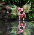
| 07/22/2010 08:57:18 AM |
"The Loveliest of all"by Len ScapComment: The editing of the horn to the horse is positively seamless. It is very believable that an actual unicorn is standing there in front of us. The setting and lighting is natural but also ethereal with the glow of the floral lights. The unicorn is pure and lovely in this forest meadow setting. |
| Photographer found comment helpful. |
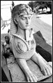
| 07/22/2010 08:35:03 AM |
riddle me this...by cbaile02Comment: There are times that I look at the face and think that it is really a human 'stone' face and then other times (when I look at the hollowed eyes) that I see it is just a statue. While this is just a statue it is one of the sphinx and it IS the choice of composing your main element that lifts this out of what I would normally view as a snapshot. I like how you composed it at an angle to include the road. The story surrounding the sphinx is that she was guarding a 'road' or path. A traveler would have to answer her question in order to pass. So here we have the Sphinx guarding the curved road and 'blocking' our path until we answer correctly. While a good shot (and I might add a slightly above average shot with minimal editing in an expert editing challenge) it could be even better. First off when I think of the sphinx I think of this creature looming over me. I don't get that with the composition as it stands now. The looking down angle makes me think/feel that we are looking down at what is supposed to be a fearsome creature. I think you could have shot this at a lower angle looking up making the the Sphinx seem larger than us. Make us fear her; show us how she can/is bigger than us. If you shot at a lower angle I would still recommend getting the road in the shot for it does complement the image. Black and White tones are good- BUT could be better. The tones on the main subject could be jussst a touch more contrast between shadow and highlights. There are blown highlights in the backdrop. Either or both an adjustment in aperture/ISO and some adjustments to Shadows/Midtones/Highlights in post processing would help. |
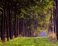
| 07/20/2010 11:39:28 AM |
Keeping Nature In Lineby kleskiComment: I like the composition of the orderly line of trees lining the pathway; a pathway to the unknown and perhaps some more natural beauty that lies beyond our sight. I'll have you know that you captured the dappled light shining and sparkling on the tree branches above perfectly. One can just watch the play of light in the leaves of trees to kick back and relax. There are two things I think that could have been done to make this capture even more visually appealing. First is that there is a purplish tone to the tree trunks. A color Adjust of the R G B where you subract some of the red would help to bring down those odd purple/red tones. Next is to play with the overall Shadow/Highlight/Midtones in the image. Just a touch more shadow and a bump in the midtones would improve the contrast and detail definition in the composition and the blades of grass would benefit from this too. |
| Photographer found comment helpful. |
| 07/20/2010 11:28:43 AM |
Redby kleskiComment: There is some very nice detail in the roses and the color! Color capture is perfect with those nice, rich reds popping off the black background. The noise/image grain takes away some details in the texture of the petals. Would have like to see the texture of the floral petals in the top one more. Perhaps bumping up the aperature a tad to get greater DOF and more detail would work but not familiar with the lens. One additional thing that would have made this a much stronger image is the composition of elements. The eye looks for shapes and patterns. I think it would be a more stronger composition if you place the roses in a direct diagonal. The bottom rose dominating the the bottom right corner and the top one dominating the top left corner. |
| Photographer found comment helpful. |
| 07/20/2010 11:15:51 AM |
Yellowby mbrutus2009Comment: Lovely colors! There really is the explosion of vivid purples and yellows in this composition. It makes me think of an exploding floral star. Composition is strong and colors really pop. One thing that would improve the appeal of the image is to get the center portion of the flower in sharper focus. It is juusst I touch soft. All points of the flower could be in sharper crisp focus if you increase the F-stop to something higher than 5.6 (for greater depth of field). A macro of an object can be very tricky if you have some points of the flower higher or lower than where you are focusing. Hence some softness to some of the elments. With adjusting the aperature to get greater DOF you will have to adjust the shutter to a slower speed to expose it correctly. |
| Photographer found comment helpful. |
| 07/20/2010 10:58:23 AM |
It was a memorable dayby AliciaComment: The tones are nice and dynamic. A very different take on the boats challenge in that we have a toy boat resting on a clam shell or shell that is pockmarked. I think but am not sure that the squarish object is a treasure chest. I think it would have been better to turn it around so it or angle it so that it is more identifiable. Analyzing this composition more I get the sense that it is supposed to project childhood and memories of the beach. There is just something extra that is needed...one or two more little things that would really cement or provide that 'umph' to make this an even better shot. Not sure what I could suggest to make it better because my brain is thinking that two items that could have been added for an interesting dynamic an 'X' marks the spot on the shell and a book in the backdrop with the spine showing such that you can read the words "Treasure Island" (I think I have been playing the soundtrack way too much for Pirates lately;-) ) |
| Photographer found comment helpful. |
| 07/02/2010 11:01:04 AM |
Calvin Borel @ Churchill Downsby TammsterComment: Lucky duck you!!!! You got to see the races up close! My eldest would love to see one of the races live - she loves horses.
The crop is good on this tilt for you have the horses mouth/nose lined up directly with the bottom left corner while Borel's tail end is lined up with the upper right corner. Diagonal lining of element placement is strong because of how you cropped this. However, that strength opens up a weakness in that you had to crop out the 'action' of the shot. The moving legs and the flying hair of the horses tail which would give the shot a strong sense of motion which would have further strengthened the sense of falling or rather rushing/racing 'downhill'. Cases like this I wish that it was possible to do both but the nature of the crop does not allow that:-( |
| 06/11/2010 04:19:56 PM |
Through a Child's Eyesby SJCarterComment: Love the capture of action here....it is like what she sees is so astounding and amazing it just blows her back. Makes me wonder just what she sees. |
| Photographer found comment helpful. |
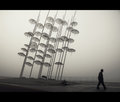
| 06/07/2010 11:03:41 AM |
Longtime Seeking by PascalComment: Followed your Life in the City Entry (congrats on the ribbon!) and found your photo that has stuck in my mind but could not remember who the photographer was. To me this captures a mood and feel of a quiet morning; a early stroll when the sights and sounds of the city is asleep so that one can take a stroll in quiet contemplation with only a lone dog as a companion. Love the B&W tones - and I am a sucker for a good umbrella shot (I love umbrellas - owning about 10 - used to be 11 but I lost that one somewhere ) |
| Photographer found comment helpful. |
Home -
Challenges -
Community -
League -
Photos -
Cameras -
Lenses -
Learn -
Help -
Terms of Use -
Privacy -
Top ^
DPChallenge, and website content and design, Copyright © 2001-2026 Challenging Technologies, LLC.
All digital photo copyrights belong to the photographers and may not be used without permission.
Current Server Time: 06/21/2026 11:57:45 AM EDT.