| Image |
Comment |
| 01/21/2004 01:26:25 PM |
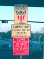
Stopby Crafty SueComment: The quality of this shot is really not the best. There is a lot of noise in every part of it. The sign is not sharp at all, and also slightly tilted. It's placed at dead center, which doesnt really do that much for it either. If you were wanting to do it in the middle I would suggest perhaps a portrait shot rather than landscape so that there isnt much space on either side of the sign. |
 Photographer found comment helpful. Photographer found comment helpful. |
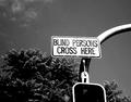
| 01/21/2004 01:20:54 PM |
Hey, we should be crossing there!by kaidaiComment: First reaction is the humor quality of the sign. Yes, it's a sign to warn others, but it could so be taken as a sign to blind people to cross there and that's where the humor stems. Unfortunately the composition doesnt really do much for me. I like the curve of the pole but it feels like the whole thing only occupies a small area of the shot and the negative space doesnt really help it. A crop suggestion might be to have the top of the curve coming out of the top right corner and crop to the left of the sign, and unless there is a reason to crop below the sign, I would probably have made it a vertical composition rather than landscape. I believe that way the emphasis would have been more on the sign. I do like the use of the black and white, and the slight noise in the sky gives it a gritty urban feeling too. |
| Photographer found comment helpful. |
| 01/21/2004 01:14:35 PM |
Photography Dr.by jackditchComment: Very appropriate sign! I like the use of black and white, it gives it a nice classy look, and I think that way the white overcast sky in the background is not as prominent, it just looks like a plain background. The tilt of the sign is a little offputting, but I can see the post is straight and so there was probably not much you could do with it. Very prominent and clear and has relevancy, good image! |
| Photographer found comment helpful. |
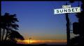
| 01/21/2004 12:52:36 AM |
Sunsetby faidoiComment: Exposure is good - I like the simple sunset, the lit sign, and the silhouetted trees. The blue is nice and deep although there appears to be a small amount of noise, whether from the high ISO or the saturation of the blue in post-processing. The connection between sign and background is apt, and the uncluttered feeling is good too. Quite a mellow scene. |
| Photographer found comment helpful. |
| 01/21/2004 12:48:40 AM |
Olhos na Lenteby joaobaComment: Not sure I see a connection here to road signs. I see a magnifying glass or lens with waterdrops over a picture of an eye. Outside of the challenge it's an interesting shot. |
| Photographer found comment helpful. |
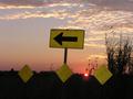
| 01/21/2004 12:46:19 AM |
Off Sunset Laneby SamuelComment: Technical - Great exposure! The disc of the sun is great just peeking out from the horizon and not overexposed either. The position of the clouds actually seem like they are traveling the direction of the sign too, and add a nice texture and color to the scene. The prairie gras also adds a nice texture and some height. The horizon line is unfortunately slightly tilted, and the perspective of the signs also seem to suggest a slanted angle also. It's slightly crowded on the right, which makes it feel a little unbalanced but not overly so.
Personal - It has a great atmosphere to it and wonderful tones.
Overall - It's a great capture, just needed a few tweaks to become a really wow shot. |
| Photographer found comment helpful. |
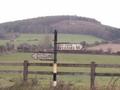
| 01/21/2004 12:38:15 AM |
Antiqueby deegeComment: Technial - It's not a very sharp image and the colors are quite muted. Having the sign dead center gives balance to the two opposing directions but I think it would help the composition more if it had been on the third. The amount of white overcast sky helps give it a washed out feel. The fence is also slightly tilted.
Personal - I like the old style signpost, I think it has great character and is a good subject to shoot.
Overall - I think if the conditions on the day you had shot this had been better then the image itself would have been better. It does have character but the muted colors and lack of sharpness go against it. |
| Photographer found comment helpful. |
| 01/21/2004 12:33:12 AM |
All Americanby Glen KingComment: Technical - The sign is certainly vibrant and stands out. It's dead center, which suggests to me that the background wasnt as important in the composition. In the background we have the arm of the traffic light and what looks like the underneath of an overpass or bridge - both of these items have a perspective that appears to be uneven or tilted, which puts it out of balance with the straightness of the sign.
Personal - The text on the red sign has humor, I've personally not seen something like that before so it adds interest.
Overall - Making road signs interesting is a real challenge, but you managed to shoot a nice bright, sharp sign. |
| Photographer found comment helpful. |
| 01/20/2004 11:18:07 PM |
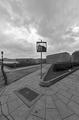
Real Royal Reflexion!by sergutComment: This has a great distorted perspective thing going, it's almost surreal. The clouds are very dramatic, the lines are interesting, the textures in the pavement and cobblestone are good, the line of whatever they are to the lamp are good. The reflection in the mirror is really what gives it the surreal feeling. It's so strange and weird that I really like it. Good use of black and white too! |
| Photographer found comment helpful. |
| 01/20/2004 11:15:52 PM |
surreal stairsby MattOzComment: I really like this. I'm not sure what it is about it, but it just has a great richness to it. The dof is great, the color tone is great, and it has wonderful textures. It's very three dimensional, very sharp. Really great! |
| Photographer found comment helpful. |
Home -
Challenges -
Community -
League -
Photos -
Cameras -
Lenses -
Learn -
Help -
Terms of Use -
Privacy -
Top ^
DPChallenge, and website content and design, Copyright © 2001-2025 Challenging Technologies, LLC.
All digital photo copyrights belong to the photographers and may not be used without permission.
Current Server Time: 08/06/2025 04:07:19 PM EDT.