| Image |
Comment |
| 01/22/2004 10:06:31 AM |
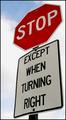
Confusedby MarjoComment: I guess having a simple shot of a sign straight on is a little boring, but not so sure that having it slightly askew is much better. The first thing I think is that it's tilted. Beyond that the sky background is good, there's some nice blue to it. The image is also sharp and clear. I just do not find much interest with it, sorry. |
 Photographer found comment helpful. Photographer found comment helpful. |
| 01/22/2004 10:02:33 AM |
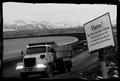
Islandroad?by garlicComment: I cant make up my mind if I like this or not. The sign is well placed in the shot, I have no idea what it says, but it looks interesting. The background of the mountain range is great, and I like the bend of the road. I actually even like the border! The truck gives the scene some movement, but it looks kinda blurry... that said I think that's partly where the mood comes from. I dont want to say it's gritty, and I'm not sure exactly what it is, but... I like it! |
| Photographer found comment helpful. |
| 01/22/2004 09:58:15 AM |
|
| Photographer found comment helpful. |
| 01/22/2004 09:55:04 AM |
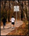
Budsby crabappl3Comment: I like how the path starts at the corner and moves diagonally into the shot and then wends out of it again. The colors give it a nice crispness to the day, but still has some warmth to it also. The shadows falling across the path also add some interest. The sign is prominent and yet it does not dominate the entire image by making the background just a dormant backdrop. Only nitpick is that the guy on the left blends into the shadows a little too much due to his dark clothing. |
| Photographer found comment helpful. |
| 01/21/2004 02:28:56 PM |
Blue Reflectionby jimc142Comment: There is a fair amount of noise on the sign, likely due to the high ISO from being taken at night. The perspective shift of the sign doesnt really do much for me. The crop at the bottom in the middle of the word just gives it a feeling of being unfinished. I think the challenge of making road signs interesting is difficult. |
| Photographer found comment helpful. |
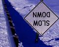
| 01/21/2004 02:26:24 PM |
Sign Neglectby scrum8Comment: The blue tone is good, gives it a nice chilly feel. The perspective of the railguard going into the distance is good too. The sign is interesting - upside down so slightly different than the usual, and the marks on its surface look like cracks, which go along with the snowy, chilly atmosphere of the shot. |
| Photographer found comment helpful. |
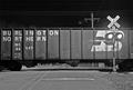
| 01/21/2004 02:09:36 PM |
Train Crossingby weavercComment: Good composition. Could maybe have done with a tad more sharpness but the contrasts are good. Is that the moon in the sky also? There seems to be a little bit of a haze around the sign, and the lights are a little bright, but otherwise the exposure is good. Ideally having the power lines cloned out would have been good, but I dont think it distracts from the image too much - it adds to the urbanness of the shot. |
| Photographer found comment helpful. |
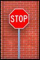
| 01/21/2004 02:04:39 PM |
This would be the last stop sign you run!by RHoldenSrComment: Very vibrant coloring. I lke the natural framing on either side with the bricks, although the different size is just a tad unbalancing. The stop sign really stands out from the background, good vertical composition. Maybe a little bit sharper would have been better, but it's a good shot. |
| Photographer found comment helpful. |
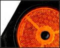
| 01/21/2004 02:01:38 PM |
Orangeby ndsComment: Took me a while to realise what this is, although I'm still wondering if it's a reflector or an orange/amber stop light. It's a great close-up, and an interesting abstract design as well. Very clear and sharp, and the noise between the black and white is actually kinda intriguing. I'm not a huge fan of abstract, but I like this. |
| Photographer found comment helpful. |
| 01/21/2004 01:39:16 PM |
STOP - Don't Drink and Driveby TommyMoe21Comment: Interesting idea, certainly a more creative one, and has a message attached. I think I would have preferred to see more of the sign. I can tell what it is, but I think it would have had more of a stronger impact if you didnt have to assume and it was hit over the head obvious. The reflections on the bottle are just a tad distracting. I think if the stop sign had been more prominent then this would have been a good image for an advertisment campaign. |
| Photographer found comment helpful. |
Home -
Challenges -
Community -
League -
Photos -
Cameras -
Lenses -
Learn -
Help -
Terms of Use -
Privacy -
Top ^
DPChallenge, and website content and design, Copyright © 2001-2025 Challenging Technologies, LLC.
All digital photo copyrights belong to the photographers and may not be used without permission.
Current Server Time: 08/06/2025 04:07:20 PM EDT.