| Image |
Comment |
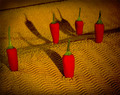
| 04/12/2006 08:43:59 PM |
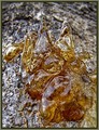
~ heatwave ~by StagoleeComment: I like the burnt corners here - it (and the other elements of the photo) really strengthen the relationship to the title. It looks to me like the 4 lesser peppers are slightly darker than the one at the front - I think I'd either prefer this exaggerated a bit more or have them all consistent, but that's just my opinion. Nice shot overall. |
 Photographer found comment helpful. Photographer found comment helpful. |
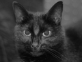
| 04/12/2006 08:42:07 PM |
Just Charleyby NigelComment: I'm not sure this is the best choice for textures in its current presentation - the subject blends in too well with the background, giving an overall flat look to the photo imho. I think this might work with a fair amount of dodging and burning to better emphasize the cat and the lighting. |
| Photographer found comment helpful. |
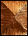
| 04/12/2006 08:39:15 PM |
Texture in Facetsby KiwiShotzComment: I think this could be a strong subject, but needs more attention given to the lighting - the highlights are distributed somewhat randomly, making the image appear a little busy (imho). It looks to me like direct sunlight, but a more controlled lighting set up could probably fix this up nicely. |
| Photographer found comment helpful. |
| 04/12/2006 08:37:40 PM |
Fading Rays of Lightby theSajComment: I'm not sure this quite fits for textures - it's difficult to discern a 3-dimensional object here (it looks like it may be a screenshot). In any case, the 'feeling' (texture) of the image is lost on me. |
| Photographer found comment helpful. |
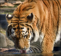
| 04/12/2006 08:35:03 PM |
Watering Holeby atsxusComment: I think this can work for textures, but with the editing done, it looks a little flat. A little more saturation in the orange fur could help separate this from the background more imho. |
| Photographer found comment helpful. |
| 04/12/2006 08:33:21 PM |
|
| Photographer found comment helpful. |
| 04/12/2006 08:32:47 PM |
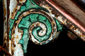
Elegant Decayby quiet_observationComment: Lighting is a little harsh (it sort of looks like direct flash). The textures are there and the subject & teal coloring is good, but I'd prefer a framing/composition that makes the sloped portion at the top right flat (and consequently cropped out of the image) - the focus on that section is soft but its still a distraction b/c of the large amount of the image that it takes up (imho). |
| Photographer found comment helpful. |
| 04/12/2006 08:30:45 PM |
|
| Photographer found comment helpful. |
| 04/12/2006 08:30:00 PM |
A little bumpy, a little slimy and lots of fuzzy furby KelliComment: I really like the concept, but it looks a little soft on the frog (though it is difficult to really tell due to the camouflage). Perhaps a closer shot on the frog would be more effective (and allow you to show more of the detail in the frog). |
| Photographer found comment helpful. |
| 04/10/2006 09:54:22 PM |
|
| Photographer found comment helpful. |
Home -
Challenges -
Community -
League -
Photos -
Cameras -
Lenses -
Learn -
Help -
Terms of Use -
Privacy -
Top ^
DPChallenge, and website content and design, Copyright © 2001-2025 Challenging Technologies, LLC.
All digital photo copyrights belong to the photographers and may not be used without permission.
Current Server Time: 07/20/2025 05:20:37 AM EDT.