| Image |
Comment |
| 08/21/2007 12:26:18 PM |
|
 Photographer found comment helpful. Photographer found comment helpful. |
| 05/23/2007 12:54:42 AM |
smoother than a baby's bottomby trolljentaComment: Hello from the Critique Club!!
First of all, great composition! You put the fish in the right place in the frame and used other elements to draw attention back to it! I think the texture in this picture is great, some people may have found it hard to associate this with "Silky-Smooth," but I think it works.
One of your biggest problems is the depth of field. It is very shallow, making too much of the picture blurry. I think a more shallow depth of field is appropriate for this picture, but this is far too much. While the colors in the picture are evident, they aren't flattering. There are a lot of dull browns and greens that, although they are in great contrast with the fish, aren't appealing to the eye of the viewer. The lighting of this picture also looks very unnatural.
The composition of the shot is terrific, but if you had spent more time on lighting, aperture, etc. it would be much nicer. Unfortunately, you said this was a last-minute shot. For the next one, try to spend more time getting the technicals down if you can.
--James B. Hale |
| Photographer found comment helpful. |
| 05/23/2007 12:42:46 AM |
Canterra Towerby CitadelComment: Hello from the Critique Club!!
This is a very strong image, the angle is dynamic and creates great negative space with the sky. The shape of the building makes for a nice subject. Many of the technical apsects are spot on.
I think what hurts this picture is the color and contrast. Correct me if I'm wrong, but it looks like this building was in the shade. The contrast is very low and doesn't allow for thet "pop" that people always look for. I have always found that neutral light creates more dull pictures. If you use the bright sun to light your subject your contrast will always be better. The reflection is only of the sky and doesn't allow for any interesting elements.
I love the shot, and think that with more dynamic colors and contrast, it would be very stong.
--James B. Hale |
| Photographer found comment helpful. |
| 05/23/2007 12:33:49 AM |
Chocolate Mint Creekby posthumousComment: Hello from the Critique Club!!
You used a longer exposure, which is great! It's always good to manipulate settings to achieve different results. The focus is on, and the colors turned out very well. In fact, there are many very good technical aspects of your picture.
However, what it's missing is a strong center of interest. The picture doesn't have much of a subject, leaving the point of interest at the stream. A stream can be a center of interest, but it must be shot from a more dynamic point of view. Next time try letting the stream flow down into the frame, rather than across it. The composition does a nice job of drawing the eye to the stream, but it includes the unnecessarily dull greenery on the top and bottom. Always remember that it helps to fill your frame with the subject, and not surround it by anything distracting.
You are on the right track, and you nailed the technical execution. Just work on your composition and think about the picture as highlighting something that people will find interesting to look at. Happy shooting!!
--James B. Hale |
| Photographer found comment helpful. |
| 05/23/2007 12:20:32 AM |
And the Journey Beginsby karmatComment: Hello from the Critique Club!!
As you said, this is a very technically sound shot. The vanishing point is clear and worked into the frame using the rule of thirds, as it should be. The colors are great and the depth of field is very deep, also as it should be for this type of picture.
The reason this photograph isn't as compelling is the subject matter. It isn't terribly interesting and doesn't have that "wow" factor that a lot of people look for. The bridge leaves the viewer a bit bored, leaving the eyes to wander, finding nothing else.
Overall you have a very well taken picture that lacks only a more interesting subject.
--James B. Hale |
| Photographer found comment helpful. |
| 05/08/2007 11:20:21 AM |
|
| Photographer found comment helpful. |
| 04/10/2007 10:28:59 PM |
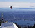
Big Air, Strong Legs by optionComment: You could have shot this as a simple looking-up-at-snowboarder or mid-air-showing-face-of-determination picture, but instead you got creative and included the landscape. That choice made the shot so much more interesting. Great job. |
| Photographer found comment helpful. |
| 04/10/2007 10:27:00 PM |
|
| Photographer found comment helpful. |
| 03/12/2007 04:18:20 PM |
Punto Gby alexjackComment: There is too much going on here. I'm not sure where the focus should be. It is also very grainy. |
| Photographer found comment helpful. |
| 03/12/2007 04:17:15 PM |
Careful...by skasubaComment: Watch the shadows of the feet. The fact that they can be seen makes the shot look very unrealistic. |
| Photographer found comment helpful. |
Home -
Challenges -
Community -
League -
Photos -
Cameras -
Lenses -
Learn -
Help -
Terms of Use -
Privacy -
Top ^
DPChallenge, and website content and design, Copyright © 2001-2025 Challenging Technologies, LLC.
All digital photo copyrights belong to the photographers and may not be used without permission.
Current Server Time: 07/19/2025 01:36:10 PM EDT.