Sorry nobody commented. Here is my critique of your shot: (hopefully from both a DPC and an Artistic perspective- they are not the same)
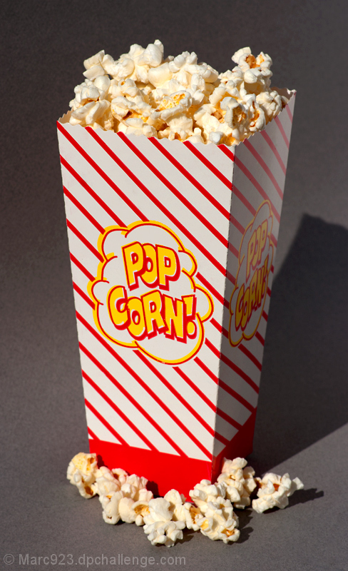
Composition: Obviously you have some prominent red stripes on the box, so, there is no mistaking that you met the challenge literally. The first thing that hits the viewer is that the subject box is right out in front, filling up much of the frame, in direct very bright flash, strobe or other light. Although that might make for clarity if you were photographing say a surgery, or a cooking technique, it does not afford the viewers eyes a chance to relax at all. Its like- baboom! big red striped box right up front. this is emphasized by the very harsh shadow to the right of the box.
Although I am not a stickler for the rule of thirds, it might have served you well to back this off and go landscape, spread out the popcorn at the base of the shot and ease up on the harsh direct high key lighting.
Focus: It appears that the front of the box is not really in sharp focus, that may be an illusion from the stripes, but no matter, its still won't cut it. The top of the popcorn is OK, and it actually appears the shadowy side of the popcorn box is in better focus. The gray counter provides contrast, but not much depth.
Good Points: Overall the image has a clear theme and is powerfully presented; the colors of cream and yellow in the popcorn at the top are really good; Check the focus, check the overall feel of the composition, run it by someone else, maybe even look for a clever twist on the theme. In the end, if you do all that- who cares what the votes are?
I was a bit more critical than usually get, but from someone who intimately knows what won't score too well, its meant in a good, encouraging way. Looking at your portfolio, you've already got some excellent shots. Rock on.
-Paul
|