| Author | Thread |
|
|
05/22/2011 07:48:20 PM |
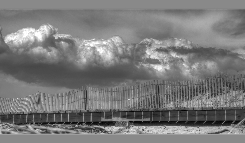
Hey Clay, you may hate this edit, but for better or worse I've found it takes this kind of contrast to grab attention here. Salmiakki said it right: If you like it it doesn't matter. But if you do care about getting higher votes, my experience is that you've got to push the envelope with processing.
So here is a stab at that, for better or worse.

|
|
 Photographer found comment helpful. Photographer found comment helpful. |
|
|
05/21/2011 09:08:20 PM |
Salmiakki,
PP is without a doubt where I lack, honestly most of the time I prefer it straight out of the camera, but have found on DPC most like some PP work done to it. that being said, with the work you did, it seems a tad to much for me. So I would not lean that far into it. Most notable is the whites in the one section of the cloud, looks almost blown out to me. Now of course, I know you didnt do this for a challenge and so I am sure this is not what you would yourself hand in. Just a quick observation. I took out more of the sky, as I have read on multiple pictures that the extra sky is not appreciated and I also felt removing it made the clouds more ominous.
As for the sensor dust.. didnt even notice I missed some.. that annoys me to.. is there an easier way to highlight that, iv looked back at a couple of my shots and have seen where I missed some.
Thank you for the comment.. every thing is helpful when trying to learn how to better your photography :) |
|
|
|
05/21/2011 04:45:11 AM |
Thought I would give you some feedback since you are clearly wanting it. I confess, I gave you a 4 for this one. You did quite well with an average of 5.7. Why did I give it a 4?
a) the composition didn't really work for me. I'd have cropped it a bit differently. Either I'd have removed more of the sky and left the clouds, or then kept the sky as it is in the original.
b) the image is very flat, lacking in contrast (can happen after tonemapping with Photomatix).
c) the border. I think in this instance the image would have worked better without the border or then it should have been a black border, the grey just highlights the lack of contrast in the image.
And the last point, is the sensor dust. When you are presenting an image for voting I think it's sloppy not to pay attention to these things (believe me, I have learned the hard way on that point!) I equate it to having multiple spelling and grammar errors in a job application letter. You want to do well, then make sure you present yourself (or your image) in the best possible light.
I took the liberty of working up your original keeping the B&W theme. Sky is still a bit noisy, but as you don't have Topaz DeNoise, I didn't use it (and I didn't bother with the dust either as this is just an example) The editing would comply with the basic ruleset and could be accomplished in Photoshop Elements (not sure what software you have). You got quite a few comments during voting, most of which should have helped you figure out what did or didn't work. Someone commented about not liking the border. You didn't feel this was helpful, and yet I would say, it's very helpful towards understanding why some have scored you lower.

ETA. I do like the image, but I feel you didn't make the best out of it. Remember, at the end of the day, if you like it, then that's what counts.
Why not throw the original into the Post Processing Side challenge and see what other people may come up with? This sort of side challenge is really an excellent way to learn.
Post Processing Side Challenge
Message edited by author 2011-05-21 04:49:54. |
|
| Photographer found comment helpful. |
|
|
05/21/2011 01:48:23 AM |
Thank you for your comments.. thought I would show you what I did do..
This is the shot before Grey or Darken (So bohemka the clouds wernt dark :)

This is grey'd without adjustments

So I did darken it up some. I was to afraid of going overboard.
Ja-9, I do not have the DeNoise, so I will have to try to get that. I do not use High Pass Filter (I think I tried it once and messed it up) and not sure what you mean about step process when you resize. So I will have to read on that.
I will leave comments for both of you.
|
|
|
|
05/20/2011 10:24:47 PM |
| ahhh, I missed the sensor spots... |
|
| Photographer found comment helpful. |
|
|
05/20/2011 10:11:03 PM |
I happened to have given you an 8 on this...I really liked the clouds and the fencing...this is what I feel it was lacking...
1) Noise in the sky...a simple noise filter like Topaz DeNoise/Neat Image (both reasonable) kicks the pants off of any PS program (IMO) Once I got those programs it's been a true "DUH" moment - mind you in this picture your noise isn't terrible...but boy is it a pet peeve of mine!!!
2) To me it appears that you need to learn about sharpening...are you using a "step" process to resize your pictures typically "sharpening" with each step? Do you know about High Pass Filter (another type of sharpening, that I've "just" found out about...it's amazing).
3) you have very "straight" lines going across this...a little step photography could go along ways here...how the fence leads you in the picture makes quite a difference...i.e. a fence that takes you "along the path" is more pleasing to the eye IMO.
So there you have it...again...go find one of my shots and leave a comment...tell me your score and what you think I could have done to improve it... |
|
| Photographer found comment helpful. |
|
|
05/20/2011 08:08:36 PM |
Reading your comment on playing with it... just boost the black in levels. It is missing the local contrast. You've got a sensational shot here but just process it differently.
You say you don't want it to look fake. Well this looks fake. Really, really fake. In real life there's way more contrast and I'd wager in real life those clouds were dark. So make them dark. |
|
| Photographer found comment helpful. |
|
|
05/17/2011 10:57:24 AM |
| A few people have said they had wished this image had a bit more contrast, you should have seen it before hand! I was afraid to add anymore didnt want it to look fake, i will have to play with that more the next time around. |
|
|
|
05/16/2011 06:13:34 PM |
| Nice clouds! Was the image black'r and more contrasty I think it could have had much more of an ominous feel to it. Really love the clouds. Such power. |
|
| Photographer found comment helpful. |
Comments Made During the Challenge  |
|
|
05/15/2011 10:04:36 PM |
| Needs some blacks. But good catch. I can't do a 5 and a half so I guess a 6. |
|
| Photographer found comment helpful. |
|
|
05/15/2011 06:39:44 PM |
| I would've voted this higher if there had been some darker tones in this image. It is a good photo but is is mostly middle grey. I would like to see some enhanced shadows in those clouds to make them more ominous. |
|
| Photographer found comment helpful. |
|
|
05/15/2011 04:54:37 PM |
| Niec varied layers in this. |
|
| Photographer found comment helpful. |
|
|
05/14/2011 04:05:22 PM |
| This is a nice B&W example where one can imagine golden clouds and sand. It's so full of light and color! For once, the border compliments the image. |
|
| Photographer found comment helpful. |
|
|
05/14/2011 10:48:11 AM |
|
| Photographer found comment helpful. |
|
|
05/12/2011 08:16:14 AM |
| Nice subject and title. I wish it had a little more contrast and definition. |
|
| Photographer found comment helpful. |
|
|
05/10/2011 05:32:59 AM |
| Love the clouds, and the wavey fence, could've been darkened somewhat, IMHO. |
|
| Photographer found comment helpful. |
|
|
05/09/2011 12:20:40 PM |
| Hate the border on this one. |
|
|
|
05/09/2011 01:19:28 AM |
|
| Photographer found comment helpful. |
Home -
Challenges -
Community -
League -
Photos -
Cameras -
Lenses -
Learn -
Prints! -
Help -
Terms of Use -
Privacy -
Top ^
DPChallenge, and website content and design, Copyright © 2001-2024 Challenging Technologies, LLC.
All digital photo copyrights belong to the photographers and may not be used without permission.
Current Server Time: 04/19/2024 02:27:19 PM EDT.