| Author | Thread |
Comments Made During the Challenge  |
|
|
08/22/2010 09:17:49 PM |
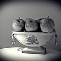
| Nice grouping; the lighting looks a little flat |
|
 Photographer found comment helpful. Photographer found comment helpful. |
|
|
08/22/2010 12:15:50 PM |
| I'm liking everything (a lot) except the border, which I feel draws the eye out of the frame instead of drawing you in. |
|
| Photographer found comment helpful. |
|
|
08/20/2010 08:01:24 PM |
| so well composed and lit and processed but such boring material i am not crazy about the border really great job on technicals here 7 |
|
| Photographer found comment helpful. |
|
|
08/20/2010 07:41:45 PM |
| Likes: sharpness, well exposed, placement of subjects. Dislikes: all black background, some background lighting or textured wall or wood would have made this photo pop some more |
|
| Photographer found comment helpful. |
|
|
08/16/2010 03:11:55 PM |
| you have the right idea, just a couple of things that bother "me"...your border (and I like borders) is to heavy and your shot is very dark IMO and that combined make this feel very heavy |
|
| Photographer found comment helpful. |
|
|
08/16/2010 03:05:23 PM |
| Nice autumnal composition. But I find that the lighting is too even over everything, making everything very close in tonal and textural qualities. |
|
| Photographer found comment helpful. |
|
|
08/16/2010 09:10:16 AM |
| Nice arrangement but looks a bit flat to me. |
|
| Photographer found comment helpful. |
Home -
Challenges -
Community -
League -
Photos -
Cameras -
Lenses -
Learn -
Prints! -
Help -
Terms of Use -
Privacy -
Top ^
DPChallenge, and website content and design, Copyright © 2001-2024 Challenging Technologies, LLC.
All digital photo copyrights belong to the photographers and may not be used without permission.
Current Server Time: 04/24/2024 07:52:10 PM EDT.