| Author | Thread |
Comments Made During the Challenge  |
|
|
07/13/2004 10:18:59 PM |
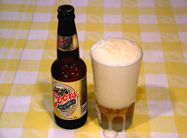
| Should have caught the foam just as it started to go down the glass. |
|
|
|
07/12/2004 05:06:24 PM |
| just a little too much head? |
|
|
|
07/10/2004 10:16:09 PM |
| You bought the only bottle of non alcoholic beer sold this year, for this picture. |
|
 Photographer found comment helpful. Photographer found comment helpful. |
|
|
07/09/2004 09:02:04 PM |
| In my opinion this looks rushed because of the overflow of the foam. I think the shot would have had more appeal it you used a warm beer and a frosted beer mug and a slow poor. This way as the beer warms the glass up the beer would have a crisper look to it. Aslo a warm beer so the bottle doesn't look sweaty. Bottle alone was a good shot but the glass made you lose marks. |
|
| Photographer found comment helpful. |
|
|
07/09/2004 06:49:20 PM |
| A good idea but fails to appeal as an advertising shot. Its the table covering that lets it down. Adverts usually have a strong studio feel if shot indoors. |
|
| Photographer found comment helpful. |
|
|
07/09/2004 09:25:06 AM |
The concept is very nice.
The image needs more lighting to offset the shadows or to send the shadows off into one direction. The background is also a little dull and could use a little sprucing up with something else that enhances the refreshment concept. |
|
| Photographer found comment helpful. |
|
|
07/09/2004 12:51:58 AM |
| Too much head. I also think this would of looked better with a different background. Maybe in a bucket of ice, or a snowy stream (I know hard to do in summer). Something that said cold and refreshing though. |
|
| Photographer found comment helpful. |
|
|
07/08/2004 07:03:42 PM |
| okay i get the safe, but sane? I feel like there is too much yellow in the picture... yellow beer, yellow label, yellow tableclothe. a solid background might enhance this picture |
|
| Photographer found comment helpful. |
|
|
07/08/2004 03:59:10 PM |
| It would look better if there was more beer than foam in the glass, but a good idea. |
|
| Photographer found comment helpful. |
|
|
07/08/2004 01:41:40 PM |
| Good idea and shot. the background just doesnt work for me for some reason. Maybe a bit darker? |
|
| Photographer found comment helpful. |
|
|
07/08/2004 12:21:38 PM |
|
| Photographer found comment helpful. |
|
|
07/07/2004 07:44:16 PM |
| I don't say this too often, but too much head! The shadows behind the subjects are pretty distracting along with the unfocused portion of the glass. |
|
| Photographer found comment helpful. |
|
|
07/07/2004 07:17:01 AM |
| What a disappointment. 10 |
|
| Photographer found comment helpful. |
Home -
Challenges -
Community -
League -
Photos -
Cameras -
Lenses -
Learn -
Prints! -
Help -
Terms of Use -
Privacy -
Top ^
DPChallenge, and website content and design, Copyright © 2001-2024 Challenging Technologies, LLC.
All digital photo copyrights belong to the photographers and may not be used without permission.
Current Server Time: 04/25/2024 07:23:22 AM EDT.