Hello and greetings from the Critique Club-
Firstly, congratulations on your new personal best!
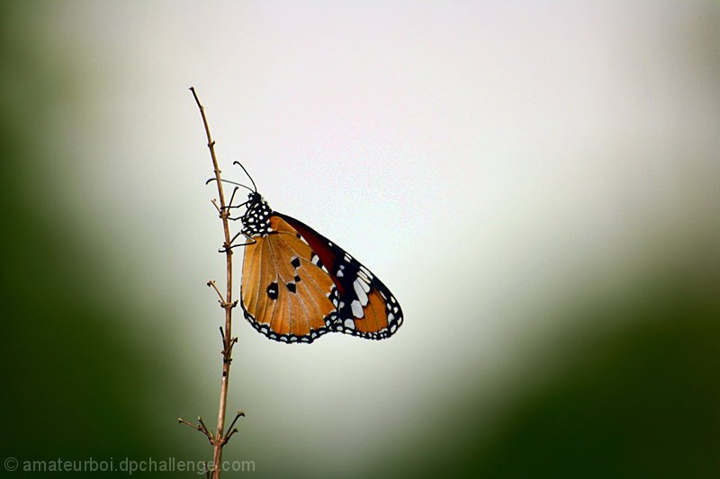
On to the photo though- I like where you went with this. It�s an interesting contrast to a lot of the photographs on DPC. Firstly, you�ve somewhat downplayed the colors in a photo with a butterfly, and muted them. I think this is a good choice, and fits with how the background looks in general. Your placement of the butterfly in relation to the background elements is also very good. You didn�t do the same sort of lighting effects with bokeh that many others did, but this doesn�t mean it�s not a good choice. Your overall editing and scene fit together very well, and having the illuminated circles in the bokeh would have gone counter to the generally somber mood of the photo. It�s very sparse, and your editing works with that instead of against it. Looking at your outtakes, I think this and img_1846 were the strongest. The other subjects suffered some from an awkward control of depth of field, where the subject itself had bits that trailed into and out of focus in a somewhat uncontrolled fashion. In the highlight of the background, immediately behind the butterfly, you�ve got some weirdness going on. I�m not entirely sure it�s just noise, it almost looks like its bits of clipping too, so lowering exposure, or using curves to specifically tone that down a little, might have been a good option, as well.
Overall, a good entry.
|