Hello from the Critique Club-
I can�t decide what I think of your take on the challenge. I see the relation between your take (advertising) and the world of fashion. Anybody flipping through a fashion mag knows that 95% of the paper is advertising space, so the two are obviously inextricably linked. But is there a delineation? I�m not really sure, I guess that�s for the DNMC worriers to worry over.
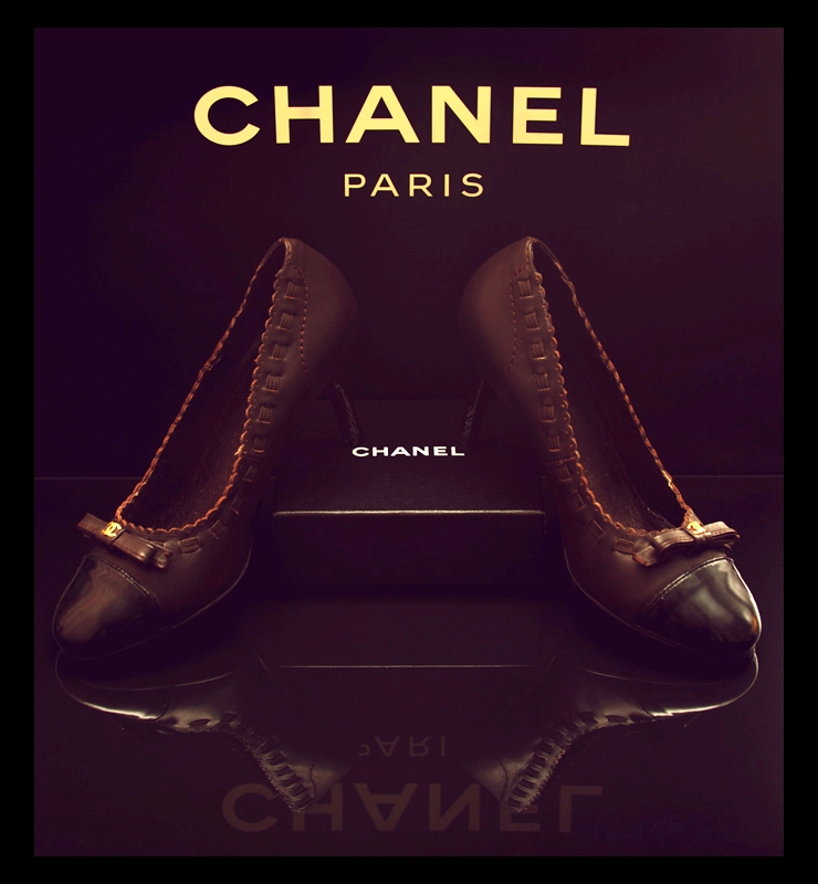
You have very successfully created a nice advertising type image, regardless of which users find it to relate to the challenge. I enjoy your subdued approach, and your positioning is very nice and directed. It would have been nice to get the Paris to reflect fully as well, but raising the positioning a bit, but that�s a minor thing. Same thing with maintaining symmetry in the front of the right shoe and the background on the right as well. I�m not really sure what it is, but something about the look of the �antique tone� for lack of a better term makes the pure black portions of the background seem to have a violet tint. I don�t actually think its that color, but the contrast of the two colors fools the eye.
Nice entry, all nitpicks aside.
|