| Author | Thread |
Comments Made During the Challenge  |
|
|
07/04/2004 10:22:25 PM |
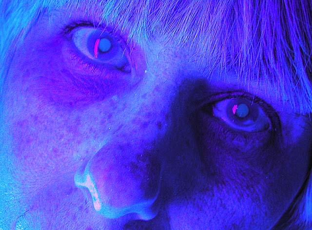
Lighting: way too harsh with just a touch of a color cast.
Pose: I do not care for the stare.
Background: n/a |
|
 Photographer found comment helpful. Photographer found comment helpful. |
|
|
07/04/2004 01:52:14 AM |
| Interesting effect -- I'd like to see the lighting a little more even on the eyes. Reminds me of a Joni Mitchell album cover. |
|
| Photographer found comment helpful. |
|
|
07/02/2004 12:06:27 AM |
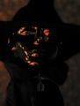
| OK, that's just scary. I admire your daring approach, but it's just too over the top for me. Not quite the "formal studio portrait" that I think many are expecting here. It might have worked better with a good exposure turned into a duotone, but this looks like it's reversed and solarized and the result is... well, weird. |
|
| Photographer found comment helpful. |
|
|
07/01/2004 11:27:02 PM |
| This image is just a bit to artsy for my taste, especially when considering a color studio portrait...it isn't really what comes to mind. Interesting lighting and effect, however. :o) |
|
| Photographer found comment helpful. |
|
|
06/30/2004 10:18:06 PM |
| Wish I could see the rest of the model's face, perhaps that will help give the picture some expression? The lighting/color doesn't agree with me (in my opinion, anyway) - less blue might be better. The picture gives out a nice surreal feeling - the reddish highlight in the eyes helped reinforce this. Very creative! |
|
| Photographer found comment helpful. |
|
|
06/30/2004 05:45:51 PM |
| Too much with the color. Sorry. |
|
| Photographer found comment helpful. |
|
|
06/30/2004 02:57:01 PM |
|
| Photographer found comment helpful. |
|
|
06/30/2004 06:37:55 AM |
| Abstract doesn't really strike me as something to expect in portrait shots, but I hope you have achieved exactly the results you are looking for. |
|
| Photographer found comment helpful. |
|
|
06/30/2004 02:36:57 AM |
| Interesting and unusual, but does not make me terribly excited. |
|
| Photographer found comment helpful. |
|
|
06/30/2004 01:17:52 AM |
| Very spooky, very different. |
|
| Photographer found comment helpful. |
|
|
06/29/2004 02:39:01 PM |
| maybe just a touch too much photoshop to this one :) This person doesn't look human. |
|
| Photographer found comment helpful. |
|
|
06/29/2004 05:21:59 AM |
| whoa...nice effect. More of a facial shot then a studio shot. |
|
| Photographer found comment helpful. |
|
|
06/28/2004 09:41:27 PM |
| This doesn't speak to me. |
|
| Photographer found comment helpful. |
|
|
06/28/2004 07:50:34 PM |
|
| Photographer found comment helpful. |
|
|
06/28/2004 05:11:20 PM |
| This isnt really what I expected from a "formal colour studio portrait" . Sorry but this is neither flattering to your model or interesting to the viewer. |
|
| Photographer found comment helpful. |
|
|
06/28/2004 05:07:34 PM |
| Not what I would consider a formal studio portrait, but it is definitely an interesting photograph. I'm curious as to how you achieved the shot. |
|
| Photographer found comment helpful. |
|
|
06/28/2004 05:01:03 PM |
| Interesting idea but I think you might have been better off leaving it with the natural lighting. The negative image on this is really distracting and hard to look at for very long. I like the set up and the way the face fills the shot but the post processing really hurt this one for me. A 4 |
|
| Photographer found comment helpful. |
|
|
06/28/2004 04:58:15 PM |
Nice attempt.
I don't think it quite works
nice shot though |
|
| Photographer found comment helpful. |
|
|
06/28/2004 02:23:30 PM |
| Sorry but this is not a very pleasing portrait. |
|
| Photographer found comment helpful. |
|
|
06/28/2004 11:58:41 AM |
| too overprocessed. Doesn't add to the portrait. |
|
| Photographer found comment helpful. |
|
|
06/28/2004 11:07:44 AM |
| Therianthrohy? She/he looks like a leopard with the spots and the cat eyes. |
|
| Photographer found comment helpful. |
|
|
06/28/2004 11:03:39 AM |
| I realy don't like this blue light. I think that blue and red colors are the worst colors for lightning faces. |
|
| Photographer found comment helpful. |
|
|
06/28/2004 07:03:56 AM |
|
| Photographer found comment helpful. |
|
|
06/28/2004 02:32:24 AM |
|
| Photographer found comment helpful. |
|
|
06/28/2004 02:30:17 AM |
| This is really just weird and unappealing. I don't mind overmanipulated portraits like this but there isn't anything to creative at work here--it just looks like you did some radical hue adjustments in selective color. |
|
| Photographer found comment helpful. |
|
|
06/28/2004 02:20:30 AM |
| kinda scary, looks like she's been out in the sun too long, like it though, very different, points for that |
|
| Photographer found comment helpful. |
|
|
06/28/2004 02:06:35 AM |
I never have and probably never will truly appreciate these overprocessed, psychedelic looking shots...
TC |
|
| Photographer found comment helpful. |
Home -
Challenges -
Community -
League -
Photos -
Cameras -
Lenses -
Learn -
Prints! -
Help -
Terms of Use -
Privacy -
Top ^
DPChallenge, and website content and design, Copyright © 2001-2024 Challenging Technologies, LLC.
All digital photo copyrights belong to the photographers and may not be used without permission.
Current Server Time: 04/24/2024 04:13:07 AM EDT.