| Author | Thread |
|
|
07/13/2005 05:02:04 PM |
| Just the motive I am always on the look for! You have captured it perfectly. This is a piece of art. Good work, Ed. |
|
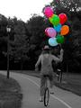
 Photographer found comment helpful. Photographer found comment helpful. |
|
|
06/29/2004 07:58:10 PM |
Originally posted by laurielblack:
Not a bad placement for a desat hater, huh? ;o) Your eye must have healed very well, because this is a great shot! Congrats on the top ten!! :o) |
Actually this shot was taken with my left eye ... ;-) |
|
|
|
06/28/2004 11:16:05 PM |
| A work of art, thanks for sharing it... |
|
| Photographer found comment helpful. |
|
|
06/28/2004 03:20:41 PM |
Aye..see you Jimmy !!!
A closet desat freak..I knew it all along. :)
Well done Ed. |
|
| Photographer found comment helpful. |
|
|
06/28/2004 11:47:43 AM |
| Not a bad placement for a desat hater, huh? ;o) Your eye must have healed very well, because this is a great shot! Congrats on the top ten!! :o) |
|
| Photographer found comment helpful. |
|
|
06/28/2004 05:55:20 AM |
|
| Photographer found comment helpful. |
|
|
06/28/2004 12:22:11 AM |
| My favorite of all. I really hoped it would ribbon. Very nice work. :) |
|
| Photographer found comment helpful. |
Comments Made During the Challenge  |
|
|
06/26/2004 02:25:42 AM |
| This gets my top vote for the Blue Ribbon. Aside from the slightly blown out highlights in the street this is about as perfect an image as you can get for this challenge. I'd give this an 11 if I could. |
|
| Photographer found comment helpful. |
|
|
06/25/2004 03:43:54 AM |
| I love the richness of this. The bold blue brings a modern feel to the old style architecture. You've got a good eye to be able to see these elements as a pleasing photograph with the intention of desaturating like this. Bravo!!! 10 |
|
| Photographer found comment helpful. |
|
|
06/24/2004 07:50:54 AM |
|
| Photographer found comment helpful. |
|
|
06/24/2004 03:09:54 AM |
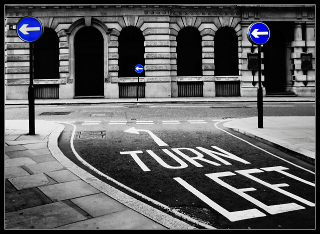
Ummmm.... can I turn right?
TC |
|
| Photographer found comment helpful. |
|
|
06/23/2004 11:05:11 PM |
| This shot is just toooo cool, I absoulutely love it, I will be mad if this doesnt get a ribbon, the is nothing wrong with this, its just the way its supposed to be, So all I can say is good luck :) - 10 |
|
| Photographer found comment helpful. |
|
|
06/23/2004 10:02:37 PM |
| The print quality is right on. Bright crisp whites and dark blacks - with plenty of tonal range between. Everything else works too - focus, composition, and the desaturization. If it were mine - I would not use the white line as part of the border. |
|
| Photographer found comment helpful. |
|
|
06/23/2004 08:58:54 PM |
| very nice b&w, it's nice to see a shot that didn't ignore the b&w aspect. the tonal range is excellent. |
|
| Photographer found comment helpful. |
|
|
06/23/2004 04:52:40 PM |
| hehe funny...very nice image as well...very good leading lines---I like I like! |
|
| Photographer found comment helpful. |
|
|
06/23/2004 12:41:41 PM |
|
| Photographer found comment helpful. |
|
|
06/23/2004 11:04:32 AM |
| Its perfect. Not much else to say but good luck! 10 |
|
| Photographer found comment helpful. |
|
|
06/23/2004 07:45:59 AM |
|
| Photographer found comment helpful. |
|
|
06/23/2004 05:34:25 AM |
| This is awesome. I love the blue, the composition, and the way the text is. It's just perfect. 9. |
|
| Photographer found comment helpful. |
|
|
06/23/2004 02:07:39 AM |
| Great use of the desaturation to emphasize the title. The contrast between the electric blue against the greyscale is so vivid...... 8 |
|
| Photographer found comment helpful. |
|
|
06/23/2004 01:23:49 AM |
| Very good picture to use on this Challenge. Crop is too tight on the top for my taste. Colors and dof are nice, contrast seems a bit much, or, was the original a bit dark? Either way - a very good job. Rated 8. |
|
| Photographer found comment helpful. |
|
|
06/22/2004 03:16:45 PM |
| I like the exposure and composition in this image as much as the desat..but they all combine well to give the picture impact. |
|
| Photographer found comment helpful. |
|
|
06/22/2004 02:20:43 PM |
| Nice use of the theme (it has a purpose!!) and there's some humour too. Blue is just too saturated though and would look more slick with a bit more subtlety. In this instance I feel that no border would have been more simple and emphatic of the technique. |
|
| Photographer found comment helpful. |
|
|
06/22/2004 11:44:28 AM |
Very simple and artistic. I can't give it less than a 10, one of my favs. Good luck...
PS: I'm back to fav it... |
|
| Photographer found comment helpful. |
|
|
06/22/2004 05:30:24 AM |
| Great work!! I love the primary colour blue in your photograph, it really stands out well. I also like the composition, choice and 'colour' in your shot. Excellent work and well done. |
|
| Photographer found comment helpful. |
|
|
06/21/2004 08:11:13 PM |
|
| Photographer found comment helpful. |
|
|
06/21/2004 06:25:22 PM |
LOL. Hmmm.... so, right turns aren't allowed here? ;)
Nice photo. The touchs of blue add rather than distract from the overall image. Well done. |
|
| Photographer found comment helpful. |
|
|
06/21/2004 01:14:39 PM |
| What's with the bright part in the middle? I like the picture though. Very smart.9 |
|
| Photographer found comment helpful. |
|
|
06/21/2004 08:00:27 AM |
| Re ally like this, it has a poster quality about it |
|
| Photographer found comment helpful. |
|
|
06/21/2004 02:47:55 AM |
| Great shot with deep, rich contrast. Really nice job! |
|
| Photographer found comment helpful. |
|
|
06/21/2004 12:42:40 AM |
| good humour in this shot. |
|
| Photographer found comment helpful. |
Home -
Challenges -
Community -
League -
Photos -
Cameras -
Lenses -
Learn -
Prints! -
Help -
Terms of Use -
Privacy -
Top ^
DPChallenge, and website content and design, Copyright © 2001-2024 Challenging Technologies, LLC.
All digital photo copyrights belong to the photographers and may not be used without permission.
Current Server Time: 04/24/2024 09:19:58 AM EDT.