| Author | Thread |
|
|
08/05/2009 07:01:52 PM |
Greetings from the Critique Club -
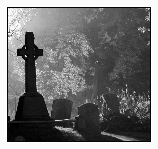
I will start off with the fact that I gave this a 7 - which in a dismal challenge was one of my higher votes. I like the graininess, I like the varied levels of shadow going back. I may have punched it even darker making the front stone almost a true silhouette. It doesnt have anything really standing out to say "WOW" but I felt it stood out well in the challenge.
My biggest issue is the border. You have this dark gloomy image wrapped in a bright white border. I would have probably gone with a black border or no border at all. It is just an odd combo in my eyes.
I figured this would have placed higher. Whatcha gonna do.
Tim |
|
 Photographer found comment helpful. Photographer found comment helpful. |
Comments Made During the Challenge  |
|
|
08/02/2009 04:03:37 PM |
| Nice pic with great ligting..fits black & white..But needs to be sharper and would place cross on left more into the pic slighty right of where it is now. Cross seems out of focus? |
|
| Photographer found comment helpful. |
|
|
07/30/2009 12:49:32 PM |
| This is a cool concept. I think the angle of the left stone needs to be adjusted to make the image come together. |
|
| Photographer found comment helpful. |
|
|
07/29/2009 06:20:53 PM |
| might have been more dramatic without the border |
|
|
|
07/29/2009 11:10:49 AM |
| white border is too thick in my opinion |
|
Home -
Challenges -
Community -
League -
Photos -
Cameras -
Lenses -
Learn -
Prints! -
Help -
Terms of Use -
Privacy -
Top ^
DPChallenge, and website content and design, Copyright © 2001-2024 Challenging Technologies, LLC.
All digital photo copyrights belong to the photographers and may not be used without permission.
Current Server Time: 04/24/2024 01:07:51 PM EDT.