| Author | Thread |
Comments Made During the Challenge  |
|
|
06/06/2004 08:40:52 PM |
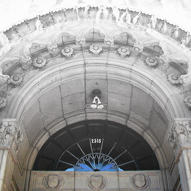
| Three arches? I am struglling to find reference to the challenge with this shot. Great job at centering though. Highlights blown out at top of image. |
|
 Photographer found comment helpful. Photographer found comment helpful. |
|
|
06/06/2004 08:39:16 PM |
| Confusing. The top is overexposed and the centered floodlight becomes a major element here. Looks like you cropped a lot to get to this point- was there any more at the bottom that would allow you to center the shields? |
|
| Photographer found comment helpful. |
|
|
06/01/2004 05:39:36 PM |
| lighting is too harsh in the upper areas. the three shields aren't enough of a focus here. |
|
| Photographer found comment helpful. |
|
|
05/31/2004 08:22:39 PM |
It's a nice picture, but a few pointer. Since the thme is 3, I think it should be a bit more your focal point and sharper. The lower part of your image, (where the three cresst are) is a bit blurry. Which removes from the whole theme.
Out of theme, I like this picture alot. |
|
| Photographer found comment helpful. |
|
|
05/31/2004 11:08:09 AM |
| Pretty faded out at the top - seems like harsh lighting conditions. |
|
| Photographer found comment helpful. |
Home -
Challenges -
Community -
League -
Photos -
Cameras -
Lenses -
Learn -
Prints! -
Help -
Terms of Use -
Privacy -
Top ^
DPChallenge, and website content and design, Copyright © 2001-2024 Challenging Technologies, LLC.
All digital photo copyrights belong to the photographers and may not be used without permission.
Current Server Time: 04/16/2024 06:28:49 PM EDT.