| Author | Thread |
|
|
03/02/2009 09:53:27 AM |
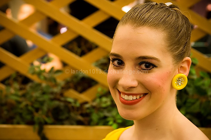
Conceptually, I couldn't care less about what month this is supposed to be, but to me it doesn't look like a calendar entry, it looks like a nice photo from a family album. Maybe more visual context would have helped set the scene and explained the makeup.
Technically I'm surprised no one has mentioned the lack of sharpness, especially noticeable in the eyes. Detail can be lost when resizing, so a little USM (unsharp mask) adjustment can help. Btw, I agree with others that the person in the background is eye-catching, despite the blur. |
|
 Photographer found comment helpful. Photographer found comment helpful. |
|
|
03/02/2009 02:27:42 AM |
Well,  Conner thought it was a nice shot! Seriously though. The main issue is the white balance. Some of the other issues are matter of personal taste and choice such as the amount of negative space on the left hand section of the frame. I also think a larger aperture would help separate her from the background. Unfortunately, I see no connection to the month of May. Sorry. Very lovely, warm smile! Conner thought it was a nice shot! Seriously though. The main issue is the white balance. Some of the other issues are matter of personal taste and choice such as the amount of negative space on the left hand section of the frame. I also think a larger aperture would help separate her from the background. Unfortunately, I see no connection to the month of May. Sorry. Very lovely, warm smile! |
|
| Photographer found comment helpful. |
|
|
03/02/2009 01:50:28 AM |
| I also did not see the month of May as your chosen month. Also, her skin (on my monitor) is yellow . There needs to be more space above her head, it feels squished and I wish the background was blurred out with a more pleasing dof. A minor but distracting part for me was that the whole image is dipping on the right. She is a pretty girl that is for sure - what is going on with her front teeth on the lower part. I also think if there were catchlights in her eyes that would have helped keep them from looking so flat. I hope this helps and doesn't hurt your feelings - this is of course my opinion and certainly I am sure others would disagree but that was my interpretation. |
|
| Photographer found comment helpful. |
|
|
03/02/2009 01:47:36 AM |
| Stage makeup or not, the colors seem a bit off. A bit too warm. To me, stage makeup is intended to look good when someone is on a stage, but rarely looks good close up. If you are considering this a portrait, the background is a bit distracting. I like the lattice, but the people and bright spots behind it don't contribute to the image. If this was not intended to be a portrait, but rather capturing a dancer in a competition, it might have helped to include more to help with the context (her gown, the dance floor, etc.) To someone who doesn't know that she's supposed to be wearing stage makeup at a dance competition, these things do affect the overall impact of the photo. |
|
| Photographer found comment helpful. |
|
|
03/02/2009 01:43:44 AM |
I agree that the colors are off in this, the entire photo has a yellowy feel to it that makes her look a little sickly. The bright spots in the background distract from her face and the portrait itself isn't particularly unique, which probably impacted your score a lot. Her eyes don't pop as much as they could, so that leave the viewers eye focusing more on her earring, which is a bit blurry and not the greatest of subjects. I hope this helps you understand the scoring better. This is a nice portrait for her though and I bet she likes it a lot.
Message edited by author 2009-03-02 01:44:09. |
|
| Photographer found comment helpful. |
|
|
03/02/2009 01:43:09 AM |
I think composition here is pretty good, though I would have to agree with the busy background, though it could be much worse. I think there are a few things that hurt the shot however. First, there appears to be an overall yellowish cast that doesn't play nice with skin tones. Second, the lighting feels kind of flat to me and doesn't give much depth. And lastly, it's focus is just slightly off enough to take away from the clarity aspect of the shot. Overall you did very nicely and captured the girl wonderfully. You're on the right track, it's just a matter of the details of the technical aspect that would make the difference with this shot.
That is why I believe it scored the way it did. Hope that helps and keep shooting!
~goinskiing
|
|
| Photographer found comment helpful. |
|
|
03/02/2009 01:42:49 AM |
| I think the white balance is a bit off. To much yellow tone. Crop out the people (on the left) would have benefited your photograph as well. |
|
| Photographer found comment helpful. |
|
|
03/02/2009 01:33:06 AM |
| I don't see how the background is busy at all.... and for another the colors aren't off. she has stage makeup this was at a ballroom competition. I actually really liked this photo I don't understand why others didn't..... |
|
Comments Made During the Challenge  |
|
|
02/27/2009 05:41:04 PM |
|
| Photographer found comment helpful. |
|
|
02/24/2009 10:47:10 PM |
| I'm sorry, it really doesn't work well for me. The colors seem off and the background is very busy. |
|
| Photographer found comment helpful. |
|
|
02/23/2009 05:27:11 PM |
| this looks to much like a "snap shot" |
|
| Photographer found comment helpful. |
Home -
Challenges -
Community -
League -
Photos -
Cameras -
Lenses -
Learn -
Prints! -
Help -
Terms of Use -
Privacy -
Top ^
DPChallenge, and website content and design, Copyright © 2001-2024 Challenging Technologies, LLC.
All digital photo copyrights belong to the photographers and may not be used without permission.
Current Server Time: 04/24/2024 11:35:03 PM EDT.