| Author | Thread |
Comments Made During the Challenge  |
|
|
04/14/2002 08:46:00 PM |
|
|
|
04/14/2002 03:10:00 PM |
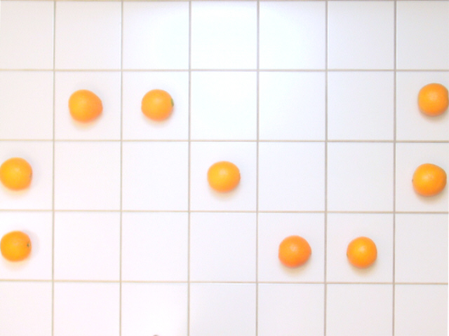
| An engineer with a sense of humor? A+ for creativity ... a 1/2 stop or so darker would have made the oranges stand out a bit more. |
|
|
|
04/14/2002 12:59:00 PM |
| very original suggestion of curves but why oranges - please dom't say 'why not' |
|
|
|
04/14/2002 12:23:00 PM |
| Very original,.. I like it. |
|
|
|
04/13/2002 02:26:00 PM |
| My eyes are playing connect the dots. :) |
|
|
|
04/13/2002 01:29:00 PM |
| Is this a photograph of a painting? It looks fake. And the bottom right corner is blank -- a bad rotate job? |
|
|
|
04/13/2002 09:30:00 AM |
| Ah, I think I've finally figured out that these are oranges on a tiled floor. Nice idea. Simple yet strong. |
|
|
|
04/12/2002 02:53:00 PM |
| Neat idea, nice contrast, but it is a little fuzzy to me. |
|
|
|
04/11/2002 03:05:00 PM |
| I like the simple idea here, but the clarity is lacking.... |
|
|
|
04/10/2002 02:22:00 PM |
|
|
|
04/10/2002 12:40:00 PM |
| Technically this isn't a sine wave, but who cares? :) Did you try sharpening the picture at all? Since the oranges are already on the edge of the frame, I would have tried cropping them directly down the middle. |
|
|
|
04/10/2002 12:39:00 PM |
| It's simple, but what the heck. I love the funky oranges. They make me think of detergent. |
|
|
|
04/10/2002 10:43:00 AM |
| Good idea. Better with the tiles squared off and with a little more room on the sides. |
|
|
|
04/10/2002 09:50:00 AM |
| Interesting idea. Don't care for the execution. The color tones on the tiles bother me -- would be better if it were a more pure white with starker grid lines. Seems a little out of focus, particularly on the left. For this type of staged photo I'd expect better formed and matched oranges -- might have added interest to have the stem sides up too. That's also the angle at which all of the oranges would have tended to be round. The cropping is not good -- better if you had whole tiles on the left and right, better still if you could have pulled out further and done a bigger, longer curve. |
|
|
|
04/09/2002 11:24:00 PM |
| 2 more fruits would have filled up the whole picture making it more interesting. |
|
|
|
04/09/2002 08:57:00 PM |
|
|
|
04/09/2002 07:16:00 PM |
| Too simple...imaginative, though. |
|
|
|
04/09/2002 03:08:00 PM |
For some reason it reminds me of the 60's and 70's.
Good idea...is it a little out of focus or just me? :) |
|
|
|
04/09/2002 12:18:00 PM |
|
|
|
04/09/2002 09:49:00 AM |
| Extra points for creativity! "when life gives you oranges ..." |
|
|
|
04/09/2002 09:48:00 AM |
| Nice originality and creativity. Good shot! |
|
|
|
04/09/2002 07:50:00 AM |
| Great idea! Very cool, and wonderful color. |
|
|
|
04/08/2002 09:51:00 PM |
| good idea looks cool, focus is too soft for my taste though |
|
|
|
04/08/2002 08:56:00 PM |
| This is cute - the oranges are a little blurry. |
|
|
|
04/08/2002 08:03:00 PM |
| are these oranges? i so wish they were in better focus. very original |
|
|
|
04/08/2002 05:22:00 PM |
| Doesn't pass the vertical line test... |
|
|
|
04/08/2002 05:18:00 PM |
| oh how cool ! What a great idea ! I do wish the angle was a little more straight so the lines and curve were lined up better. |
|
|
|
04/08/2002 02:48:00 PM |
| Hehe, me likes :o) The lighting is nicely uniform, which makes it stand out all the more. |
|
|
|
04/08/2002 01:06:00 PM |
| Clever! I wish it was more clear. |
|
|
|
04/08/2002 12:37:00 PM |
| Why do I like this one? I don't know. Better focus next time though. |
|
|
|
04/08/2002 10:57:00 AM |
|
|
|
04/08/2002 10:47:00 AM |
| Very original! let me guess - kitchen floor? |
|
|
|
04/08/2002 10:32:00 AM |
| This photo appears to be slightly out of focus and a little on the BRIGHT side. I would like this photo better if there was an extra row of tiles around the outside so that the oranges on the left and right sides weren't so close to the edge of the frame. |
|
|
|
04/08/2002 10:30:00 AM |
| Very interesting. The oranges are a little out of focus but it is still a great photo. |
|
|
|
04/08/2002 08:55:00 AM |
| i dont want to like this at all but i do. i wish the shot was lined up a bit more and the oranged were not cut off at the sides. |
|
|
|
04/08/2002 08:49:00 AM |
| Cool! good imagination and execution. Could have been a bit sharper focused/ better sharpened in software to make this really 'bite'. Bit too tightly cropped on the left and right. Really good entry. |
|
|
|
04/08/2002 06:37:00 AM |
|
|
|
04/08/2002 12:31:00 AM |
| The framing is great. It's tilted just a TINY bit clockwise from straight, and the oranges are a little fuzzy, but I like the idea. |
|
Home -
Challenges -
Community -
League -
Photos -
Cameras -
Lenses -
Learn -
Prints! -
Help -
Terms of Use -
Privacy -
Top ^
DPChallenge, and website content and design, Copyright © 2001-2024 Challenging Technologies, LLC.
All digital photo copyrights belong to the photographers and may not be used without permission.
Current Server Time: 04/25/2024 07:15:07 AM EDT.