| Author | Thread |
|
|
01/08/2009 11:23:59 PM |
| A bit of a toss up for me between this and the b&w version. Totally different moods, but both great. |
|
 Photographer found comment helpful. Photographer found comment helpful. |
|
|
01/07/2009 11:48:55 PM |
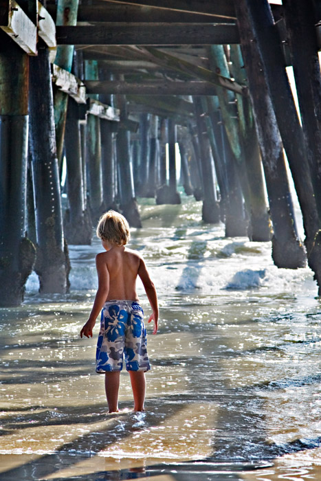
| I just want to know what he is looking at. This has a very dreamy feel to it. Honestly I don't even know where to start, I really like this shot. I can see myself in him, the curiosity, the willingness to look further and see what most of us don't. |
|
| Photographer found comment helpful. |
|
|
01/05/2009 07:07:39 PM |
| The lighting on the boy is great and the blue shorts work nicely. I'd like to see it with a darker/moodier lighting on the BG piers. Maybe play around with a heavy vignette?? |
|
| Photographer found comment helpful. |
|
|
01/05/2009 12:29:48 PM |
| I have to agree with everyone else, this is fabulous in color! The blue one is nice, but since he is darkened for me the focus ends up being on the water and pier instead of the boy (even though I love the glow of the water). The B&W is beautifully converted, but he does seem to blend in a bit too much. In this one I relate to the boy, I hear the waves and smell the ocean :-) |
|
| Photographer found comment helpful. |
|
|
01/04/2009 12:34:37 PM |
Out of all three, i like this one the best. I like the depth given by the peer, and the shadows caused by the pylons really give alot of interest to the photo. I also like the soft light hitting your subject on the head and back. Just seems to flow together nicely.
|
|
| Photographer found comment helpful. |
|
|
01/03/2009 09:23:42 PM |
I like this. The background is great but it's also very busy, and a little something is needed to make the boy stand out. The color does it. In the black and white shot, you have to work a bit harder to find him.
Message edited by author 2009-01-03 21:28:12. |
|
| Photographer found comment helpful. |
|
|
01/03/2009 08:18:24 PM |
| I like this one the best. It has a magical storybook quality to it. |
|
| Photographer found comment helpful. |
|
|
01/03/2009 04:38:56 PM |
| The color version is so soft (not in definition but in feel, pastel almost) and sparkly! |
|
| Photographer found comment helpful. |
|
|
01/03/2009 04:38:17 PM |
| I prefer this edit, Deb. Would be interested to see if you do B&W edit on it. |
|
| Photographer found comment helpful. |
Home -
Challenges -
Community -
League -
Photos -
Cameras -
Lenses -
Learn -
Prints! -
Help -
Terms of Use -
Privacy -
Top ^
DPChallenge, and website content and design, Copyright © 2001-2024 Challenging Technologies, LLC.
All digital photo copyrights belong to the photographers and may not be used without permission.
Current Server Time: 04/18/2024 08:54:17 AM EDT.