| Author | Thread |
|
|
01/12/2009 07:23:20 PM |
| Yes I like this version better it seems more stronger and appropriate for the image |
|
 Photographer found comment helpful. Photographer found comment helpful. |
|
|
01/08/2009 11:48:52 PM |
| I think that I prefer this because the small plane is more accentuated in this version. What a fantastic juxtaposition! |
|
| Photographer found comment helpful. |
|
|
01/08/2009 06:18:57 AM |
| I like this way better! I like the dark cloud hanging over the planes. |
|
| Photographer found comment helpful. |
|
|
01/07/2009 11:41:17 PM |
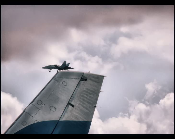
| First thing that pops out at me is the border. Its not as distracting as others I've seen done this way but i don't think it adds anything. As for the shot, intresting take on the F/A-18B. Maybe its just me spending too many years on an aircraft carrier, but it looks like its just coming off from a launch. Great timing. This also may just be me but on my monitor it looks a tad magenta. However I don't feel as though the color takes away from the shot. BTW I love the detail in the clouds. |
|
| Photographer found comment helpful. |
|
|
01/07/2009 11:27:53 PM |
| I like this version better than the other; and of course your timing was perfect. I'm not too fond of the border, but that's just my opinion. |
|
| Photographer found comment helpful. |
|
|
01/07/2009 04:45:31 PM |
| Yes -- better contrast and detail help. I don't care so much for the thicker border on the top -- I make most of mine "poster style" with the border (approximately) equal on the top and sides, and fatter on the bottom (in my case, to accomodate a caption). |
|
| Photographer found comment helpful. |
|
|
01/06/2009 10:04:22 AM |
| I really like this edit. The contrast is better and the tones are quite interesting. |
|
| Photographer found comment helpful. |
|
|
01/04/2009 12:25:25 PM |
I like the addition of the contrast, but think you lost a bit of the detail in the sky, but the wings are showing up better in which is what you really want being the subbject and all. Perhaps a layer to contrast certain areas can help keep some detail as well?
I am not sure if I care for the double spaced boarder on the bottom and top, it works, but makes me spend more time looking at the bottom, than into the overall photo. Perhaps if it was in white, it wouldnt garner as much attention perhaps? |
|
| Photographer found comment helpful. |
|
|
01/04/2009 12:15:26 AM |
| I like the improved contrast here! But I'm not as sure about the color changes -- I miss some of the blue to the sky. Maybe if going this direction, BW might be interesting! |
|
| Photographer found comment helpful. |
|
|
01/03/2009 09:08:47 PM |
| I too think it is better. Seems the plane off the wing does show up a lot better. I like the change in the sky too. |
|
| Photographer found comment helpful. |
|
|
01/03/2009 03:53:04 PM |
| Yes, this is better! You've really brought the focal point to your subject and created more contrast, more detail. Nice work! |
|
| Photographer found comment helpful. |
|
|
01/03/2009 03:33:04 PM |
| I like this version much better. The contrast adds to the photo, creating a much more interesting background. Border helps too. |
|
| Photographer found comment helpful. |
Home -
Challenges -
Community -
League -
Photos -
Cameras -
Lenses -
Learn -
Prints! -
Help -
Terms of Use -
Privacy -
Top ^
DPChallenge, and website content and design, Copyright © 2001-2024 Challenging Technologies, LLC.
All digital photo copyrights belong to the photographers and may not be used without permission.
Current Server Time: 04/19/2024 10:29:11 PM EDT.