| Author | Thread |
Comments Made During the Challenge  |
|
|
08/19/2008 04:54:49 PM |
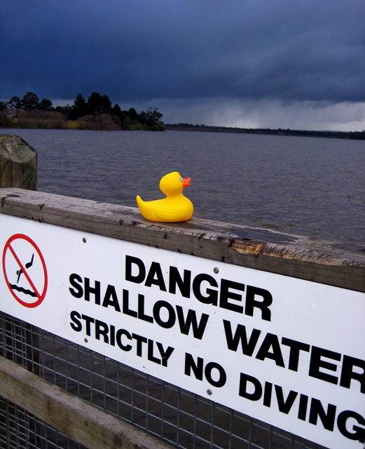
| The rest of the letters of the sign showing might have made this score a bit higher. As it is, it looks a bit incomplete to me. |
|
 Photographer found comment helpful. Photographer found comment helpful. |
|
|
08/16/2008 10:21:24 AM |
| Composition is a bit centered. I like the dark clouds in the back, nice contrast with the ducky. |
|
| Photographer found comment helpful. |
|
|
08/15/2008 06:53:41 PM |
| what, no duck-diving allowed either? 6 |
|
| Photographer found comment helpful. |
|
|
08/13/2008 04:05:46 PM |
| I don't think your concept is pushed quite far enough... i'd like to see a little more tension somehow--maybe a more dramatic angle? not sure... however, i love the contrasting colors of the duck in the foreground and the brooding clouds in the distance. |
|
| Photographer found comment helpful. |
|
|
08/13/2008 03:24:42 PM |
|
| Photographer found comment helpful. |
|
|
08/13/2008 11:17:03 AM |
|
Home -
Challenges -
Community -
League -
Photos -
Cameras -
Lenses -
Learn -
Prints! -
Help -
Terms of Use -
Privacy -
Top ^
DPChallenge, and website content and design, Copyright © 2001-2024 Challenging Technologies, LLC.
All digital photo copyrights belong to the photographers and may not be used without permission.
Current Server Time: 04/18/2024 05:47:10 AM EDT.