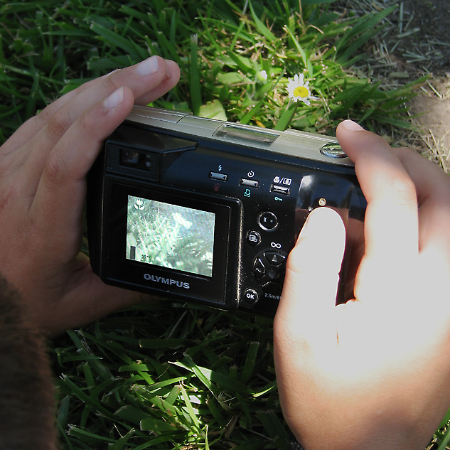
The first thing I notice is the blown out highlight and flat colours. Though the blown highlight and 'cover-up' take center stage for lower score.
As I look at this image, the flat color really stands out with the lake of 'whites' to go along with the blacks of the image. Though I am sure this is a difficult image to capture with the dappled lighting itself on the subject/s. I do not feel exactly that the camera is taking center stage. I am wondering if a closer perspective of the camera, well actually visualize this. rotating the camera so that the camera has the 'sun spot' and the hands are both in shadow. Have the model stretch farther so their head is not in the image and expose for the camera. Also with this, there will be that bright sunspot reflection on the body of the camera, so try to rotate the camera front or back so you can still see the screen as well as 'hide' the sunspot on an edge or button.
With the flatness of the image, I am finding it difficult to find the focal point. Though I see the grass blades at the bottom to be sharper than those at the top, I think the 'subject' is lost somewhere in the middle.
As for the screen, I noticed you did some editing to the screen itself, though I am not sure about it. Granted I am assuming this is an older camera and a lower quality of screen? It just feels overly bright to me, against the shadowed black of the camera body.
Lastly, I do notice the pink lines in the finger nails where you 'healed' out some areas. It is not a major distraction but it is noticeable to me.
Overall it is a nice idea, makes for a fun snapshot; but remember to adjust for best quality and control over the primary subject and everything else becomes secondary. Also remember to balance the whites and the blacks within the image.
Andrew |