| Author | Thread |
|
|
04/09/2008 11:51:25 PM |
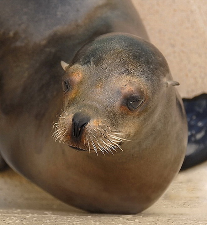
I wonder if maybe allowing us to view more of his right side (camera left) would've given the voters a "little more" to see. I love the fact that it's upclose and clear but I feel like there is more to the story than what I can see right here.
On a side note this would've been a great candidate for the "centered composition" challenge. I'm also not sure what the black stuff is on the right hand side; I do realize though that you couldn't really tell them to "Hold still for a min while I remove this object from the background!" -BB
PS. I'm really not sure why your final score was so low for this?! |
|
|
|
04/08/2008 03:28:05 PM |
Compositionally, I find myself trying to "push" his head further right in the frame. I think having his head in the right of the frame, and his body filling the left would make the composition feel more balanced.
Technically, the focus seems off. I can't tell if it is truly out of focus, if it is compression artifacts from resizing, noise reduction, or if it is from a pretty severe crop. Either way, it really detracts from the overall quality. If the "focus" were spot on, I think you would have found the score to be substantially higher. |
|
 Photographer found comment helpful. Photographer found comment helpful. |
|
|
04/08/2008 11:50:05 AM |
I read something that said for animal photos it's all about the eyes. If the eyes are in focus and tack sharp you can get away with a lot of imperfections in the photo. I have noticed this to be very true, the animal photos I like always has the focus on the eyes. In this photo the sharpest focus seems to be on the nose and whiskers and that is where my eye is drawn when I first look at the photo.
I think the lighting and color are OK and I like the way the sea lion (seal?) is coming from the top corner of the frame into the photo. Would like to see a little more of the body. My initial reaction when seeing the photo was "where are the flippers", because of the DOF and color the color blob on the right side of the photo doesn't look like it is part of the sea lion, it might be the flipper but it isn't clear.
Overall it's a good photo. |
|
| Photographer found comment helpful. |
|
|
04/08/2008 11:11:54 AM |
Just to say something different -
There's something about the angle of this shot that takes the "life" out of th eyes. This could be taxidermy (although if it were, it would be much easier to follow the others advise and get in closer).
It also seems a bit like you were torn between using just the face, or the entire front half of the seal in the composition. When I do this, it always turns out wrong, lol. A landscape crop that showed that front flipper (even w/ the short focal lenghth), or maybe both front flippers might work better, so might a tighter crop on just the cafe (although that probably isn't a good idea given the resolution). |
|
| Photographer found comment helpful. |
|
|
04/08/2008 02:02:40 AM |
| This looks to be a small crop from a much larger image. It may not be obvious at first glance, but it is quite apparent to the trained eye, and I see a few others commented on it too. You've obviously made the decision to crop right down, which is fine, but it's best to make this decision before the shutter is pressed, and get closer if you can. If this was a full photo of the seal's head, I would say crop it closer to get rid of the odd-looking pose and the distracting background, but it's already cropped beyond the technical limit, so maybe there was a wider composition that was usable? Anyway, enough about the cropping. Let's move on. The colours are slightly warm, which is not a bad thing here. The pose is a little odd, like a giant worm with a seal's head. :) The title is a little cheesy. It might have been better to go with the obvious "Seal", or better, the official name of this type of seal. I know it's fickle, but I think a cheesy title does actually pull down the score of the photo. Despite it's minor faults, I think this photo should have scored better than it did. |
|
| Photographer found comment helpful. |
Comments Made During the Challenge  |
|
|
04/04/2008 08:33:35 AM |
|
| Photographer found comment helpful. |
|
|
04/04/2008 05:30:32 AM |
| Something's missing here. I need something more, but not sure what. |
|
| Photographer found comment helpful. |
|
|
04/04/2008 04:44:51 AM |
Is this a crop of a much larger image? I am finding the image quality isn't that great and I am struggling to find the point of focus in this image. I would have liked to see the eyes in focus and possibly more of a close up on the face so I could see some of the wonderful detail in the whiskers (are they whiskers?).
This is just my humble opinion. |
|
| Photographer found comment helpful. |
|
|
04/03/2008 11:29:35 PM |
|
| Photographer found comment helpful. |
|
|
04/03/2008 08:44:43 AM |
| Seems cropped too much or sharpened too much - too pixelated. |
|
| Photographer found comment helpful. |
|
|
04/01/2008 10:33:40 PM |
|
| Photographer found comment helpful. |
Home -
Challenges -
Community -
League -
Photos -
Cameras -
Lenses -
Learn -
Prints! -
Help -
Terms of Use -
Privacy -
Top ^
DPChallenge, and website content and design, Copyright © 2001-2024 Challenging Technologies, LLC.
All digital photo copyrights belong to the photographers and may not be used without permission.
Current Server Time: 04/23/2024 06:03:47 PM EDT.