| Author | Thread |
|
|
08/16/2009 08:38:46 PM |
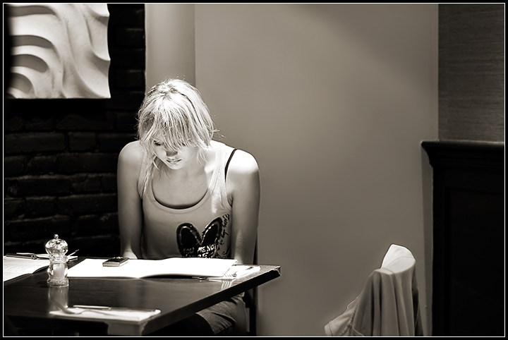
I have a question regarding the depth of field at 1.8. Using my MF lens and the D90, it is impossible to get any sharp image at 1.8 using the 50mm prime that I have. On the other hand this fantastic image seems to have the person's face and her arms all in pretty good focus! I can't even keep the eyes and nose of a person in focus in the same image =/
What could be the reason? |
|
 Photographer found comment helpful. Photographer found comment helpful. |
|
|
05/20/2008 05:35:31 PM |
|
| Photographer found comment helpful. |
|
|
05/07/2008 09:19:44 PM |
 PostLuminous Award WINNER! PostLuminous Award WINNER!
|
|
| Photographer found comment helpful. |
|
|
04/09/2008 02:07:15 PM |
| I like the lighting. Very interesting, creative photo. |
|
| Photographer found comment helpful. |
|
|
04/08/2008 01:01:30 PM |
| The lighting is terrific and the simple placement of items in the frame really creates a nice closeness to the subject. |
|
| Photographer found comment helpful. |
|
|
04/08/2008 03:03:11 AM |
| Very pleased to see this did well. Excellent composition, very well done conversion. I love the way the light reflects from the menu into her face. |
|
| Photographer found comment helpful. |
|
|
04/08/2008 02:42:56 AM |
| great manual focus at 1.8! I like the hot highlights, without it you wouldn't get the bounced light back on her face. |
|
| Photographer found comment helpful. |
Comments Made During the Challenge  |
|
|
04/06/2008 07:45:34 PM |
| nicely composed...seems a little hot though. |
|
| Photographer found comment helpful. |
|
|
04/05/2008 03:45:31 PM |
| Great use of light, cool location. |
|
| Photographer found comment helpful. |
|
|
04/04/2008 04:58:22 AM |
| Really great! Perfect lighting. Great choice to use B&W here. Great mood. |
|
| Photographer found comment helpful. |
|
|
04/01/2008 03:44:03 PM |
| This is a really interesting image. The composition with the contrasting forms of the artwork to the left, the ledge and chair to the right and the table. The lighting accentuates the girls hair and you can really see her expression and it leaves this interesting neutral quality leaning towards and calm sadness with the mood lighting. I like this a lot |
|
| Photographer found comment helpful. |
|
|
04/01/2008 12:47:09 AM |
| Simple, but good. I like it. |
|
| Photographer found comment helpful. |
|
|
04/01/2008 12:41:58 AM |
| I quite like the shot. I like the lighting but the chair on the right ought to be removed IMO 6 |
|
| Photographer found comment helpful. |
Home -
Challenges -
Community -
League -
Photos -
Cameras -
Lenses -
Learn -
Prints! -
Help -
Terms of Use -
Privacy -
Top ^
DPChallenge, and website content and design, Copyright © 2001-2024 Challenging Technologies, LLC.
All digital photo copyrights belong to the photographers and may not be used without permission.
Current Server Time: 04/19/2024 10:57:49 PM EDT.