| Author | Thread |
|
|
04/09/2008 09:22:28 PM |
My apologies for taking so long to comment..
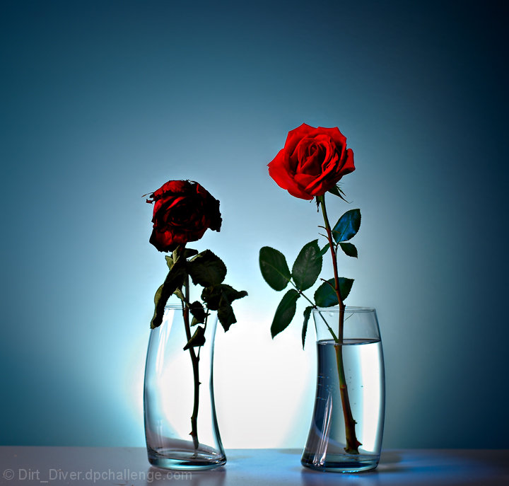
I like the lighting of the background. The way if pulls focus to the center of the image works well. However, I think I'd have a tighter crop, and more light on the wilted flower. Perhaps you intended for it to be dark to underscore that it is dying, but I'd prefer to see some of the texture. |
|
 Photographer found comment helpful. Photographer found comment helpful. |
|
|
04/08/2008 08:10:57 PM |
| Hey great idea, like the others maybe a tigher crop. But then you do great work so you should be proud. |
|
| Photographer found comment helpful. |
|
|
04/08/2008 04:24:57 PM |
| Hey Dirt_Diver,Interesting image and idea. I'm not really an expert when it come to studio lighting but I'll just voice some opinions about this image and what I like and dislike. First I really like the background and how it makes the roses pop, but the table is very distracting and be far the worse thing about the image. The rose on the left is too dark and lost in the shadows, it looks like it was intended to better juxtapose the two roses but I'm just not feeling it. Another thing is the roses have a bit of a halo around them which I noticed right away and kinda distracted me from the roses. Altogether the Image is of extremely high caliber and the lighting is in my opinion very well done, congratulations on a excellent image shame it didn't score better. |
|
| Photographer found comment helpful. |
|
|
04/08/2008 01:06:57 PM |
| Hi Joseph. I really like this image. I like the rounded vases, the strong and weak roses, the use of a light/flash on the background and the overall composition. I think this didn't do better partly because DPC does not like sad topics, which in your case is the death of a flower. But oh well, that aside, things that could improve the image are that not everything seems tack sharp, the leaves (not petals) of the rose on the right are a little soft. I really like the lighting on the rose to the right, but i really dislike the lighting on the rose to the left. The one on the right is very sharp and the shadows complement its beauty. The one on the left is, well, all shadow. I see why you did that, but you may have taken it a little to far. Maybe using another light coming from below and to the right to light the dying rose would have helped. This light could be weaker than the others to keep the darkness of the left rose. Also, maybe you could have toned down a little the background light so it's not so blown out, and that would let you brighten the the rest of the image. Finally, a minor thing, there are bubbles or dirt on the right vase. Hope this helped. |
|
| Photographer found comment helpful. |
|
|
04/08/2008 09:16:27 AM |
| Gradient background is a great setup, but like others have said, looks blown out at the base. I think the curved glasses could have been better set up symetricaly with the gradient. (they aren't centered) Looks like some air bubbles sticking to the side of the glass filled with water? a little distracting. The dead rose is to dark, and neither of their leaves have much color in them. Thats my opinion. |
|
| Photographer found comment helpful. |
|
|
04/08/2008 06:32:23 AM |
| This is well done for the message you wished to convey - very good lighting to create the lovely gradient behind, simple presentation, good crisp focus, and I like the use of the curved glasses. The surface could stand a wee bit of cloning, but that's very nit pickyish. Though it wouldn't have been as cleanly symmetrical, I wonder if more mood could be conveyed by moving the dead rose more to the left and turning the vase/glass and flower to face away, leaving the live one more in the spotlight, the dead one more in the dark. It would create an off-balance tension, kinda. Might work, might not. Just a thought. As for score - as I said, to my eye this is very good studio work but may not have the insidious and evasive "wow" factor. |
|
| Photographer found comment helpful. |
|
|
04/08/2008 03:18:25 AM |
Hi Joseph - here's a critique...
Nice graduated background colours, and the blue contrasts well with the red flowers - almost too well that the flowers are almost disconnected from the background in a disconcerting way. The blown highlight would be improved by moving the light further from the background, and maybe snooting it to get the edge shadows back. The dying flower is almost a silhouette here, making it lack interest next to the live flower. The crop is also wider than it needs to be, so the flowers get a bit lost in the big frame. So, a little more front fill-light on the wilted flower, a little less back light to remove the blowout and a slightly closer crop, and this image would be much improved. I also think it would be better a little smaller. Some images benefit from using the full 720x720 pixel size, but I do think some images just get lost in the maximum size, and this is one of them that would actually look more at home at 640x640. |
|
| Photographer found comment helpful. |
Comments Made During the Challenge  |
|
|
04/05/2008 10:42:37 PM |
| Very nice concept. Really like the lighting and choices of colors. All of the technicals look fine. The only nitpick is the table top surface. It has some spots which could be easily cloned out. Would've been great I think if the table surface was similar in color to the background. (comment, no vote) |
|
| Photographer found comment helpful. |
|
|
04/05/2008 12:31:19 PM |
| Nice idea, the background light seems a little too hot, maybe knock it down 1 step. |
|
| Photographer found comment helpful. |
|
|
04/05/2008 08:34:03 AM |
| I really like the poetry here. I love it when a photo is more than a picture. |
|
| Photographer found comment helpful. |
|
|
04/03/2008 09:37:14 AM |
| Nice capture. The lighting is nice, the composition is well done. The different heights on the rose's was a nice touch. For me dead or dieing things just do it for me. If the other rose was alive and had a smidge of water in it maybe titled (running out of time) would have worked much better for me (imho). |
|
| Photographer found comment helpful. |
|
|
04/01/2008 02:59:20 PM |
| the dying rose is lost in shadow. the in-studio appearance gives this a rather clinical feel. |
|
| Photographer found comment helpful. |
Home -
Challenges -
Community -
League -
Photos -
Cameras -
Lenses -
Learn -
Prints! -
Help -
Terms of Use -
Privacy -
Top ^
DPChallenge, and website content and design, Copyright © 2001-2024 Challenging Technologies, LLC.
All digital photo copyrights belong to the photographers and may not be used without permission.
Current Server Time: 04/25/2024 06:52:39 AM EDT.