| Author | Thread |
|
|
04/14/2008 11:55:57 PM |
| very cool use of composition, keeping things simple and appealing |
|
 Photographer found comment helpful. Photographer found comment helpful. |
|
|
03/19/2008 04:32:41 PM |
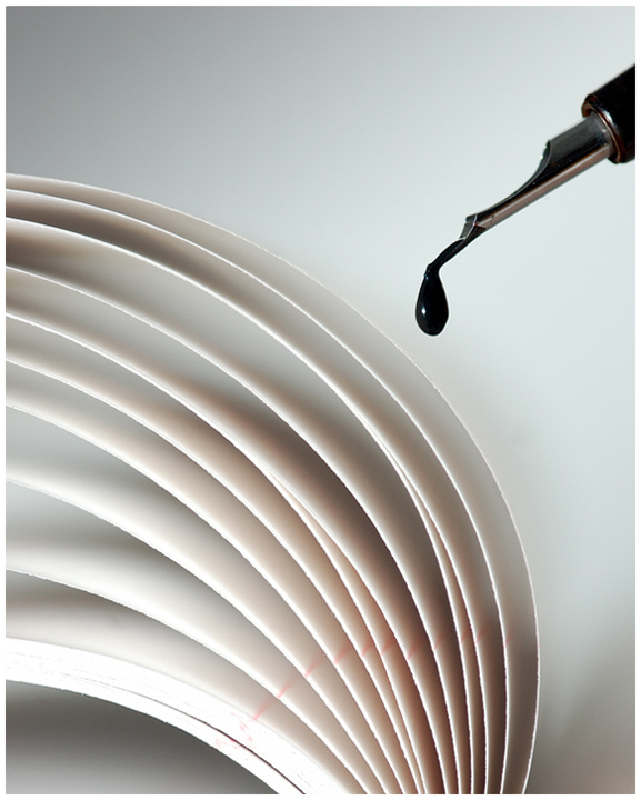
| Very nice photo Ryan. Love the dropping ink. |
|
| Photographer found comment helpful. |
|
|
03/06/2008 01:26:56 PM |
|
| Photographer found comment helpful. |
|
|
03/05/2008 10:31:03 AM |
| Clever work with the drop. I like these kind of tricks hehe. Good job with the composition. Only nitpick are those red lines in the paper, but we find what we can. I sure know how that works. |
|
| Photographer found comment helpful. |
|
|
03/05/2008 02:20:03 AM |
| Congrats, Ryan! Very nice. |
|
| Photographer found comment helpful. |
Comments Made During the Challenge  |
|
|
03/04/2008 10:07:40 PM |
| Love the simplicity of the look, but the complexity of the catch in this shot! |
|
| Photographer found comment helpful. |
|
|
03/03/2008 03:47:03 PM |
|
| Photographer found comment helpful. |
|
|
03/02/2008 08:35:56 AM |
| Great concept...I think I would have cropped off the bottom two inches...where the red starts on the paper (and it's not just because of the red, it's because the paper is looking a bit blown). |
|
| Photographer found comment helpful. |
|
|
03/01/2008 12:09:39 AM |
| I like this. simple and very clean lines. |
|
| Photographer found comment helpful. |
|
|
02/29/2008 11:15:26 AM |
| Very nice. I give this an 8. The blown out portion on the left side is what's a bit distracting. Otherwise an interesting shot. |
|
| Photographer found comment helpful. |
|
|
02/28/2008 01:52:26 PM |
| Love this sort of photo. How much paper did you ruin with the ink drops? Good luck. |
|
| Photographer found comment helpful. |
|
|
02/28/2008 12:45:53 PM |
| Creative visual approach! |
|
| Photographer found comment helpful. |
|
|
02/28/2008 12:16:09 PM |
| this is a very clean shot, I dont know if im thrilled with the border choice on this one though. |
|
| Photographer found comment helpful. |
|
|
02/27/2008 07:00:36 PM |
| great shot, not perfectly black and white but a great shot.10 |
|
| Photographer found comment helpful. |
|
|
02/27/2008 02:17:35 PM |
| The red on the pages distracts me and makes this not as good as if the reds had been reduced, in my opinion. I like the concept and the paper patterns. |
|
| Photographer found comment helpful. |
|
|
02/27/2008 12:45:58 PM |
| I'd love to see what this looked like AFTER the ink dropped. |
|
| Photographer found comment helpful. |
|
|
02/27/2008 10:42:24 AM |
|
| Photographer found comment helpful. |
Home -
Challenges -
Community -
League -
Photos -
Cameras -
Lenses -
Learn -
Prints! -
Help -
Terms of Use -
Privacy -
Top ^
DPChallenge, and website content and design, Copyright © 2001-2024 Challenging Technologies, LLC.
All digital photo copyrights belong to the photographers and may not be used without permission.
Current Server Time: 04/24/2024 08:07:08 PM EDT.