| Author | Thread |
|
|
11/01/2007 10:03:04 AM |
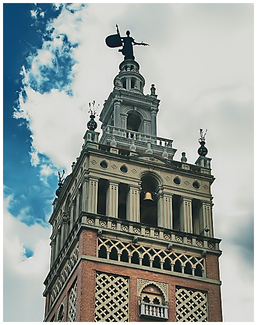
| Okay......bear with me, I'm trying to learn how to leave carefully constructive comments. The contrast between the entire structure being visible *except* the way that the guardian is shrouded in shadow is disconcerting to me. I would like to see more definition on the guardian, or less on the steeple/tower. Perhaps angled as someone else suggested, or perhaps less of the steeple/tower below it. I agree that the colors seem a tad off. |
|
 Photographer found comment helpful. Photographer found comment helpful. |
|
|
10/31/2007 08:40:56 AM |
| What an interesting building and guardian. It's amazing that "they" put these wonderful statues so high up that all you ever see are there silhouettes. |
|
| Photographer found comment helpful. |
|
|
10/31/2007 06:44:25 AM |
| I like the PP, the building almost seems superimposed on the sky. I might have skued the building even more to add some contrast to the strong horizontal and vertical lines of the building. |
|
| Photographer found comment helpful. |
|
|
10/31/2007 12:27:02 AM |
| Charlene - I love the sky in this. It has such a beautiful swirly blend. Looks like a beautiful building with all the variety in construction. And I personally like the processing. |
|
| Photographer found comment helpful. |
Comments Made During the Challenge  |
|
|
10/27/2007 04:32:10 PM |
I really like the PP on this especially the colours which have an almost olden day feel to them
Cool building and nice detail |
|
| Photographer found comment helpful. |
|
|
10/27/2007 01:10:39 AM |
| Midtones seem a little flat, giving the whole image a greyed out, undercontrasted feel. I'm not sure if that's what you were after, but I think it detracts from the image somewhat. |
|
| Photographer found comment helpful. |
|
|
10/25/2007 04:37:48 PM |
|
| Photographer found comment helpful. |
|
|
10/25/2007 01:02:20 PM |
| The colours look a bit odd? I don't know why, what have you been doing to it eh? hahahaahha I have grown to like it tho the way it is... |
|
| Photographer found comment helpful. |
Home -
Challenges -
Community -
League -
Photos -
Cameras -
Lenses -
Learn -
Prints! -
Help -
Terms of Use -
Privacy -
Top ^
DPChallenge, and website content and design, Copyright © 2001-2024 Challenging Technologies, LLC.
All digital photo copyrights belong to the photographers and may not be used without permission.
Current Server Time: 04/19/2024 09:50:35 PM EDT.