| Author | Thread |
|
|
05/21/2008 10:00:19 AM |
This is a fun idea and made me smile.
Great impact, good colors, great leading lines, and I like it a lot.....
I like for you to continue to do your photos like you are, but listen to any comments that are given to you, that can improve the technique and visual impact pf your images.
I get bad scores and yes, it does disappoints me sometimes, but if I like the image, then you should be happy with that. |
|
 Photographer found comment helpful. Photographer found comment helpful. |
|
|
10/28/2007 10:34:37 AM |
HEE HEE - I didn't vote on all of the challenge so I missed this. How cute. Congrats on top 25. Reminds me of my contest entry "The Chairman."  Men's ties are awesome!!! Men's ties are awesome!!! |
|
| Photographer found comment helpful. |
|
|
10/28/2007 10:09:01 AM |
Hey dude, you asked for my critique dude but there is really not much I can say about this image except I like it. It´s got nice colors, well composed and excellent tones details in all areas of the shot, it´s well lit and thought out.
However, it probably didn´t do better in the challenge because it just lack´s that "x-factor" and what that could have been is beyond me... Maybe a water droplet falling on that flower? Nahhh, cheezy... Sorry dude, just can´t think of a thing but anyway, technically this shot is well done and up to par.
As far as figuring out the low votes, spare yourself the headache and just do stuff for yourself, some people might have given it a 4 simply because they think heads should pop out of shirt´s or that they don´t like red neckties or that they were offended that that´s the flower their date threw in their faces when they broke up with them 27 years ago at valentines day. Who knows? :)
Edit: spelling error!
Message edited by author 2007-10-28 10:09:38. |
|
| Photographer found comment helpful. |
|
|
10/17/2007 12:47:11 PM |
| A wonderful image Nilesh, Everything seems so perfect here and the concept is awesome. Should've done better but nonetheless at the end of the day you should feel good about your image and you surely do, So thats about it i guess |
|
| Photographer found comment helpful. |
|
|
10/17/2007 12:09:47 AM |
Well nobody complained about this shot but I didn't understand the reason behind some lower votes. May be one has to pay for trying to do different. May be slightly colors should be popped up, I don't know..
With small modifications
Message edited by author 2007-10-17 02:54:54. |
|
Comments Made During the Challenge  |
|
|
10/16/2007 02:26:17 PM |
| nice idea and a clarity shot |
|
| Photographer found comment helpful. |
|
|
10/13/2007 08:45:25 PM |
|
| Photographer found comment helpful. |
|
|
10/13/2007 06:35:21 PM |
|
| Photographer found comment helpful. |
|
|
10/13/2007 09:18:42 AM |
| i like the colors and composition 9 |
|
| Photographer found comment helpful. |
|
|
10/13/2007 01:22:02 AM |
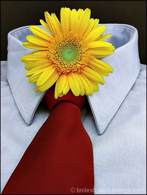
- blue, red, yellow, and green...beautiful colors
- diagonal composition with tie placed right at the corner and leading the viewer to the main subject, flower
- shirt with texture
- perfectly lit and placed (top third line) flower with water droplets for an added interest
- oof void out side the dof just behind the flower to give "depth" to the shot
Masterfully executed thoughtful shot. It would be injustice, if I give less than 10 |
|
| Photographer found comment helpful. |
|
|
10/12/2007 11:16:01 PM |
|
| Photographer found comment helpful. |
|
|
10/12/2007 02:26:15 PM |
| cute, nicely done overall too, puns jumped out at me, as in you tied a good one on, sorry bout that! overall 7 |
|
| Photographer found comment helpful. |
|
|
10/12/2007 11:54:02 AM |
| Nice humor here, it is nice to see a picture that doesn't look like every other picture, I'm not sure that it is a ribbon winner, but it is definitely a nice change of pace. |
|
| Photographer found comment helpful. |
|
|
10/10/2007 01:21:29 PM |
|
| Photographer found comment helpful. |
|
|
10/10/2007 09:28:00 AM |
| Different, which is why I like it. |
|
| Photographer found comment helpful. |
|
|
10/10/2007 05:23:28 AM |
| funny and creative, good light and compo, but not really flora |
|
| Photographer found comment helpful. |
|
|
10/10/2007 02:23:27 AM |
| how fun! wonderful focus and lighting and your colors are perfect, |
|
| Photographer found comment helpful. |
|
|
10/10/2007 12:38:44 AM |
| sunshine... on my shoulders makes me happy:) |
|
| Photographer found comment helpful. |
Home -
Challenges -
Community -
League -
Photos -
Cameras -
Lenses -
Learn -
Prints! -
Help -
Terms of Use -
Privacy -
Top ^
DPChallenge, and website content and design, Copyright © 2001-2024 Challenging Technologies, LLC.
All digital photo copyrights belong to the photographers and may not be used without permission.
Current Server Time: 04/25/2024 12:03:49 AM EDT.