| Author | Thread |
|
|
09/14/2007 12:09:53 PM |
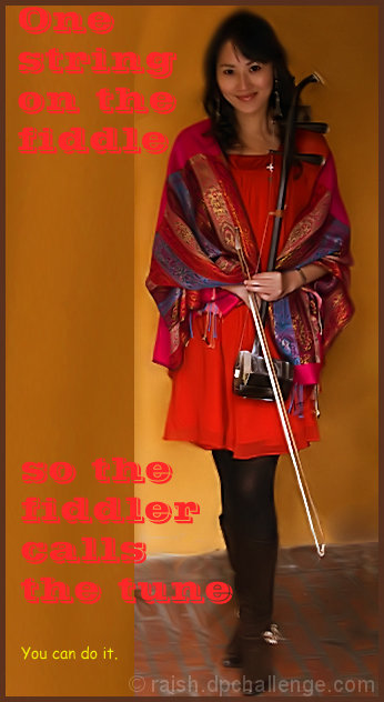
| I love the photograph and actually think the font is fine. I'm weird. |
|
 Photographer found comment helpful. Photographer found comment helpful. |
Comments Made During the Challenge  |
|
|
09/09/2007 12:54:04 PM |
| Beautiful photo and great message but the font is a distraction. For me, solid text would have worked better. |
|
| Photographer found comment helpful. |
|
|
09/09/2007 09:41:50 AM |
|
| Photographer found comment helpful. |
|
|
09/09/2007 02:50:15 AM |
| Interesting subject, nice poster. |
|
| Photographer found comment helpful. |
|
|
09/08/2007 02:56:58 PM |
| Not a bad shot of her, although her face is a little dark. The font choice is unfortunate, though. And using two different fonts makes it even worse. Yes, this is a photography contest, but when you add text, those choices also come into play. |
|
| Photographer found comment helpful. |
|
|
09/04/2007 08:36:55 AM |
| I think the wording on your photo makes it too busy. I think if you extended the photo on the left, added a border, or just used smaller font, it would have made it less busy. |
|
| Photographer found comment helpful. |
|
|
09/03/2007 05:34:35 PM |
| Not sure what to say really. I don't think the orange/pink font was a good idea, although, I realise you were matching the clothing but it's hard to read over the mustard wall. |
|
| Photographer found comment helpful. |
|
|
09/03/2007 03:01:45 PM |
| The font and the text doesnt seem to be working in this. The blur around the head looks a bit distracting 6 |
|
| Photographer found comment helpful. |
|
|
09/03/2007 07:55:26 AM |
|
| Photographer found comment helpful. |
|
|
09/03/2007 12:40:43 AM |
| the text is too garrish and overpowering...font choice is not good...image is nice |
|
| Photographer found comment helpful. |
Home -
Challenges -
Community -
League -
Photos -
Cameras -
Lenses -
Learn -
Prints! -
Help -
Terms of Use -
Privacy -
Top ^
DPChallenge, and website content and design, Copyright © 2001-2024 Challenging Technologies, LLC.
All digital photo copyrights belong to the photographers and may not be used without permission.
Current Server Time: 04/19/2024 06:15:06 PM EDT.