| Author | Thread |
|
|
02/11/2004 09:25:46 PM |
Originally posted by leaf:
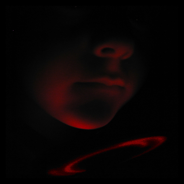
I like the tone and mood of this image. It makes me think and wonder. It is a very dark image, and i know it is meant to be... perhaps i would say it was well exposed, i guess you don't have a bright light source.. and it looks like on the boy's chin the red is almost blasting out,... so perhaps it is fine... I think the cropping of the image was done well.
Perhaps The picture is too contrasty. Perhaps somelight should be given to the entire image... and let it still be dark, but not SO dark. an image can be low key with good detail. This makes an image more interesting generally than an image that is too dark to see anything.
overall, good, just play with the lighting a bit more.
-from the critique club-
and remember, these are just my thoughts. |
Thank you, and all the commenters. I knew the degree of darkness would be a problem for some people (even to see), but I really wanted it dark for a variety of reasons, including that a lot of people would recognize my model if I showed any more.
My light source was quite faint -- I'm actually surprised I got any kind of decent image out of my P+S camera. I "punched up" the swirly lights a little, but the rest is a pretty straight photo. I meant to post a photo of the set-up (with the lights on) but forgot -- I'll try and do that this weekend.
Message edited by author 2004-02-11 21:26:25. |
|
|
|
02/11/2004 05:18:21 PM |
| Nicely done, Paul. Nice composition and balance. I like the way Isaac's face fades away, upwards. Colour looks good to me; I like the shades of red. |
|
 Photographer found comment helpful. Photographer found comment helpful. |
|
|
02/06/2004 06:49:20 PM |
I like the tone and mood of this image. It makes me think and wonder. It is a very dark image, and i know it is meant to be... perhaps i would say it was well exposed, i guess you don't have a bright light source.. and it looks like on the boy's chin the red is almost blasting out,... so perhaps it is fine... I think the cropping of the image was done well.
Perhaps The picture is too contrasty. Perhaps somelight should be given to the entire image... and let it still be dark, but not SO dark. an image can be low key with good detail. This makes an image more interesting generally than an image that is too dark to see anything.
overall, good, just play with the lighting a bit more.
-from the critique club-
and remember, these are just my thoughts. |
|
| Photographer found comment helpful. |
Comments Made During the Challenge  |
|
|
02/01/2004 06:36:02 PM |
| Fantastic. Definitely should be a first place winner. Very cute kid too!. Well done. 10 |
|
|
|
02/01/2004 12:46:12 AM |
not sur about this photo
i can hardly see anything |
|
| Photographer found comment helpful. |
|
|
01/30/2004 08:40:27 AM |
| Eerie light effect and engaging compostion. |
|
| Photographer found comment helpful. |
|
|
01/28/2004 10:30:42 PM |
|
| Photographer found comment helpful. |
|
|
01/28/2004 05:31:40 PM |
| You probably heard this one before, but I believe a little more light on the subject would help here. |
|
| Photographer found comment helpful. |
|
|
01/27/2004 03:49:12 PM |
| I love the simplicity of this photo...great shot....a ten |
|
| Photographer found comment helpful. |
|
|
01/26/2004 10:47:59 AM |
very subtle - nicely done.
although might be too dark for some folks... |
|
| Photographer found comment helpful. |
|
|
01/26/2004 03:42:42 AM |
| Beautiful. Subtle, enigmatic, well composed low-key portrait. |
|
| Photographer found comment helpful. |
|
|
01/26/2004 12:23:33 AM |
|
| Photographer found comment helpful. |
Home -
Challenges -
Community -
League -
Photos -
Cameras -
Lenses -
Learn -
Prints! -
Help -
Terms of Use -
Privacy -
Top ^
DPChallenge, and website content and design, Copyright © 2001-2024 Challenging Technologies, LLC.
All digital photo copyrights belong to the photographers and may not be used without permission.
Current Server Time: 04/19/2024 12:21:36 PM EDT.