| Author | Thread |
|
|
01/31/2004 02:45:20 PM |
| Excellent observation and a brave entry, since many people may vote based on their instant reaction to a 'dull' scene (which this is not). A good first attempt. |
|
 Photographer found comment helpful. Photographer found comment helpful. |
|
|
01/30/2004 06:00:05 AM |
| If there were an 'almost but just fractionally not quite' favourites thing here this would be in. Just that little element that keeps it out of there for me. Great submission though, and quite a standard you've set yourself. |
|
| Photographer found comment helpful. |
Comments Made During the Challenge  |
|
|
01/27/2004 11:18:38 PM |
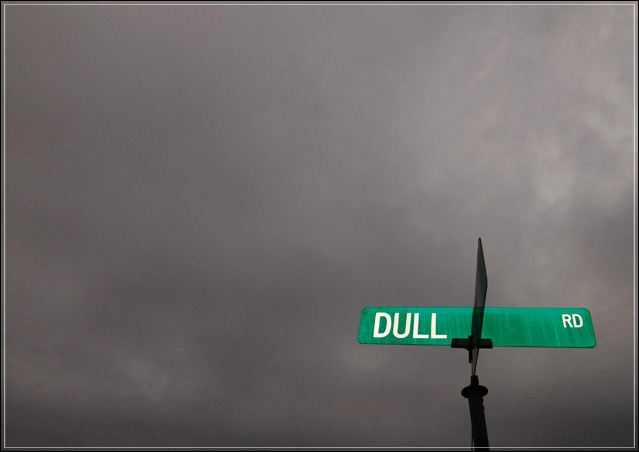
| Very appropriate sign. I like the contrast between the green and the gray. A little noisy in the sky but not a distraction. I like the very low placement of the sign in the frame. Well done. |
|
| Photographer found comment helpful. |
|
|
01/27/2004 05:16:53 PM |
| nice pic! Dull road maybe, but not a dull picture. |
|
| Photographer found comment helpful. |
|
|
01/27/2004 08:10:56 AM |
| more interesting if it were centered. |
|
| Photographer found comment helpful. |
|
|
01/27/2004 04:24:34 AM |
| Good sky.... Works well with the "dull" theme... |
|
| Photographer found comment helpful. |
|
|
01/26/2004 10:14:28 PM |
|
| Photographer found comment helpful. |
|
|
01/26/2004 07:34:01 PM |
| Wonderful shot. The angling of the road-sign bothers me a touch (a very small touch, I should add) - had I taken it, I'd have tried to get a sqauer-on view, to lose the angle of the other arm of the sign at least, and to give a more regular shape to the two visible arms: in a composition this oddly geomatric, that distortion becomes quite important I think. 9 |
|
| Photographer found comment helpful. |
|
|
01/26/2004 12:15:05 PM |
| Great contrast and strong idea. |
|
| Photographer found comment helpful. |
|
|
01/26/2004 03:48:42 AM |
| Very funny. Beautiful shot. |
|
| Photographer found comment helpful. |
|
|
01/25/2004 11:38:40 PM |
| You took a potentially very dull picture, and with your desaturation made it interesting. Opps, but maybe you wanted Dull! Nicely done |
|
| Photographer found comment helpful. |
|
|
01/25/2004 07:43:20 PM |
| Hahaha! Awesome- great composition and really funny- personal fav! |
|
| Photographer found comment helpful. |
|
|
01/25/2004 06:24:25 PM |
| Yap! "Dull" describes it all! I love the gloomy sky! Goes perfectly with the sign! |
|
| Photographer found comment helpful. |
|
|
01/25/2004 03:34:37 PM |
| Very well spotted - nice contrast |
|
| Photographer found comment helpful. |
|
|
01/25/2004 02:26:40 AM |
| A dull day to be on Dull road. But the pic is NOT dull! A fun find on an awesome day for the theme and shot! |
|
| Photographer found comment helpful. |
|
|
01/24/2004 05:24:41 PM |
| If you mean the photograph then I�d beg to differ. Excellent. |
|
| Photographer found comment helpful. |
|
|
01/24/2004 09:01:25 AM |
| Great shot, but there seems to be a weird effect on the sky. Maybe too much post processing? |
|
| Photographer found comment helpful. |
|
|
01/24/2004 01:03:29 AM |
| Great use of negative space. Nice contrast between the gray sky and the street sign. By chance, was the cross street Boring Road? :) |
|
| Photographer found comment helpful. |
|
|
01/23/2004 04:27:20 PM |
| great use of contrasting colors |
|
| Photographer found comment helpful. |
|
|
01/23/2004 03:23:18 PM |
|
| Photographer found comment helpful. |
|
|
01/23/2004 04:41:10 AM |
| "Dull" but at least 9 for me! Bravo! |
|
| Photographer found comment helpful. |
|
|
01/23/2004 12:33:16 AM |
| great use of negative space and the green contrast really makes the pic only thing wrong is it's a bit grainy. |
|
| Photographer found comment helpful. |
|
|
01/22/2004 08:03:48 PM |
| Witty photo that has the look to pull it off. Good job. This is one of the few photos here where a bright and obviously placed sign sticks out in an appealing way, not in an obstrusive or annoying way! It suggests sarcastic commentary to me, which is excellent. Good sarcastic photos are hard to come by. |
|
| Photographer found comment helpful. |
|
|
01/22/2004 04:18:18 PM |
| the neg space goes well here |
|
| Photographer found comment helpful. |
|
|
01/22/2004 01:55:25 PM |
| I love this composition and the metaphor. I also liked the colours/contrast. |
|
| Photographer found comment helpful. |
|
|
01/22/2004 12:55:41 PM |
|
| Photographer found comment helpful. |
|
|
01/22/2004 11:28:45 AM |
| Funny. Glad my address isn't "Dull Rd." It is a nice idea - those thick blank clouds, and -pop- at the bottom the green sign. Still, I'm made curious what is beneath the sign. |
|
| Photographer found comment helpful. |
|
|
01/22/2004 03:29:14 AM |
| Excellent!! Wouldn't work with another coloured sky. Maybe a night shot in fogg Black & white would also look good |
|
| Photographer found comment helpful. |
|
|
01/21/2004 02:54:58 PM |
| nicely composed and good use of negative space. |
|
| Photographer found comment helpful. |
|
|
01/21/2004 12:51:37 PM |
| The sky cooperated nicely for you here! |
|
| Photographer found comment helpful. |
|
|
01/21/2004 11:58:24 AM |
| I would normally not like this dull sky, but it does go well with the sign and make its point. |
|
| Photographer found comment helpful. |
|
|
01/21/2004 11:43:08 AM |
| haha, i love it! perhaps some more sign and less sky would be better.. |
|
| Photographer found comment helpful. |
|
|
01/21/2004 09:30:10 AM |
| of the signs that "say what they mean," this one is the best. Nice work on the saturation/desaturation. good composition with the angle and the negative space - it would have been nice if there wasn't a bisecting sign, but you can't help that and your choice of angle shows just enough of it so that it doesn't intefere but doesn't look like you tried to hide it either. |
|
| Photographer found comment helpful. |
|
|
01/21/2004 09:29:49 AM |
| I like the picture. Good coalescence of road name and sky. |
|
| Photographer found comment helpful. |
|
|
01/21/2004 03:59:44 AM |
| wow nice contrast there, the background is nice and dull. |
|
| Photographer found comment helpful. |
|
|
01/21/2004 12:39:24 AM |
| Good use of the rule of thirds here, the dark sky adds to the photo, nice job. 8 |
|
| Photographer found comment helpful. |
|
|
01/21/2004 12:32:02 AM |
I like it, i like it a lot
|
|
| Photographer found comment helpful. |
Home -
Challenges -
Community -
League -
Photos -
Cameras -
Lenses -
Learn -
Prints! -
Help -
Terms of Use -
Privacy -
Top ^
DPChallenge, and website content and design, Copyright © 2001-2024 Challenging Technologies, LLC.
All digital photo copyrights belong to the photographers and may not be used without permission.
Current Server Time: 04/18/2024 08:19:25 PM EDT.