| Author | Thread |
|
|
09/09/2006 12:04:08 AM |
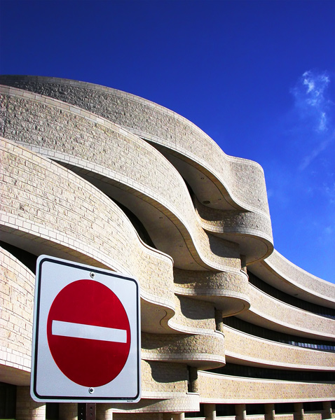
I love the sign! It could be one of those mind the bend signs but its still great. Signs by their very nature punch, especially a no entry sign, so combined with the curves of that buiding - what a foil!
well done
love your eye by the way.
david |
|
|
|
12/19/2004 10:32:29 AM |
| is that the museum of civil civilization in hull/ottawa, canada? |
|
|
|
01/29/2004 10:11:29 AM |
Originally posted by Chicagrafo:
Originally posted by Gordon:
I think I'd like this a lot more without the sign! sort of feels like the sign is just 'in the way' of a great picture, to make it fit the challenge. |
I agree, at the time I voted you with a 9, I knew something was wrong with the picture, but couldn't find out. Now I know, sorry pal, but my opinion is that this is an otherwise magnificent picture that happens to have an unfitting traffic sign which made it fit the challenge |
You're absolutely right! And I capitalised on that! :-) If you look at the "postcard" callenge" I almost have the exact same photo but without the sign... it looks way better. :-) |
|
|
|
01/28/2004 06:42:04 PM |
Originally posted by Gordon:
I think I'd like this a lot more without the sign! sort of feels like the sign is just 'in the way' of a great picture, to make it fit the challenge. |
I agree, at the time I voted you with a 9, I knew something was wrong with the picture, but couldn't find out. Now I know, sorry pal, but my opinion is that this is an otherwise magnificent picture that happens to have an unfitting traffic sign which made it fit the challenge |
|
|
|
01/28/2004 10:45:02 AM |
| I think I'd like this a lot more without the sign! sort of feels like the sign is just 'in the way' of a great picture, to make it fit the challenge. |
|
|
|
01/28/2004 08:44:28 AM |
| Thanks for all your wonderfull feedback! I never thought ti would score so well!! :-) |
|
|
|
01/28/2004 08:23:25 AM |
| Hey! I know this place!!! Beautiful. You're on a roll. Congratulations. |
|
|
|
01/28/2004 07:55:13 AM |
| Congrats, a great shot! Love the colors... I think the sign is great the way it is. :-) |
|
|
|
01/28/2004 07:29:05 AM |
Wonderful, one of my favorites!
my 10 among the 33:-)
|
|
|
|
01/28/2004 06:23:27 AM |
Dude, that's wonderful. Je pensais reconnaître cet édifice ... euh l'autre côté de la rivière et du parlement. Ah oui, le musée de la civilisation?
Congrats on the ribbon. Wonderful curves. |
|
|
|
01/28/2004 05:13:03 AM |
| I didn't vote, but when I saw this in the thumbnails I knew it was a ribbon shot. Well done! |
|
|
|
01/28/2004 03:03:46 AM |
| Congrats, a great shot, the contrasts are really good. |
|
|
|
01/28/2004 02:16:03 AM |
| Congratulations, I really liked this photo. well-deserved.! |
|
|
|
01/28/2004 12:51:08 AM |
| congrats! well deserved, and props for spotting this excellent scene! |
|
|
|
01/28/2004 12:34:20 AM |
| Congratulations on the yellow ribbon! This is a fantastic shot! :-) |
|
Comments Made During the Challenge  |
|
|
01/27/2004 10:45:09 PM |
| Very amusing and well done 10 |
|
|
|
01/27/2004 09:18:58 PM |
| Beautiful composition and contrast of shapes. Colours are simple, yet very effective. Lovely photo. |
|
|
|
01/27/2004 01:06:10 PM |
| Great composition!! Wonderful lines and colors. Great capture! |
|
|
|
01/27/2004 11:18:21 AM |
| I love all the contrasts you've got here! |
|
|
|
01/26/2004 08:27:30 PM |
| Love it.... Hope this gets a ribbon... Great saturation/contrast, crisp clean lines, tack sharp! 10 |
|
|
|
01/26/2004 03:47:33 AM |
|
|
|
01/25/2004 01:15:44 PM |
|
|
|
01/25/2004 06:53:02 AM |
|
|
|
01/25/2004 03:07:20 AM |
| Good eye! I love the disparity of the sign and building! |
|
|
|
01/24/2004 08:26:50 AM |
|
|
|
01/24/2004 12:50:53 AM |
|
|
|
01/24/2004 12:07:47 AM |
| I love the curvy lines and the bold red and blue |
|
|
|
01/23/2004 06:43:23 PM |
| Cool texture and moving shapes. Also love the sky. Good entry. |
|
|
|
01/23/2004 04:10:58 PM |
|
|
|
01/23/2004 03:27:08 PM |
|
|
|
01/23/2004 02:42:37 PM |
| very good shoot. nice colors and great lines. 9 |
|
|
|
01/23/2004 05:54:28 AM |
| Wonderful shapes and colours - what a vibrant image! Well composed in terms of viewpoint, balance of building to sky and position of sign. |
|
|
|
01/23/2004 05:00:09 AM |
| This is my #3 vote, great contrast between sign and building. |
|
|
|
01/23/2004 04:39:05 AM |
| What a nice correlation... and icy cold sky behind! I like it very much! |
|
|
|
01/22/2004 07:55:44 PM |
| This is a very nice abstract photo that's better technically than most the other photos (abstract or otherwise). It lacks a slight amount of "wow"-factor though. |
|
|
|
01/22/2004 06:23:19 PM |
|
|
|
01/22/2004 01:34:47 PM |
|
|
|
01/22/2004 12:36:00 PM |
| beautiful photo and subject matter. 8 |
|
|
|
01/22/2004 12:09:16 PM |
| Great contrast, composition. Nice colors. Very clean and well done. 9 |
|
|
|
01/22/2004 12:02:15 PM |
| Like sign juxtaposed against curvy building. I would have cropped sky. |
|
|
|
01/22/2004 07:50:00 AM |
| Fascinating building, nice colours & lighting. Picture is ncely balanced. Unfortunately the sign just looks like it doesn't belong there. |
|
|
|
01/21/2004 11:34:21 PM |
| Great composition. Like the color. |
|
|
|
01/21/2004 01:12:03 PM |
| Fantastic. Exposure, contrast depth of field and colors are perfect. |
|
|
|
01/21/2004 12:00:53 PM |
|
|
|
01/21/2004 11:53:16 AM |
| Elegant composition, great exposure. What more can one ask! 10 |
|
|
|
01/21/2004 11:12:59 AM |
| Beautiful. Hull, Quebec? 9 |
|
|
|
01/21/2004 10:45:50 AM |
| Great composition - one of my favourites. I think the architect should get a pat on the back also. |
|
|
|
01/21/2004 10:38:07 AM |
| Neat Architecture....and nice, vibrant colors.... |
|
|
|
01/21/2004 09:34:07 AM |
| Wonderful picture! The building is great as are the colors! |
|
|
|
01/21/2004 09:16:02 AM |
.
Message edited by author 2006-05-05 14:43:53. |
|
|
|
01/21/2004 08:26:10 AM |
| I really like the contrast between the sign and the buildings. |
|
|
|
01/21/2004 07:03:14 AM |
| This is a masterpiece! Beautiful! 10 |
|
|
|
01/21/2004 02:29:33 AM |
| very very nice composiition |
|
Home -
Challenges -
Community -
League -
Photos -
Cameras -
Lenses -
Learn -
Prints! -
Help -
Terms of Use -
Privacy -
Top ^
DPChallenge, and website content and design, Copyright © 2001-2024 Challenging Technologies, LLC.
All digital photo copyrights belong to the photographers and may not be used without permission.
Current Server Time: 04/24/2024 06:53:50 AM EDT.


 Straight & Curved


