| Author | Thread |
|
|
08/10/2007 11:51:09 AM |
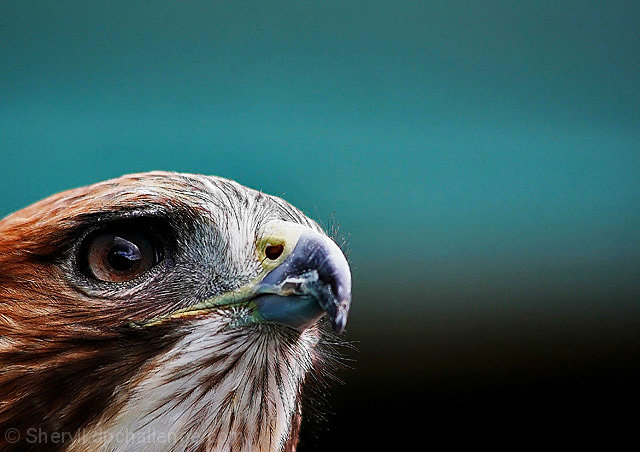
| just following the comments here and wanted to note that this without question satisfies the 'negative space' element of the challenge and would fit into any reasonable person's concept of 'negative space' as an artistic tool. While its not as drastic as some other examples, your subject takes up <25% of the image and the rest is pretty much uniform color, it really works for this image. Congrats on the high finish! |
|
 Photographer found comment helpful. Photographer found comment helpful. |
|
|
08/10/2007 11:19:37 AM |
Congrats on a captivating image and top 10!
I'll pipe in here to say that it looks a bit "overprocessed" to me, too. But as you've already noted, it's your image to process as YOU like it, and you obviously impressed enough people to do very well in the challenge. :) At any rate, that would've been a minor consideration had I voted on it. |
|
| Photographer found comment helpful. |
|
|
07/19/2007 10:36:42 PM |
Wow Sheryll, excellent image and congrats on your top ten as well as your PB!!! Yippee!!!
Michael |
|
| Photographer found comment helpful. |
|
|
06/29/2007 01:08:30 PM |
Right. I express my opinions on a shot, offer to give some different perspectives on it and I'm on crack and pathetic.
I'm jealous of how far she has come? I've never seen or taken any special note of where she has come from or her progress. I saw one shot and made a comment on it.
So much for trying to be constructive. Don't like my edits, that's fine. I stand by my comments.
Definitely bad form for putting my processes into the comments so other people can learn what does and does not work with a particular image. I didn't say that mine were better, just some alternatives.
Thought this was a learning site... we all learn together right?
Oh and I'm still waiting on how you guys feel that the negative space 'creates the Wow' in this image. Go ahead, correct me. If I am wrong, show me how. Don't just sling names around.
ETA: IF you boys want to continue the conversation elsewhere, let's make a thread and not sully this pic. No sense in posting personal attacks against another commenter in the comments. Clearly some people feel that my comments are inappropriate. Hence, I have reported my OWN comments. The SC can communicate with me directly if there is an issue with the way I presented my opinions. Anything further should go to the forums.
Message edited by author 2007-06-29 21:16:05. |
|
|
|
06/29/2007 07:15:12 AM |
| WTG Sheryll!!! Love the shot! You have improved sooo much over the last few weeks. Keep up the great work :) |
|
| Photographer found comment helpful. |
|
|
06/29/2007 01:29:50 AM |
| Beautiful shot...congratulations |
|
| Photographer found comment helpful. |
|
|
06/28/2007 09:31:12 PM |
And that right there is probably why your DPL teammates suggested that you submit it for the challenge. For starters, they are more attuned to the public appeal of an image.
It's a good question as to why this image caught my attention. I found that the image really stood out to me among the top 30. (my habit is to view the top 30-50 and bottom 20 of each challenge)
I just double checked the top 30 images. This is the only image that really stands out as having an issue where there IS negative space, but that negative space plays no significant role in the image.
Yes, it's the complementary color to the reds in the feathers of the hawk, but how is that doing anything of note in the image. It is simply a background. the impact of the negative space in this image would not change the image significantly by cropping most of it away.
That cannot be said of any other image in the top 30.
I'm not trying to say that I don't like the image. In fact, I do like the image. that's why I put the time into the alternate edits to try to give you some options from that really heavily processed look.
What I don't like about the image is that it looks so overprocessed. What I don't like about it in this challenge is that it is DNMC.
What I don't like about that is not so much that you entered it (we are all entitled to our own takes on the challenge description) but that this is a strong negative effect of the DPL. The DPL has increased the number of 'shoehorn' entries and this is a very plain demonstration of that. That the DPL is helping you individually is great. Shoot a pic, put it on your DPL forum and learn. Wonderful! I'm all for it.
negative space does not = free study.
And while we are there, DNMC does not = this is a bad pic.
Perhaps you could mention something in the image details about how you feel the Negative Space makes a contribution to the image? |
|
| Photographer found comment helpful. |
|
|
06/28/2007 07:07:54 PM |
Originally posted by eschelar:
I still feel that the negative space in this image is not a strong enough element to avoid a DNMC. No amount of processing changes this as this is a content issue. I think it is improved slightly in the two more severe crops, but it's still a bit of a shoehorn. |
Thanks for the input and while I appreciate the attempt and the opinion. I still prefer my image over your edits. I like the image and apparently so did quite a few others on DPC since it did place 10th out of 299 entries.
As you said in your email to me there were things that I did in editing that you couldn't get the same so we each have our different combinations and ways of editing. One is not right over the other nor better or worse than the other. It all comes down to taste and what people like. You may not like some of the things about my shot and may think that my DPL team was wrong to have said I should enter this but if you take a look and compare my average and my highest challenge was before entering the DPL and look at them now then it is quite obvious that there has been a tremendous immprovement over that short amount of time.
I don't claim that my entry was the best it could be nor that it was the best in the challenge. Why you picked out my entry to comment on I don't know but there were several shots in that challenge that had different takes on negative space and while commenting on every entry in that challenge I admitted that their take was different than mine but still good. There were also quite a few (many in fact) who had the same idea that I did.
Anyway thanks for your input and while your edit has its merits I still prefer mine.
|
|
|
|
06/28/2007 08:57:27 AM |
just for reference. Sheryll took my invitation to see what I could do and provided me the original.
Came up with three successive variants.
  
I did not originally think to post them here, but after some more thought, I realized that it was a DPL suggestion that she put this image into the challenge, so it would be appropriate to place it here for them to view as well.
I still feel that the negative space in this image is not a strong enough element to avoid a DNMC. No amount of processing changes this as this is a content issue. I think it is improved slightly in the two more severe crops, but it's still a bit of a shoehorn. |
|
| Photographer found comment helpful. |
|
|
06/27/2007 02:24:36 PM |
| Congrats on your new PB! :) It's lovely. |
|
| Photographer found comment helpful. |
|
|
06/27/2007 08:15:21 AM |
| TOP 10!!!!!!!!!!!!!!!!!! WAY TO GO SHERYLL!!!!!! Love where you work is heading. You have learned tons since we started the DPL. Congrats and keep up the great work!! |
|
| Photographer found comment helpful. |
|
|
06/27/2007 07:32:00 AM |
| Congrats on the great finish and your pb! Love the stare in the sky! |
|
| Photographer found comment helpful. |
|
|
06/27/2007 05:56:27 AM |
man, I hate making negative comments.
I don't agree that this is a great image. I find it generally bitty, grainy and overprocessed. The fine detail is garbled and suffers from oversharpening. the beak is nice, but that's it for me.
The BG is grainy and not fluid. The color does not complement the animal at all. It also contains a fairly visible color cast matching the BG which does nothing for the overall pic. It contains very awkward composition as well which is unsettling without purpose.
According to your image details, you were unsure if you should have submitted it and you were recommended for DPL reasons? I am disappointed that you tried to foist this into a challenge for this reason.
I hope that you understand that I am not trying to be mean with this comment, but I genuinely feel that an image should be presented because of its own merit, not because of the DPL. This image on its own merit is unappealing to me. I would have voted a 3 or 4.
Does it have potential though? Absolutely. Correct that color cast, compose a bit more forcefully, back OFF on that sharpening/processing and use a slightly gentler resize method and I think you do have something which could become compelling.
You do seem to have done a very good job in controlling the highlights.
I would be happy to play with it if you wanted me to "put my money where my mouth is".
Message edited by author 2007-06-27 05:58:14. |
|
| Photographer found comment helpful. |
|
|
06/27/2007 02:00:38 AM |
|
| Photographer found comment helpful. |
|
|
06/27/2007 01:38:02 AM |
| Great shot. Nice and sharp on the eye. Congrats on your PB |
|
| Photographer found comment helpful. |
|
|
06/27/2007 01:08:54 AM |
| Congrats on a strong finish. Beautiful image. |
|
| Photographer found comment helpful. |
|
|
06/27/2007 12:55:49 AM |
| thanks guys. I just realized I had something about the original title (which was dream) in the details. I had changed the title at the last minute on the suggestion of teammates and forgot to make sure the detail section reflected it. |
|
|
|
06/27/2007 12:27:27 AM |
Great job Sheryll and congratulations on your new personal best!
|
|
| Photographer found comment helpful. |
|
|
06/27/2007 12:24:01 AM |
| Congrats on the new PB and breaking the 6.0 mark in a big way. I know it took me forever to break 6 at DPC. |
|
| Photographer found comment helpful. |
|
|
06/27/2007 12:23:28 AM |
Congrats on your top 10 finish
Message edited by author 2007-07-23 23:21:12. |
|
| Photographer found comment helpful. |
|
|
06/27/2007 12:20:47 AM |
| Congratulations, Sheryll, on your excellent finish! Way to go!!!! |
|
| Photographer found comment helpful. |
Comments Made During the Challenge  |
|
|
06/25/2007 08:49:55 AM |
|
| Photographer found comment helpful. |
|
|
06/24/2007 10:10:01 PM |
|
| Photographer found comment helpful. |
|
|
06/24/2007 04:24:40 PM |
| Very nice detail. Beautiful colors. |
|
| Photographer found comment helpful. |
|
|
06/22/2007 08:24:47 PM |
|
| Photographer found comment helpful. |
|
|
06/20/2007 03:42:26 PM |
| Wow! This guy kinda startled me when I clicked the little >> button! Nice shot! |
|
| Photographer found comment helpful. |
|
|
06/20/2007 12:57:37 PM |
|
| Photographer found comment helpful. |
|
|
06/20/2007 12:52:44 PM |
| slightly oversharpened but dynamic use of space. 7 |
|
| Photographer found comment helpful. |
|
|
06/20/2007 04:55:18 AM |
| You have a very nice shape clear image but you ratio and use of negative space is a bit off or I would give you a higher score from an already high hi score. |
|
| Photographer found comment helpful. |
|
|
06/20/2007 01:03:14 AM |
| WOW what an intense stare! surely this is top 3 material! 10 |
|
| Photographer found comment helpful. |
Home -
Challenges -
Community -
League -
Photos -
Cameras -
Lenses -
Learn -
Prints! -
Help -
Terms of Use -
Privacy -
Top ^
DPChallenge, and website content and design, Copyright © 2001-2024 Challenging Technologies, LLC.
All digital photo copyrights belong to the photographers and may not be used without permission.
Current Server Time: 04/18/2024 01:23:40 PM EDT.