| Author | Thread |
|
|
02/05/2008 03:54:21 PM |
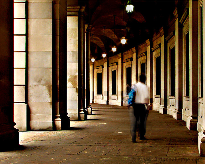
| This image speaks to me about the relative permanence of the things we build versus our transient nature. We walk through our days and our lives in old halls whose enduring quality goes largely unquestioned not questioning our own mortality. Bravo! |
|
 Photographer found comment helpful. Photographer found comment helpful. |
|
|
02/04/2008 08:22:03 PM |
Don't feel like reading all the other comments, please forgive me if I repeat stuff.
I love it! I can be pretty unforgiving with blur, too often I feel that an accidental blur is being passed off as "artistic". Not in this case - it feels very much intended and makes a wonderful contrast to the static architecture.
I also love that you didn't HDR the living daylights out of this - it feels so right to see very dark areas, as well as glimpses of light coming in.
Saying that I don't care for the blue back pack would be way too picky, so I won't say it :-)
I just tried it in b+w - it looks good, too, but changes the mood quite a bit, so I'm glad you left those warm colors. |
|
| Photographer found comment helpful. |
|
|
01/26/2008 12:48:11 PM |
| Wow, my views have changed in the last 9 months of being on DPC, i came here thinking everything had to be a certain type of shot, and i actually gave this a 4 during voting. I came back to this today, and I thought "that is a really awesome shot." Really love the artsy feel to it, very unique shot which I like a lot, great job with the composition and lighting. Nicely done and I'm adding to faves. |
|
| Photographer found comment helpful. |
|
|
06/06/2007 09:51:51 PM |
In reply to your posting of this image in the nauseating 'is it art' thread...
Whoever told you to use a faster shutter speed is obviously an idiot. This is a very impressive shot, particularly how you acheived such absolute clarity/sharpness throughout the architecture while using a shutter speed slow enough to get a pleasing amount of blur on the subject.
Your score is pretty much all you could expect to get from entering this image on this website. This website caters to gimmick studio shots and hypersaturated, bullshit landscapes. Zero-thought-required images. Monkey sees, monkey likes, monkey votes.
Of course you know this, you've been here for some time.
Is this shot art? To someone it is. To others it's not. I would ride the fence. It's a bit of a cliche and, while technically impressive, it doesn't stir my emotions the way other photos do and that's my personal benchmark for what I consider to be art. Is it a good picture? Yes. You waste it on DPC. |
|
| Photographer found comment helpful. |
|
|
05/21/2007 12:14:04 PM |
| Wow, I gave you your only 10. I was sure this photo was going to do so well. I guess you just appealed to my artistic side. I still love it! |
|
| Photographer found comment helpful. |
|
|
05/11/2007 11:24:52 PM |
| interesting choice to leave yourself in, all fuzzy like that. this is, however, a very gorgeous architecture shot. the curve and the lighting - very nice! |
|
| Photographer found comment helpful. |
|
|
05/11/2007 09:28:04 PM |
| I love the lines in this, and the starkness of the shadows. |
|
| Photographer found comment helpful. |
|
|
05/11/2007 09:26:48 PM |
| You got a 7 from me for what little it was worth. Personally, find it quite entertaining and stylish - sharp as well, at this size. Careful, you might end up playing to the cheap gallery seats in which Posthumous usually sits... |
|
| Photographer found comment helpful. |
|
|
05/08/2007 05:01:40 PM |
Not a bad looking place to have to be when you're not at home! Nice mystery in the darker parts and the overall coloring has a nostalgic quality to it, although I'll admit I would prefer the backpack were not there - too distracting.
And I really like the inclusion of motion blur for the human part of this shot - for me, it emphasizes the ephemeral quality of human life just "passing through" these solid examples of classic architecture. |
|
| Photographer found comment helpful. |
|
|
05/08/2007 01:18:28 PM |
| Nice lines and a terrific idea to incorporate a person to bring some interest to the photo. I really like the movement created here, it helps with the entire image. Nice lighting and post work. |
|
| Photographer found comment helpful. |
|
|
05/08/2007 08:58:32 AM |
| I disagree that this is second. this is your most artsy-fartsy photo yet. you are totally infected, dude... and this stuff is VERY hard to get out of your system! |
|
| Photographer found comment helpful. |
|
|
05/08/2007 08:20:48 AM |
| Jeffrey, this is a fantastic shot. I think the person being out of focus hurts it some. I'm not sure I would have even had a person in the shot. The composition and the colors are great. |
|
| Photographer found comment helpful. |
|
|
05/08/2007 12:08:51 AM |
| I really like the contrast of the blurred guy against the sharp hallway. The blue backpack looks a little weird, but goes well with the title. |
|
| Photographer found comment helpful. |
Comments Made During the Challenge  |
|
|
05/07/2007 10:01:43 PM |
| an angel in the architecture. 8 |
|
| Photographer found comment helpful. |
|
|
05/03/2007 11:31:20 PM |
| This works for me. The image could be really static, but with the person there, and with the blur of the person moving, it works. I like it that the building lines sort of flow towards the right, and the person, even though walking straight ahead, seems to be moving to the right a bit (the head). ~9 |
|
| Photographer found comment helpful. |
|
|
05/02/2007 10:31:22 AM |
| B&W would have been better. |
|
| Photographer found comment helpful. |
|
|
05/01/2007 04:59:38 PM |
| the architecture of this bilding is very nice, and its fine light but the man, i would not have him in the picture, sorry, but this is a very good picture without him, i want to give this picture 7 |
|
| Photographer found comment helpful. |
Home -
Challenges -
Community -
League -
Photos -
Cameras -
Lenses -
Learn -
Prints! -
Help -
Terms of Use -
Privacy -
Top ^
DPChallenge, and website content and design, Copyright © 2001-2024 Challenging Technologies, LLC.
All digital photo copyrights belong to the photographers and may not be used without permission.
Current Server Time: 04/25/2024 04:43:47 PM EDT.