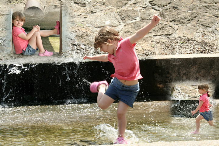
We went to the park down the road to escape Football draft. The storm drains still had a lot of water from the rain we had the day before. I used sharpen on the image where she was sitting. Then used brighten and contrast on it and the other two. I try to do very little in post processing.
Statistics
Place: 171 out of 244 Avg (all users): 5.5049 Avg (commenters): 6.5714 Avg (participants): 5.3158 Avg (non-participants): 5.6667 Views since voting: 882 Views during voting: 364 Votes: 206 Comments: 10 Favorites: 0
Positives: Non-traditional but creative tryptych approach, particularly with the inverted look for the lower right image from its "background". A Child at play is a good subject choice for a tryptych and is nicely arranged.
Technicals: Generally OK but with a few rough spots. Focus is very good on the two smaller images but your central image shows "out-of-focusness" because of movement by your subject. The problem with its sharpness is that it is in never-never focus land. It should either be totally stop action or show more motion blur, but not be where it is.
The wall in the lower right tryp is level to the frame but in the main image it is not. That is a bit of a distraction. Viewers generally want symmetry with things so closely related like that. You have plenty of light but there is nothing eye catching about it. The background of your main image looks flat and lacks texture.
The blend in the upper left tryp is a little weak.
The Challenge: Yours placed absolutely middle of the pack but about .3 below the challenge average. That means that the group felt there were a lot of very, very good tryps at the top then the rest, like yours, melted away into the background.
The technicals held back your entry more than anything. The lack of focus of your model in the main image and the bland background and lighting were the main culprits.
Suggestions: You would have to do a reshoot to address the problem with movement by your subject in the main image. In that case you want either a shorter shutter speed for stop action or a longer shutter speed for more motion blur to better capture the feeling of a child at play. The second one is harder to do.
The bland, textureless background can be addressed in post processing. Dodge and burn could be used to good effect to add texturing to the background and give it a feeling of depth that the image lacks. Vignettes can contribute to that as well. Additional color saturation would add even more depth and texturing.
Overall lighting is a different issue. Taking it earlier or later in the day with more raking (side) lighting would add more viewer interest to the composition as well.
With some effort you could modify the upper left tryp to make it perfectly blend with the middle image, as if it is actually part of it. That would make viewers surprised for a moment when it looks like it is part of the same image yet has the same model. That would be rewarded in voting.
this is a nice image; three quite good shots contained within. tehcnically, the images are quite good, with good exposure and focus. i'll look at each image individaully and then tackle the composition as a whole.
the main image is quite good, with the dark leading line of the wall behind. the position of the girl, the dynamic contraposto curve is very nice. however, i find the girl a little washed out, with the large expanse of wall behind her, a wall that is quite close in tone and colour to her skin. i think a closer crop, a vertical orientation with the edges being quite close to her arms and legs, would have given you a much stronger and more exciting image. the viewers eyes would then be drawn inexorably to the girl, rather than wandering aimlessly on the stone textures. this is definitely the strongest of the three images, so you chose right there.
the sitting image is good; the shadow echoing the line of her right leg is very nice. the parallel lines of the shadow, her leg and her back set up a very visually powerful set of angles.
the image on the right, of her running, is probably the weakest in the compostion. it's nice, but is much more evocative of a 'snapshot'. this is not a bad thing, but when compared to the other two, i find this one looks much less exciting.
as a triptych, i find the images work well, but need to be arranged differently. while the image of the girl sitting works very well beng 'inserted' in the wall, the running shot just looks awkward where it is. i think these images would be served much better by a cleaner presentation, on a solid background. the wall and water of the main image actually distract from the viewr from being able to see the girl clearly. (i lovel the texture of the wall directly behind the running shot, and end up looking at it more than the girl). also, the very small size of the subsidiary images make them quite hard to see.
There's a great feeling of energy and fresh summer in this triptych. right now this is a lovely family snapshot image to have on your fridge, but with a little work, it could be a very good piece of art.
great work, keep shooting!
If you have any questions or comments about this critique, please PM me. i hope the above is useful,
What fun! My daughters and wife all swear by crocs (that's what those shoes are called here). I like all three shots, but I think I'd like it better with a hard boundary to help me see where the background one ends and the insets begin.