| Author | Thread |
|
|
05/07/2007 12:01:26 PM |
Greetings from the Critique Club
Challenge: Meets the challenge description.
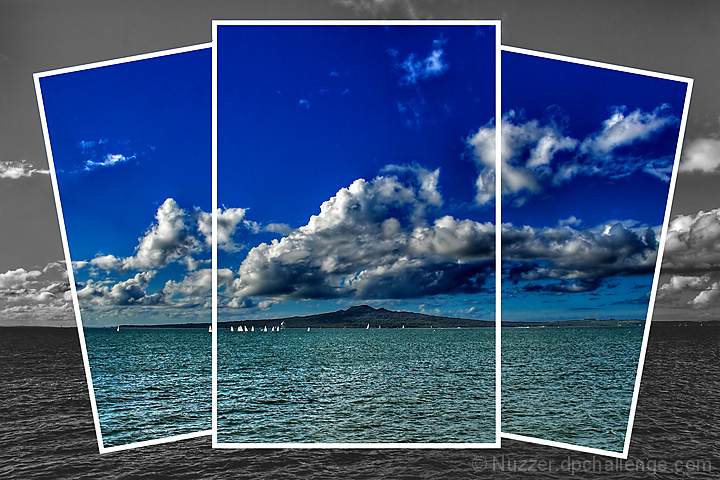
Strong points: The 3 overlapping windows combined with colour on B/W give this scene a lot more interest than it might have had all on its own. The sky is beautiful. The little sailboats draw you in.
Possible weak points: Very strict interpreters of "triptych" had a problem with this. The image looks a bit overprocessed. It is a rather centred composition, even though the horizon line is not at centre.
Technicals: The exposure/shutter speed combo you used looks to be right on. Your presentation is excellent. The processing looks (to my eyes) just a bit too strong (oversaturation in the coloured areas, too much contrast at the expense of detail).
Overall: A beautiful entry for Triptych, and you got an excellent score to go with it. Congratulations!
~Ursula |
|
 Photographer found comment helpful. Photographer found comment helpful. |
Comments Made During the Challenge  |
|
|
05/06/2007 03:52:32 PM |
I think the color parts or overprocessed... EG: Your water is green and your clouds look overly Heida'd. But the overall idea is great!
TC |
|
| Photographer found comment helpful. |
|
|
05/06/2007 06:10:48 AM |
| lovely presentation Is that Rangitoto Island? |
|
| Photographer found comment helpful. |
|
|
05/05/2007 08:50:26 PM |
Nice composition and framing
|
|
| Photographer found comment helpful. |
|
|
05/05/2007 04:51:31 AM |
| 10 - I mean, I could nitpick, but why? The colors and set up are outstanding. |
|
| Photographer found comment helpful. |
|
|
05/04/2007 01:58:39 AM |
Ladies and gentlemen, we have a winner!!!!
Fantastic us of the triptych and a fantastic shy line too.
10, well done and best of luck with the ribbons. |
|
| Photographer found comment helpful. |
|
|
05/03/2007 05:44:54 PM |
| I love this , and I know you only used 3 pictures and made it look like you used 4. you are good with photoshop ! 10 |
|
| Photographer found comment helpful. |
|
|
05/03/2007 09:32:07 AM |
| Great creative take on what a triptych is. I love this idea of sat on desat and that you took the extra step of angling the frames. |
|
| Photographer found comment helpful. |
|
|
05/02/2007 05:28:35 PM |
| I am not usually a fan of the fake divisions but this works very well. OK, I am assuming one picture with drawn borders and selected desat and maybe you actually put together several photos, which would be even more impressive. Regardless, I like the effect very much. |
|
| Photographer found comment helpful. |
|
|
05/02/2007 10:51:13 AM |
| This works very well - Lots of punch.8 |
|
| Photographer found comment helpful. |
|
|
05/02/2007 02:33:32 AM |
| I really like this one. The different placement of the three photos/sections is great, and the black and white background forces me to look at the coloured sections. I think that the colours could have been slightly lighter/brighter. However this is one of my favourites. |
|
| Photographer found comment helpful. |
|
|
05/01/2007 05:22:27 PM |
| this is great.. very creative!!! beautiful colors... well done! |
|
| Photographer found comment helpful. |
|
|
05/01/2007 04:35:30 PM |
| Interesting choice. I think I like it. |
|
| Photographer found comment helpful. |
|
|
05/01/2007 12:26:35 PM |
I like the color portion and i like the unique take you have on the theme.
but i do think the black and white portion is lacking a little punch.
i know it's not the major part of the image, but it sticks out to me. |
|
| Photographer found comment helpful. |
|
|
04/30/2007 10:12:49 PM |
| done very creativly i like it |
|
| Photographer found comment helpful. |
|
|
04/30/2007 08:58:47 PM |
|
| Photographer found comment helpful. |
|
|
04/30/2007 08:53:16 PM |
| Technically, this is 4 panels and the rules call for 3.. The background that's in b & w is the image too, plus the 3 panels you've left in color. The picture is divided into 4 images.. That being said, it's very beautiful. It's a 10 for me and I hope it doesn't get dq'd becuase of that.. I love the way you separated the images in the middle.. |
|
| Photographer found comment helpful. |
|
|
04/30/2007 08:46:33 PM |
| Very nice I like the blue tones |
|
| Photographer found comment helpful. |
|
|
04/30/2007 08:27:08 PM |
| You must be an Aucklander nice shot of Rangitoto :) |
|
| Photographer found comment helpful. |
|
|
04/30/2007 08:10:51 PM |
| Te Rangi i totongia a Tamatekapua. Snapshots in tasteful arrangment. Thicker bottom edges for a polaroid look maybe?? |
|
| Photographer found comment helpful. |
|
|
04/30/2007 07:22:05 PM |
| Great layout, quite inderesting and well done. Beautiful sky and blue colors. |
|
| Photographer found comment helpful. |
|
|
04/30/2007 05:34:20 PM |
| I really like this idea with the black and white border |
|
| Photographer found comment helpful. |
|
|
04/30/2007 03:18:53 PM |
| Very creative. Definately the best triptych using only one photo!! |
|
| Photographer found comment helpful. |
|
|
04/30/2007 02:00:16 PM |
|
| Photographer found comment helpful. |
|
|
04/30/2007 12:26:56 PM |
| this is a very nice capture but the clouds seem over worked in the color portion. the frames here are very nicely placed, i like the balance of this. |
|
| Photographer found comment helpful. |
|
|
04/30/2007 10:33:29 AM |
| You've made a pretty average landscape into something appealing. Nice job! |
|
| Photographer found comment helpful. |
|
|
04/30/2007 10:24:07 AM |
|
| Photographer found comment helpful. |
|
|
04/30/2007 05:41:32 AM |
| like the way it draws you in to the island..........9 |
|
| Photographer found comment helpful. |
|
|
04/30/2007 01:30:56 AM |
| Yes! This presentation is way cool. You've just become my new hero! :) |
|
| Photographer found comment helpful. |
|
|
04/30/2007 12:38:36 AM |
| nicely done...nice saturation 7 |
|
| Photographer found comment helpful. |
Home -
Challenges -
Community -
League -
Photos -
Cameras -
Lenses -
Learn -
Prints! -
Help -
Terms of Use -
Privacy -
Top ^
DPChallenge, and website content and design, Copyright © 2001-2024 Challenging Technologies, LLC.
All digital photo copyrights belong to the photographers and may not be used without permission.
Current Server Time: 04/25/2024 04:37:08 PM EDT.