| Author | Thread |
Comments Made During the Challenge  |
|
|
04/17/2007 11:47:56 PM |
| I somehow like the composition.. i don't know why but I have a feeling a straight shot wouldn't have been half as interesting as this tilted one! 8 |
|
 Photographer found comment helpful. Photographer found comment helpful. |
|
|
04/17/2007 04:36:04 PM |
nice shot
i like the angulation
well done |
|
| Photographer found comment helpful. |
|
|
04/16/2007 10:57:23 AM |
| Watch it! It's tipping! :-0 |
|
| Photographer found comment helpful. |
|
|
04/15/2007 02:03:33 PM |
| Interesting angle. Some may not like it, but I think it adds character to the shot. |
|
| Photographer found comment helpful. |
|
|
04/15/2007 12:51:05 PM |
| This is a nice shot and I think it would have been great without the angle. the colors are really nice. |
|
| Photographer found comment helpful. |
|
|
04/13/2007 09:07:31 AM |
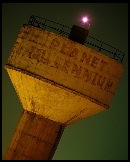
| Very cool. Nice, simple, sharp, and interesting crop. The colors work together for a nightshot. Some viewers may be inclined to deem this boring, however I think the Planet Millennium on the face, and the crop make it pretty cool. GL. |
|
| Photographer found comment helpful. |
|
|
04/12/2007 10:02:37 PM |
| Excellent choice on the crop - extra point! |
|
| Photographer found comment helpful. |
|
|
04/12/2007 09:49:20 PM |
| I personally don't like off angle photos. |
|
|
|
04/12/2007 01:44:16 PM |
| Cool. But I don't like the light on the top of it. |
|
| Photographer found comment helpful. |
|
|
04/12/2007 11:09:21 AM |
| Very nice exposure on this tower. I'm undecided about the artistic tilt, it works but I'm not sure if it really adds to the photo or not. |
|
| Photographer found comment helpful. |
|
|
04/11/2007 08:37:07 PM |
| Timbeeeeeeeerrrrrrr! It looks like it is falling over. Never a good idea for buidings. |
|
| Photographer found comment helpful. |
|
|
04/11/2007 11:34:34 AM |
| It looks like its falling down. Oh boy. |
|
| Photographer found comment helpful. |
|
|
04/11/2007 09:42:11 AM |
| nothing good about it .. sorry |
|
|
|
04/11/2007 02:03:06 AM |
| I like the angle, and the colours are nicely balanced. Unfortunately the chroma noise reduction has bled some yellow into the green, and there's still some luminance noise - the green would look even better if the background was silky smooth. But overall, it's still one my top picks. |
|
| Photographer found comment helpful. |
Home -
Challenges -
Community -
League -
Photos -
Cameras -
Lenses -
Learn -
Prints! -
Help -
Terms of Use -
Privacy -
Top ^
DPChallenge, and website content and design, Copyright © 2001-2024 Challenging Technologies, LLC.
All digital photo copyrights belong to the photographers and may not be used without permission.
Current Server Time: 04/19/2024 05:30:50 AM EDT.