| Author | Thread |
|
|
09/03/2007 01:24:00 PM |
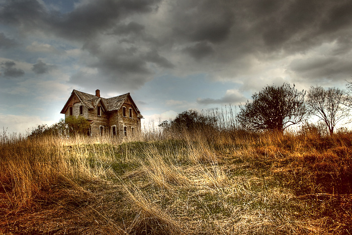
yanko, I believe you assumed I liked this version better because I asked why she entered the other. Not the case at all and I never said anything like that. The reason I asked about the other is because the clouds in that one seemed more unnatural. But you are right, each to their own. I do like the house better in this one.
mk, you can hide this if you want. I just didn't like someone using my comment to state their biases. |
|
 Photographer found comment helpful. Photographer found comment helpful. |
|
|
09/03/2007 11:39:41 AM |
Originally posted by yanko:
Why do you prefer this version? No offense to the great Mysterious Yellow 70 but this edit kind of looks like she just punch in some random settings to produce this tonemapping. The tonal relationships are completely destroyed making the photo look like a mess.
The other version (i.e. take III.jpg) is a much finer edit hands down. The highlights and shadows while still looking tonemapped is still believable. The light still looks like it's coming from the sun where as in this photo it looks like the weeds are radioactive emitting their own light. It just floors me that people love these crazy edits but hey to each is own.
Also, don't kill me! *runs* |
You're exactly right. This version was a simple tonemap of the disaster that was the original entry (good god!) as a test when I first got the plugin. It was only done on a 640px image. I had to redo in order to make a print res version and the other is what I came up with.
At this point, I think I'm probably done editing this silly pic. Time to do some new stuff. :)
|
|
|
|
09/03/2007 06:23:35 AM |
Originally posted by pcody:
to bad it didn't get accepted. But I saw the picture you posted as the winner last year...and, well...enough said. Their loss.
Can I ask why you decided on a softer version?
This is the MN fair? Next year I swear I'm going to send something in. Especially seeing that picture that won.
If you want I'll erase this comment. Don't want to mess up your presentation. |
Why do you prefer this version? No offense to the great Mysterious Yellow 70 but this edit kind of looks like she just punch in some random settings to produce this tonemapping. The tonal relationships are completely destroyed making the photo look like a mess.
The other version (i.e. take III.jpg) is a much finer edit hands down. The highlights and shadows while still looking tonemapped is still believable. The light still looks like it's coming from the sun where as in this photo it looks like the weeds are radioactive emitting their own light. It just floors me that people love these crazy edits but hey to each is own.
Also, don't kill me! *runs*
Message edited by author 2007-09-03 06:26:22. |
|
| Photographer found comment helpful. |
|
|
08/27/2007 09:05:55 PM |
to bad it didn't get accepted. But I saw the picture you posted as the winner last year...and, well...enough said. Their loss.
Can I ask why you decided on a softer version?
This is the MN fair? Next year I swear I'm going to send something in. Especially seeing that picture that won.
If you want I'll erase this comment. Don't want to mess up your presentation.
|
|
| Photographer found comment helpful. |
|
|
08/27/2007 05:53:35 PM |
This is actually the version I ended up submitting.

It wasn't accepted. But that's cool because at least my cat digs it.

(And it's hanging in a local gallery and will be printed in next year's calendar for a Fortune 500 company so I'll be okay about the fair rejection. :) ) |
|
|
|
08/27/2007 03:33:17 PM |
| Looks like a house just off the highway up in the St Cloud/Rice area. How'd it do at the fair? |
|
| Photographer found comment helpful. |
|
|
06/20/2007 11:21:07 PM |
| I just love what you did with this image and am quite honestly envious of your find. Very nice indeed. |
|
| Photographer found comment helpful. |
|
|
06/20/2007 09:50:35 PM |
| Yeah, I like this one. Very much. I like the grasses in front in particular, they glow right up to the house. |
|
| Photographer found comment helpful. |
|
|
04/30/2007 01:29:04 PM |
| Yes...I like this version much better. Looks like a wonderful old house - perfect for photographing! |
|
| Photographer found comment helpful. |
|
|
04/28/2007 02:20:50 PM |
| Yes this one rocks, way better than your entry....but hey, thats progress |
|
| Photographer found comment helpful. |
|
|
04/25/2007 11:49:10 AM |
| This IMO is a lot better than the one you entered. |
|
| Photographer found comment helpful. |
Home -
Challenges -
Community -
League -
Photos -
Cameras -
Lenses -
Learn -
Prints! -
Help -
Terms of Use -
Privacy -
Top ^
DPChallenge, and website content and design, Copyright © 2001-2024 Challenging Technologies, LLC.
All digital photo copyrights belong to the photographers and may not be used without permission.
Current Server Time: 04/19/2024 06:19:52 AM EDT.