| Author | Thread |
Comments Made During the Challenge  |
|
|
09/01/2002 08:36:00 PM |
|
|
|
09/01/2002 05:31:00 PM |
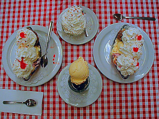
| I like the setup. However the reflections hurt and top table cloth is too much in focus. Good shot |
|
 Photographer found comment helpful. Photographer found comment helpful. |
|
|
09/01/2002 09:24:00 AM |
Composition: Subject Placement, Cropping, Background5,
Technical: Focus, Exposure, Lighting, Processing6,
Challenge: Does your entry meet it?4,
Appeal: Is it Interesting, Motivating, Etc.? 6,
Total Averaged Rating5. Autool
|
|
| Photographer found comment helpful. |
|
|
08/30/2002 11:28:00 AM |
| There's something wrong with the light here but I'm having trouble with what it is. It seems well lit and dark all at the same time. Perhaps use auto-levels in your graphics package to see if that improves things. Anyway - it's a good subject matter and I love the tablecloth. Really gives it an old feeling. - floyd |
|
| Photographer found comment helpful. |
|
|
08/30/2002 05:01:00 AM |
|
| Photographer found comment helpful. |
|
|
08/29/2002 10:26:00 AM |
| The colors on this seem a little muted, they do not "pop" as I feel they should. I am not sure if you did this intentionally or not, and its just a personal opinion. |
|
| Photographer found comment helpful. |
|
|
08/28/2002 04:08:00 PM |
|
|
|
08/28/2002 11:13:00 AM |
| Yummy looking. This is well done. I like how you have 2 big plates and 2 little plates. The lighting and placement are great. There is a glare on the large plate on the right, but nothing too distracting. And there is a wrinkle in the tablecloth. Other than that, you have a really great photo. Great job and good luck in the challenge. |
|
| Photographer found comment helpful. |
|
|
08/27/2002 04:31:00 PM |
| This is a nicely done image... I definitely like the subject matter... The top down view seems a bit strange to me though... I would have preferred to see a lower angle photo... this particular view removes the sense of depth from the image... it becomes more two dimensional in this perpsective... - jmsetzler |
|
| Photographer found comment helpful. |
|
|
08/27/2002 11:27:00 AM |
Original idea. Composition - layout of objecrs on table, not too exciting. Paper serviette cropped off at right. Because of pattern on tablecloth perhaps needs to be shot from right overhead in order to get those lines accurately horizontal and vertical within the frame. Or muss the table cloth up much more so they are deliberately off the vertical and horizontal. Colours a little dark.
Kavey |
|
| Photographer found comment helpful. |
|
|
08/27/2002 08:27:00 AM |
| Nice photo. Layed out well. Lighting is OK. Focus is good. Subject is yummy... |
|
| Photographer found comment helpful. |
|
|
08/27/2002 06:15:00 AM |
Composition - 6
Technical Aspects - 6
Meets Challenge - yes 4 (if NO -2 point)
Creativity � 5
Rating 5 |
|
| Photographer found comment helpful. |
|
|
08/26/2002 08:37:00 PM |
| This photo seems very dark and under-lit. If this was afilm shot, i'd almost say it was underexposed. It ruins the whole effect. 3 -lennier |
|
| Photographer found comment helpful. |
|
|
08/26/2002 08:10:00 PM |
|
|
|
08/26/2002 06:02:00 PM |
| yummy yummy, pictures making my mouth water! Nice table cloth background. |
|
| Photographer found comment helpful. |
|
|
08/26/2002 05:50:00 PM |
| the food looks like the table cloth--get more detail and a better focus--might need better lighting |
|
| Photographer found comment helpful. |
|
|
08/26/2002 03:25:00 PM |
| Great composition, could be a little brighter!! |
|
| Photographer found comment helpful. |
|
|
08/26/2002 03:21:00 PM |
| i love the color and the subject matter in this shot. did you take it from a lower vantage point instead of from straight above? karmat |
|
| Photographer found comment helpful. |
|
|
08/26/2002 02:56:00 PM |
| Please my thighs!!!!!!!!!!! LOL Nice job. |
|
|
|
08/26/2002 01:23:00 AM |
| A little too dark for me. 5. |
|
| Photographer found comment helpful. |
|
|
08/26/2002 01:00:00 AM |
| I like this idea a lot. I like the perspective too. However, I would say it looks a little dark. Perhaps more lighting? |
|
| Photographer found comment helpful. |
Home -
Challenges -
Community -
League -
Photos -
Cameras -
Lenses -
Learn -
Prints! -
Help -
Terms of Use -
Privacy -
Top ^
DPChallenge, and website content and design, Copyright © 2001-2024 Challenging Technologies, LLC.
All digital photo copyrights belong to the photographers and may not be used without permission.
Current Server Time: 04/19/2024 07:33:56 PM EDT.