Greetings from the critique club:
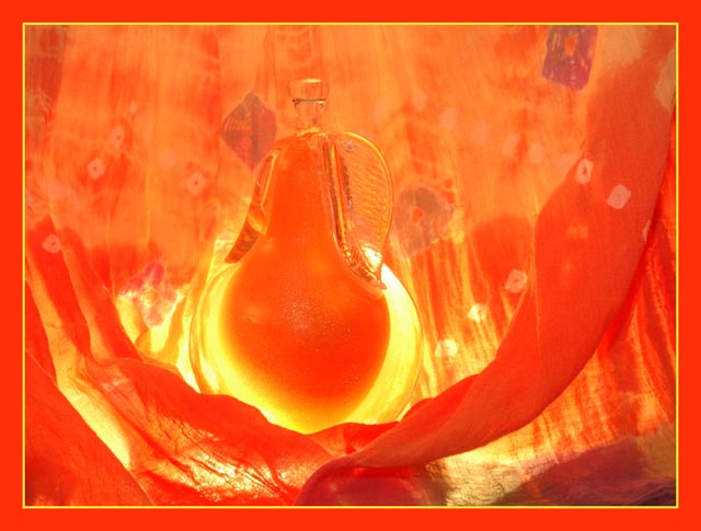
Strengths: Pretty color, somewhat abstract feel. Good use of leading lines.
Weakness: The abstract feel, while adding to aesthetics, makes the connection to the theme a bit less clear. And after a couple of moments looking, it starts to become less abstract, so it's kind of in-between artistically. The pear feels a bit too centered (though not exactly so). Not sure what the pattern on the 'curtain' adds, and the blueish tones which come through strongly bottom right, and in other spots, seems to break the nice orange feel. There's double ambiguity in the connection to the theme: I presume the pear is actually perfume, which does bring in love and romance; but then the title takes it a different direction, loving pears.
Suggestions: A slightly different composition, following the rule of thirds; a duotone approach with the orange; single, strong, connection to the theme; simplify visual elements, use a plain cheescloth (or whatever it is) curtain rather than one with patterns. Consider more dramatic lighting.
Hope that helps!
|