| Author | Thread |
|
|
01/13/2013 01:45:22 PM |
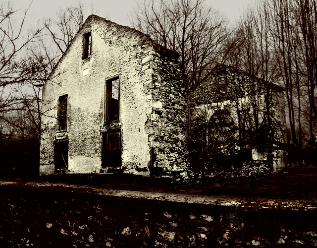
| So very moody, and the mood is sad. |
|
 Photographer found comment helpful. Photographer found comment helpful. |
|
|
09/02/2010 12:28:22 AM |
| very powerful image. i look here, i look there, i am not at rest, every part of the image is singing at me. (I almost wish I hadn't seen it; all the things you did that I don't know how to do). |
|
| Photographer found comment helpful. |
|
|
07/16/2007 08:33:44 AM |
this is poetic, living in country with large number of devastated/abandoned buildings i can almost see you visited my country :-)
... it gives me mixed emotions ... i can be sad watching this or i can slam my fist at the desk saying ... "damn, there must me a better world out there" ... and go out, go home, go anywhere ... enjoy your life ... no one will do it for you. just GO !
peace |
|
| Photographer found comment helpful. |
|
|
02/19/2007 01:23:41 AM |
| Makes me FEEL. I think of my childhood in Nova Scotia. My dad had a love of exploring old abandoned buildings and farms. I can smell their old musty smells. This image also makes me think of Wuthering Heights and Jane Eyre. The technical part is way beyond my ability. |
|
| Photographer found comment helpful. |
|
|
01/18/2007 10:48:22 AM |
Hi Don,
Like this a lot. Gave it a 7 while voting. The tritone finish makes it refreshingly different, and the curves give a great sense of motion.
BTW - what's that about a crappy score, hmmmmm? Anything above a 6 is a great score, in my book! What you complaining about, boy? |
|
| Photographer found comment helpful. |
|
|
01/17/2007 11:49:31 PM |
| Wow! This is awesome!! And I'm not saying that just 'cause you're Fearless Leader!!! I like the tone-mapping effect, I believe it's called. Or at least that's what I understand the pastelizing effect...what looks like antiquing. You do have good sky but I fear that the definition in the wall suffered though that may have been intentional. The whole dirty, gloomy look works really well with this old falling in house. I wonder why it didn't fare better except that if you look at it quickly, you cannot get the effect......it's possibly too subtle. |
|
| Photographer found comment helpful. |
|
|
01/17/2007 09:16:10 PM |
I am too tired from reading your comments to take in the shot...will have to come back later...
edit: I am back...I think this has the feel of a painting...the dabs in the foreground..inky looking sides of the building...maybe that makes it an ink drawing...oh no you are starting to realize I don't know what I am talking about...ok let me say this...the darkening effect of the tritone works well here, as the key bits of info are all present, and it adds a stark look to the overall shot...you did a nice job with the foreground, giving it a painterly look (can't blame me for trying...)...
ahem...cool looking shot
Message edited by author 2007-01-17 21:21:52. |
|
| Photographer found comment helpful. |
|
|
01/17/2007 02:05:12 AM |
| The thing that strikes me, after reading what you wrote, is this doesn't look all that "processed" to me, which is a good thing. It does look old, like it was taken in an era long before Photoshop. The picture itself engenders a bit of sadness and a sense of what once was never to be again. Dare I say it? This is a fine editing job. |
|
| Photographer found comment helpful. |
Comments Made During the Challenge  |
|
|
01/16/2007 08:41:09 PM |
|
| Photographer found comment helpful. |
|
|
01/15/2007 02:23:48 PM |
| Nice tones. Looks like a gothic horror... |
|
| Photographer found comment helpful. |
|
|
01/15/2007 01:48:56 PM |
| great photo. I always like photos the evoke emotion in me when I view them. This one tells a story. |
|
| Photographer found comment helpful. |
|
|
01/15/2007 11:20:53 AM |
| Beautiful picture. Where was this taken at? |
|
| Photographer found comment helpful. |
|
|
01/12/2007 10:24:17 AM |
| I like the tones and processing on this. Works well for this photo. The title you've picked wouldn't have been my first choice. I associate that title more with a person rather than an object. Just my take on it. Good luck in the challenge. |
|
| Photographer found comment helpful. |
|
|
01/11/2007 05:59:16 PM |
| Great shot. I really love the contrast. 7 |
|
| Photographer found comment helpful. |
|
|
01/11/2007 12:11:32 PM |
|
| Photographer found comment helpful. |
|
|
01/11/2007 11:49:05 AM |
| Nice composition. Not much colour going on here and maybe a bit darker, though, but I suppose that's what you wanted... |
|
| Photographer found comment helpful. |
|
|
01/11/2007 11:39:54 AM |
| A little too dark for my taste, but I still like it. |
|
| Photographer found comment helpful. |
|
|
01/10/2007 04:37:27 PM |
| theres alot of texture and it takes away from what im trying to look at. |
|
| Photographer found comment helpful. |
|
|
01/10/2007 01:57:19 PM |
| A little spackle and fresh coat of paint... :) |
|
| Photographer found comment helpful. |
|
|
01/10/2007 08:33:22 AM |
| oh i love old worn down buildings! |
|
| Photographer found comment helpful. |
Home -
Challenges -
Community -
League -
Photos -
Cameras -
Lenses -
Learn -
Prints! -
Help -
Terms of Use -
Privacy -
Top ^
DPChallenge, and website content and design, Copyright © 2001-2024 Challenging Technologies, LLC.
All digital photo copyrights belong to the photographers and may not be used without permission.
Current Server Time: 04/24/2024 02:16:29 AM EDT.