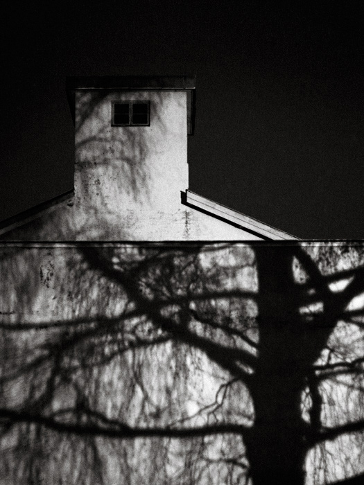
A remarkable image, well seen and so nearly well composed, I feel prompted to comment.
As the horizontal division of the portrait format into two equal panes appears naturally dictated by givens of the subject (and its parts), the remaining negative space in the upper half could (and, to my senses 'should') be trimmed to suit a 1/3 - 2/3 proportion in this section. This (IMO) would introduce a tension (a more dynamic force) to the image which is not there, if the two sections remained balanced (as presented). Also,
the roof line of the wall is slightly, albeit critically tilted, which could easily be corrected by rotating accordingly.
A little dodging (or some other means of revealing the deteriorated outlines in the middle and upper half, especially toward the left) may benefit a clearer and quicker appreciation of the compositional geometry which is so superbly ordering the chiaroscura on the walls (both bottom and top).
A remarkable image, worth more than words, nevertheless. |